Brody recently emailed me this question:
Since I got back into pens, I have become really enamored with Fountain Pens. I have been burning through notebooks trying to find good fits for FPs. I also started journalling – one for my daughter, one for my son, and one for me. I started off with the Piccadilly leather-something… and now I realize that if I keep going with this journalling, when I start vol. 2 I might not find a good match. Piccadilly seems to be erratic and in odd supplies. Are they going down for the count?
Anyway – I want to find a good journal that is solid and will last a long time, as well as something archival AND in a format that is likely to be around over the years as I fill them up. Knowing that nothing forever, what’s a good bet? Although I don’t use Leuchtturm 1917, I thought maybe it would work well… many colors and solid paper. Other thoughts?
Piccadilly does cater to the budget market like overstock shops so it can be hit-or-miss to find their on a regular basis. Their web site lists retailers who stock their products. Some people have mentioned issues with the binding over time with Piccadilly so I wouldn’t rely on it for archival journals and keepsakes. I use a Piccadilly for work notes which are not relevant by the end of the week so I don’t plan to pass mine down to future generations.
If you are actually looking for multi-color pages, The Ciak Multicolor Journal might be to your taste.
Fabriano used to make one too, for years, but I can’t seem to find anyone selling them now which is sad. They do make a version with an array of white, cream and kraft colored paper but not the rainbow of colors they used to make.
Fabriano has made paper for centuries I think so they would be a good bet though I have not used the paper with fountain pens but it is designed for artists using pencil and pen so it might work well. You may be able to find some Fabriano sketchbooks in a local art supply store.
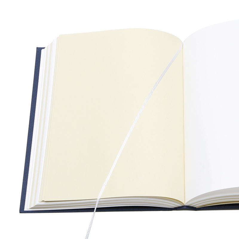
Rhodia Webnotebooks might be a good option. Excellent paper for fountain pens, well-constructed hardbound books and Clairefontaine has been around for awhile and people love the Webnotebook line so they should be available for years to come. There aren’t a ton of cover colors, black and orange at present but their smaller Rhodiarama line have many different colored covers.

I think the Leuchtturm1917 should be around for awhile, its good quality and reasonably priced. Its not super high end paper so some wider nibbed pens might bleed but it has the potential to be a book you’ll be able to find for years to come. They come is several sizes and configurations and have lots of cover color options, including a up-to-the-moment neon option at present.
The classic black, artists sketchbooks from Stillman & Birn, Canson or Cachet might also fit your needs since they are all similar sizes and designed for artists so the paper quality is good (usually 65lb or higher) and reasonable priced (between $10-$15 for a 8.5×11″ size). They are available in an A5 and a US Letter size no matter which brand you choose. Some offer a square or spiral bound option as well. And, to butcher a Henry Ford quote, you can have colored cover you want, as long as you want black. Any art supply store will carry one of these brands (or something comparable) so you’d always have access. I’d recommend the Stillman & Birn to start — the Alpha series paper is not too thick and excellent with fountain pens — though its not as widely available as the other more widely distributed brands.
Most modern notebooks should have fairly low acidity paper, even if its not labelled “archival.” The artist-grade sketchbooks are definitely archival. I would recommend storing completed journals and notebooks in a dark, dry location (like an opaque plastic tub in a closet or attic) after its completed to protect it from light degradation or moisture which will could be a bigger threat than the archival-ness of the paper.