Zack was curious:
Re: Federal Supply Service Notebook
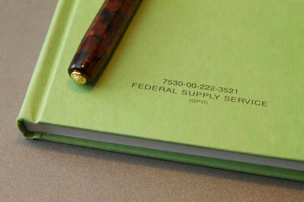
I was wondering if you have ever seen one of those books in a golden color? I have one ins the green but would love to have a few golden colored ones.
It appears that like Henry Ford might have said, “You can have any color Federal Supply notebook you want as long as its green.” That said, if you’re looking for a durable notebook in a golden color, you might want to try Rite in the Rain.

Rachel asks:
I love the stamps I bought at your store!
I’m a stamping neophyte and have two basic questions about care and storage. What is the best way to clean a rubber stamp when I want to use a different color ink? How should I be storing my stamp pads? I have rubber bands around them now to keep the lids on, but wonder whether I should have them in some sort of air-tight container to keep them from drying out.
Thanks, Rachel! I’m so glad you like the stamps.
To clean stamps, I use a damp paper towel on a ceramic plate to clean my stamps between colors. After stamping, I wipe the stamp gently on the wet towel and then use a dry towel to remove any excess moisture. If a stamp gets left with ink on it, I will add a drop of dishwashing liquid to the wet paper towel to loosen up and remove the dried ink.
I do not recommend submerging the stamps in water or ever using any harsh soaps or detergents to remove ink.
On a particularly crusty stamp, dip an old toothbrush into a cup of water with a couple drops of dishwashing liquid and then gently scrub the stamp to remove ink build-up.
If you use a stamp pad regularly, keeping the lid closed and stored flat, should be enough to keep the pad from drying out.
As for storing stamp pads, I either use a rubber band to keep the lids sealed or bits of tape, depending on how often a particular stamp pad is used. I store my large stamp pads on their ends so tape or rubber bands are a must for keeping them from drying out. But stamp pads, no matter how they are stored, will not stay fresh indefinitely so use them up and re-ink when possible. Happy stamping!
PS: You might enjoy my post about different types of stamp pad ink.