Fountain Pen Exhibit Prep

Vintage Esterbrooks

On Friday, I helped two of my co-workers set up a display in our gallery area of fountain pens. I didn’t have nearly as many to add to the collection as they did but it was fun to see all the pens and touch them. There are vintage hard rubber pens, a TON of Esterbrooks, Parker, Sheaffer and many others. I have one case filled with modern fountain pens (most featured here on the blog).

The show will be in the gallery at Hallmark HQ for the month of March. If you are in the KC area and would like to see the show during regular business hours, let me know and I can give you a tour. If not, I’ll be posting photos soon of the show once it’s all set up.

A few vintage pens

Uni Kura Toga Mechanical Pencil

Uni KuraToga writing sample

My pal Brad over at Pen Addict always refers to the Uni Kuru Toga mechanical pencil as his pencil of choice so I finally decided I’d give it a try. The feature that makes this mechanical pencil unique is a automatic lead rotation so that you do not have to continually alter your grip to avoid getting a wide chisel effect.

The pencil body is plastic painted to look metallic and the grip area is clear plastic with some ridges to aid in gripping. There is a small ring of rubber just above the tip that must be designed to keep your fingers from slipping on the plastic body into the tip writing area. Overall, I love the color but this is not the most comfortable pencil for long session writing. For that, I would prefer the Pilot Opt with its large rubberized grip area.

The Kuru Toga pencil includes a small white plastic eraser under the translucent cap which works well and the cap keeps the eraser clean and free from bottom-of-the-bag debris.

Uni KuraToga close-up

There is a spring-loaded clutch in the pencil that is triggered every time you lift the pencil helping to rotate the lead to a perfect point as you write. I test drove the 0.5mm green model though there are 0.3mm lead versions of the pencil as well for an even finer line which would be good to tight technical drawings or other detailed work.

Uni KuraToga close-up

The image above is a writing sample from the Kuru Toga. There does seem to be an overall consistency in the line widths. I worked hard not to adjust my grip on the pencil while I was writing. Its a hard habit to break.

Zebra pencil writing close-up

This is a sample of my writing using a standard big-box mechanical pencil with a 0.5mm lead. I wrote with this without rotating the pencil while I wrote an lo and behold, the writing does get much thicker and more indistinct as a result of the pencil lead wearing into a chisel point.

If a consistent line width with your pencil is an issue, then the Kuru Toga line is definitely the answer. Available from JetPens for $7.50 for either the 0.5mm or 0.3mm versions.

Word Notebook Winners!

winners

Let’s get right to the winners:

The first winner is #2 and our letter loving friend, Derrick Dodson and he is getting the orange book. The second winner is the dark lord of pens, Ivan R and I’ll be sending him the camo version. Expect an email soon so you can send me your address.

Thanks to everyone who left comments and I can’t wait to hear what Derrick and Ivan think of the notebooks when they receive them.

Scout Books

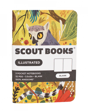
Do you love those little pocket notebooks but wish you could customize them, stick your logo on them or otherwise create your own book? If so, Scout Books is what you need. You can customize the front of the kraft paper covers with your 1- or 2-color logo and then select between dot grid, blank, grid or lined paper (sturdy 70# white text, 100% recycled). Minimum order is 50 notebooks.

Scout Book vs. Field Notes

The books are a tiny bit smaller (3.5″wide x 5″ tall) than the ubiquitous Field Notes (3.5″x5.5″) but the paper is excellent. The lines and grids are light and fine so as to not be distracting but enough to keep your lines straight when needed.

Scout Book internal pages

Scout Book pen test

In writing tests, the 70# text was fabulous. None of the pens I used had any show through at all. I did not bring out the pen heavy artillery but I suspect a Sharpie marker would get some show through but not bleed through.

reverse of Scout Book pen test

I like you’all so much I have a set of three kraft notebooks to giveaway (one lined, one grid and one dot gird) to one lucky winner. (One notebook has a tiny grease stain on the cover. I blame myself for getting the mail and the pizza at the same time — a well-placed sticker will disguise this blemish).

scoutbooks box scoutbooks rainbow

UPDATE!!!: Scout Books has kindly offered a set of their Rainbow Composition Books for the giveaway as well so I’ll draw two winners. The first will get to choose between the 3-pack of blank books or the Rainbow Set. Second winner will get the other.

Leave a note in the comments telling me what you’d get custom printed on your own stash of Scout Books to be entered to win.

FINE PRINT: Giveaway ends at 10pm on Monday, March 11, 2013 (US Central Time). All comment must be submitted at wellappointeddesk.com, not Twitter, Tumblr or Facebook, okay? Winner will be announced on Friday. Winner will be selected by random number generator from entries that played by the rules (see above). Please include your email address in the comment form so that I can contact you if you win. I will not save email addresses or sell them to anyone — pinky swear.

Washable Blues

Diamine Washable Blue vs Sheaffer Skrip Washable Blue

I was thumbing through the Miquelrius medium flexible 300 grid paper book I use for all my pen and ink testing, when I stumbled across this comparison between the vintage Sheaffer Scrip Washable Blue and the more recent Diamine Washable Blue. I think the Sheaffer Scrip Blue looks more like a blue-black and the Diamine is a brighter blue. Just thought it was interesting… which do you prefer?

TWSBI Mini Review…Finally

TWSBI 540 and Mini

I’ve had the TWSBI Mini ($50-$55) since Christmas but I haven’t reviewed it because I’ve been waiting for a new EF nib unit. Initially, I got it with the F nib thinking I’d like to be able to compare the F nib with the EF nib I have on my TWSBI Diamond 540*. What I discovered is the F nib is quite broad and made me quite sad — I tend to prefer either razor fine or italic/stub nibs, no in-between. So, in order to give a fair and balanced review of the new Mini, I decided to wait until I could swap out the nib unit with the EF and compare apples to apples.

TWSBI Mini

I liked the overall looks of the clear demonstrator model of the TWSBI 540 so I purchased the clear demonstrator Mini as well. The clip shape is ever so slightly different (I think the new 580 uses the same clip design) and TWSBI added threads to the end of the pen so that the cap will post snugly. The silver band at the base of the cap is narrower as well. Otherwise, the size is the only visible difference between the 540 and the Mini.

Size comparison

The 540 is about an inch longer than the Mini which measures about 4.5″ capped which is about half an inch longer than a Kaweco Sport. The barrels on the 540 and the Mini are the same diameter. Uncapped, the Mini is about 4.25″ long and with the cap posted its 5.5″ long which is comparable to most full-sized pens. The Mini weighs 20gms (full of ink and capped) which is 7gms heavier than a Kaweco sport but 8gms lighter than the full-sized 540. In my current pen collection, the TWSBI 540 is as weighty as my Lamy Studio which has an all-metal body.

Fountain Pen Weights

TWSBI Mini nib

The nib of the Mini is more slender than the 540 nib but the same length with the sample decorative filigree and logo.

TWSBI mini review

As expected, in writing tests, the Mini performed exactly the same as the full-sized 540 but was more comfortable in my hands for long writing sessions. The nib is smooth on the paper and writes continuously without any need to prime it. (If pausing while writing, some other fountain pens will dry out requiring that I scratch on a scrap of paper to get it going again which is often referred to as “priming.”)

The ink capacity is not as large as the 540 but both use the same built-in piston filler which is easy to use. The Mini has held enough ink to keep me writing for about a week without needing to refill so it definitely hold more ink than the standard European cartridge.

TWSBI mini writing close-up

If you are looking for an upgrade to the Kaweco-sized pens or want to use a lot of bottled inks, I recommend the Mini.

*The TWSBI 540 has been discontinued and replaced by the upgraded Diamond 580.

(This pen was tested on the Miquelrius medium flexible 300 grid paper book purchased from B+N.)

February Ink Drop 2013

February 2013 Ink Drop

Goulet Pens continues to delight with their monthly themed Ink Drop ink samples. For February, the colors were inspired by Valentine’s Day naturally. There were two pinks (Pilot Iroshizuku Yama-Budo and Diamine Deep Magenta), one shade of red (Sailor Jentle Grenade) — which reminds me of J. Herbin 1670 Rouge Hematite with more of a pink undertone — and two shades of purple (DeAtramentis Aubergine and Rohrer & Klingner Cassia).

The DeAtramentis Aubergine is almost a purple black and reminds me of Scribal Work Shop Cryptid Nessie from the October Ink Drop. The Yama-Budo is a raspberry pink and the Deep Magenta is a bright magenta pink. I prefer the Yama-Budo color — its a fun pink color but not quite so princess-y pink as the Deep Magenta. The Cassia is a vibrant violet. Which color is your favorite?

The more I test these inks them more I’m coming to discover consistencies in the inks. De Atramentis inks always seem wetter which I find works well later in finer nib pens. Diamine inks are more solid — I can almost use them with crow quill dip nibs without too much bleed. I think these inks would work well in broader pens like a 1.1 calligraphy/stub nib. Just an observation…

I tested these inks using my vintage Parker and vintage Sheaffer pens, both with lovely striated details in the bodies and gold nibs. I need to get them both re-sacked so that I can use them more often. As it is, I use them like dip pens.

Ink stained fingers

Thought you’d like to see how messy I get testing all my inks. My manicurist would faint dead away if she saw what I did to my hands.