Paper Pastries’ Custom Return Address Stamps

Paper Pastries Custom Return Address Rubber Stamp

Paper Pastries just created some new custom, hand-lettered return address stamps featuring animal silhouettes. Margaret asked if I’d be a volunteer address for her new creations since she knows I’m a cat lover. She created a lovely hand-lettered rubber stamp with my return address inside a big fluffy cat silhouette. Looks like my big ol’ Maine Coon Milo!

Paper Pastries has a dozen different, animal designs available: cats in various poses,  dog silhouettes, and even a bunny! Or you can send her a clear photo of your pet to be turned into a custom silhouette stamp. Then she’ll hand letter your address and make this fabulous wood, art block stamp for you. Each stamp will cost $70 but they are original designs, made just for you and, seeing one in person, it’s clear that its a great value.

Paper Pastries also has state silhouettes, custom calligraphy and unique hand-lettered rubber stamps available as well.


DISCLAIMER: This item was sent to me free of charge by Paper Pastries for the purpose of review. Please see the About page for more details.

Ink Review: J. Herbin Rose Cyclamen

J. Herbin Rose Cyclamen Ink

As the weather warms up and I’m seeing the first peeks flowers and trees budding, I decided it was time to get out some brighter inks. I had this J. Herbin Rose Cyclamen ($9 for a 30ml bottle) from the massive ink haul I won last year from Julie B over at Pens Paper Inks … Whatever. I’m not normally inclined to purchase pink inks, Pelikan Edelstein Turmaline Color of the Year not included, but I was getting the itch to use an ink that wasn’t blue-black. So the J. Herbin Cyclamen found its way into circulation and, boy, am I glad it did.

I painted the title with a paintbrush and then wrote the writing sample using the Pilot Plumix calligraphy nib currently residing on my “spare” lime green Pilot Prera. Following the nib hack a couple weeks ago, a reader (Denis) mentioned that this hack also worked with Preras. Since I had a Prera with a too-fine-for-me F nib, this seemed like a great way to make it useful again. Besides, the pink ink in the lime green pen made me think of Lilly Pulitzer summer resort dresses.

J. Herbin Rose Cyclamen Ink writing sample

It’s a very purple-y pink, more raspberry than a fuchsia or hot pink. It really is the color of a Cyclamen flower.

(via Wikipedia)

The ink has a little shading but not much and its not as noticeable once the ink is dry either. But overall, J. Herbin ink is very reasonably priced and offers vivid colors that brighten my day.

J. Herbin Rose Cyclamen Ink Pink comparison

For comparison, here are some swatches of other pinks I had on hand. From left to right, Diamine Deep Magenta, J. Herbin Rose Cyclamen, J. Herbin Rose Tendresse, DeAtramentis Dianthus, Platinum Cyclamen Pink (actually neon which was hard to capture in a photograph), Diamine Hope Pink (also neon bright) and Pelikan Edelstein Turmaline (no longer available).

To be honest, I found very little difference between the J. Herbin Rose Cyclamen and Rose Tendresse. I find the Cyclamen a tiny bit deeper and a little more complex and the Tendresse a tiny bit brighter. I think the Tendresse looks like it would shade a bit more. The De Atramentis Dianthus is very similar in hue, maybe a tiny bit brighter and it is a scented ink. I could only smell it slightly when it was wet and was lightly floral. When dry, there is no scent. The only other color close (in my collection) was the Diamine Deep Magenta which was more of a deep, dirty pink not as raspberry purple as the other three mentioned. The Platinum Cyclamen, Diamine Hope Pink are much pinker and neon when wet. They both dry to a vibrant pinky-red. The Pelikan Edelstein Turmaline is the most subdued as a deep, complex red/pink/brown.

Do you ever use pink ink? What’s your favorite?

Ink Drop: March 2014 Lasting Impressions

Ink Drop March 2014

This month’s Ink Drop featured five inks known for their stay-put properties and titled the collection Lasting Impressions. These inks are all designed to be permanent or very water-proof. The colors featured were Rohrer & Klingner Salix and Scabiosa, Platinum Carbon Black (that dark sheen spot is dry ink though if I rub it with my finger, it smudges like charcoal), Noodler’s Bad Green Gator and Upper Ganges Blue.

I was delighted that, when presenting permanent inks, Goulet Pens didn’t send just black and blue inks. I had wanted to see Scabiosa in person for a long time because I do like a deeper, more complex color and it really is unique. Its a deep plum, almost purple black.

In my swash test, I really liked the woodsy green of Bad Green Gator but I’ll have a full review of the color later this week. Noodler’s Upper Gange blue is a deep blue on the edge of a blue-black while the R&K Salix is more of a denim-y blue.

As mentioned, the Platinum Carbon Black left a shiny deposit in my swash test when dry and when I ran my finger over it, it smudged like charcoal pencil. The swash had been sitting for almost 24 hours when I smudged it. Keeping in mind, this was not a writing sample but it is definitely a black ink that is going to stick around.

Overall, these colors seem more sedated and subdued than their less-permanent, more-vibrant brethren. Not that subdued is a bad thing at all. I find their muted colors to be pleasing.

Both of the R&K colors are iron gall inks and I know a lot of people are concerned with potential damage to their pens as a result of these inks. I don’t know much about caring for pens with iron gall inks or other permanent inks but I think if you change your inks at least monthly, it shouldn’t be much of an issue. If concerned that any of these permanent inks might stain or clog your favorite pen, I recommend trying it first in a cheaper pen (maybe a Plaltinum Preppy or a Pilot Metropolitan) before trying it in your top-dollar or vintage pen.


Field Notes: Shelterwood

Field Notes Shelterwood

The newest edition of the Field Notes color series is called Shelterwood and its awesome feature is the REAL WOOD covers. Slivers of wood are bonded to kraft paper covers to create unique, beautiful wood veneer-covered Field Notes. Inside the books are the same 70 lb Finch Soft White paper that was in the America The Beautiful editions with green lines. This special edition is going to sell out fast so you better order yours today. $9.95 for  a 3-pack, or better yet, subscribe for a year and be guaranteed to get the next edition as soon as its available.

I’ll give you more details when my set arrives but, by then, it might be too late. Take a chance on these and order quickly!

Kickstarter: Tiletto

Tiletto

By now, I’m sure you’ve probably already heard about the Tiletto. Tiletto is a Kickstarter project that’s a multi-function letter opener made from titanium, of course. It can also be used as a bottle opener (my favorite additional feature), hex wrench, straight edge, pry bar, box opener, and the list goes on. Its durable, functional and pretty elegant looking. You can get in on the ground floor for $30. The project has just eleven days left.

Ask The Desk: Scratchy Pens & Jotter Refills

Ask The Desk Header

Millicent asked two questions and I’ve been mulling over them for a few days:

About fine points of any type, be they fountain, roller, ball pen or even pencil.  While they would not be my first choice, sometimes a medium or broad just won’t work. I have found workarounds for pencils to avoid the 0.3 and 0.5 nightmares. I see all the reviews for fountain pens extolling the virtues of specific nibs.  All I get is scratchy frustration, with no apparent sweet spot. Alternate ink and paper don’t seem to help. There are pens sitting unused in my arsenal that deserve court time. Plus there are always ones waiting to be acquired.  Suggestions and recommendations ???

Fine nib pens are not, as a whole, scratchy. I do find that the teeny tipped gel pens, like the 0.25 Pilot Hi Tec Cs, to be a little scritchy, but overall there may be some other issues to consider.

heavy or light hand writing

The only thing I can think is that you might have a “heavy hand.” This is in no way an insult or anything, it just means that you press your pen more firmly on the paper or that you grip you writing tools tighter than others. With fountain pens, if all pens seem scratchy, I would recommend making sure to use a lighter hand — the least amount of pressure to release ink on the paper. You might want to practice just by making loops on paper with the lightest, loosest grip. Once you find the sweet spot, try actually writing.

I think the same process would work with gel or rollerball pens too.

The only other possibility would be the angle that you are writing. If you have a Lamy Safari or other pen that has a molded grip area  that forces a “correct” hand hold, try using that in combination with your lightest touch. Please let us know if you are still having issues.

Millicent’s second question was:

Many pens come supplied with the Parker Jotter style refills.  The issue is that they are almost always black ink.  The first thing I do is change the refill to blue or green.   I refuse to just toss the black refills in the waste bin since they are brand new. They need a good home, just like puppies and kitties 🙂   Any ideas?

Parker-style refill

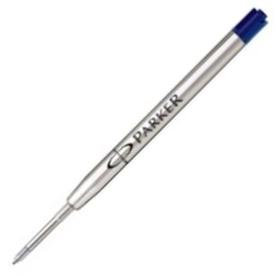
Anyone in need of black Parker Style refills? Or know of any place she can trade or sell them? Leave a comment or email me through the Ask The Desk link and I can put you in touch with Millicent. Thanks!

I Do These Things For You

Moleskine Art Plus Sketchbook

Moleskine recently unveiled their new Art Plus Sketch Album which explicitly called out the weight of the paper stock on new books is 120 gsm (80lb). Its a cardstock cover book available as a pocket or large “reporter style” though they show it used horizontally on the site, or a 7.5″ square size. Each book has 88 pages and retail prices are $7.95 for the pocket (A6-ish) , $13.95 for the large (A5-ish) and $19.95 for the 7.5″ (19cm) square.

I am willing to try one out so that you, my fine readers, do not have to blow your hard-earned cash if these are not a real improvement over the regular paper (terrible for anything but pencil) or the “sketchbook” stock which was water-resisting, manila card stock.  I ordered one and expect to have it for review in a week or so. If it is terrible paper that makes me shout profanities, there will be a bonfire and you’ll all be invited.

Moleskine Art Plus inside