

Kyo-no-oto is an ink line from the TAG stationery store in Japan with colors designed to represent traditional Japanese dyes. The latest release from Kyo-no-oto is Sakuranezumi or Cherry Blossom Mouse (maybe the cutest name ever).

From the box, the color seems to be a dusty pinkish purple that shades well. The box is a thick cardstock with the name Kyo-no-oto letterpressed into the material and is one of those boxes that I can never seem to open without a small tear in one corner.

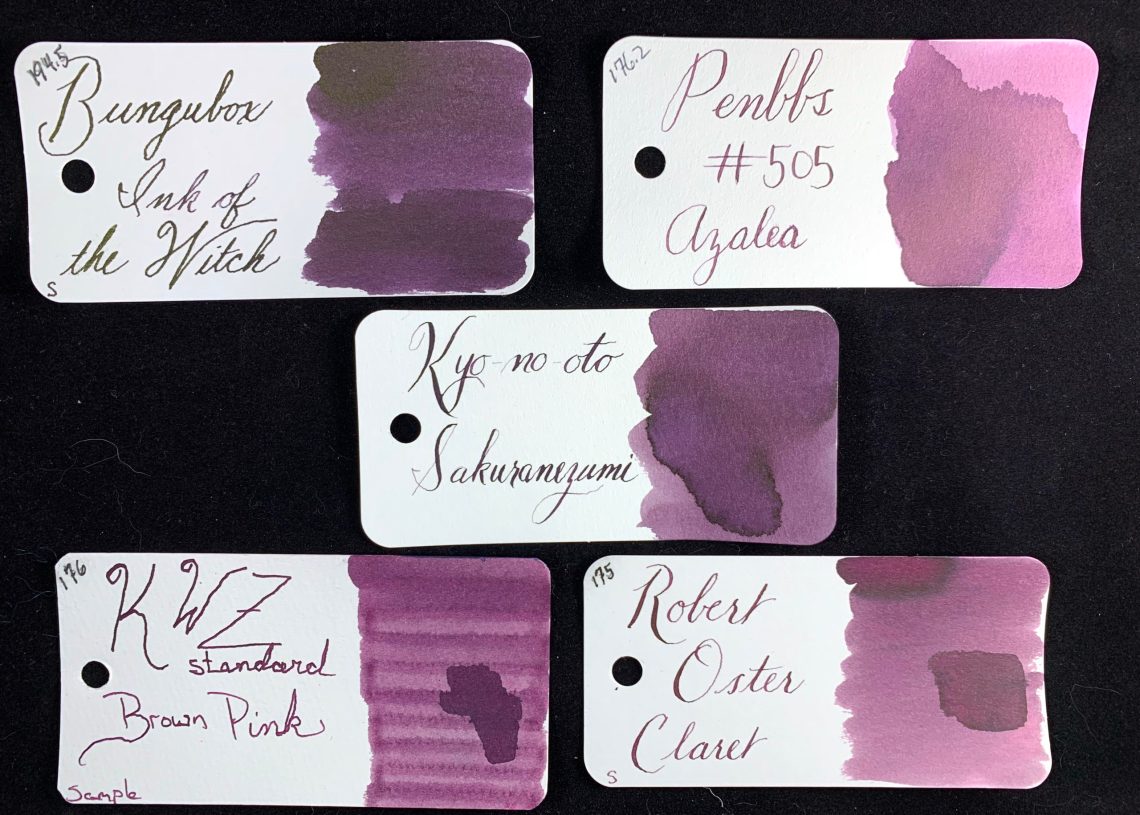
Opening the bottle, the ink seems to be a very dark purple and on the thin side – very little ink stayed on the inside of the lid.
Sakuranezumi is an amazing shading ink. On my swatch card, the shading varies from a dusty rose to a plum with a dark halo and a hint of a goldish-green sheen on tthe edges of that halo.

In very heavy applications, Sakuranezumi can even move towards a violet. This only happened where I allowed a LOT of ink to dry.

As I compared Sakuranezumi to other inks, there was a wide range to match. The lightest areas seemed to be a good match to Robert Oster Claret while the heavier applications looked near the lightest portions of Bungubox Ink of the Witch.
Due to the sakura portion of the name, I was inspired to draw a few flowers. The shading is great here, just don’t judge the quality of the actual drawing!

Another large swatch of ink shows again the leaning towards blue undertones.

The biggest complaint about Kyo-no-oto ink is that the inks are terribly dry. I used a pen that is normally too wet for my taste in order to compensate for the dryness and I was pleased with the results! The flow seemed perfect. I would label Sakuranezumi as a dry-ish ink, although nowhere near the dryness level of Stone Road or Hisoku.

Wide nibs and script writing (rather than cursive) show the shading very well. In writing I would actually say Sakuranezumi is a medium shading ink.

At $28 for 40mL, Kyo-no-oto inks are on the pricy side, but, in my opinion, are worth the price for the original colors. Now I need to find a stuffed Cherry Blossom Mouse for my desk!

Tools:
- Paper: Musubi Tomoe River Refill ($30-35 USD)
- Ink: Kyo-no-oto Sakuranezumi (Pen Boutique, 40mL for $25.20)
- Swatch Cards: Col-o-ring ink testing cards ($10 for 100 card pack)
DISCLAIMER: All materials used in this review were purchased by me. Please see the About page for more details.
Where’s the mouse? 😉
How does this one compare colour wise with Soft Snow of Ohara?
I love the colors of the TAG/Takeda Jimuki inks, but every one I tried was super dry. I had success with adding a drop of 50:1 dilution Photo-Flo 200 to a vial of ink, which made it a lot better behaved.
I love Kyo-no-oto Hisoku but it requires a shot of white lighting or something to make it wetter. I wonder what kind of pens they use to “test” this ink when producing… I can tell you no Sailor/Pilot EF/F nib was used as it’s way too dry for them…
I have this. It’s the most similar thing I have to my first love, Scabiosa, although this can go darker. A lot of the quirks are similar too, dryness, although this one isn’t iron gall. Not sure I’m correct but my guess is that Japanese adds “cha” (= tea) to a colour neutralized towards brown, “nezumi” (=mouse) if it’s neutralized towards grey? This isn’t close to grey like Diamine Vivaldi or Kobe Mikage or Tamon, but it can be dark enough that the purple is hidden.
I agree with you about Scabiosa. It’s also quite similar to, but a touch lighter/warmer than, Diamine Damson, IMO. I’m finding it to be, in many ways, the middle ground between Scabiosa & Damson that I’ve been looking for in this type of dusky eggplant type of color.