

Huge apologies for skipping Day 8 on Inkmas this year. Thankfully, one of our readers noticed the oversight. So, we have decided to bump this out to be our post-Boxing Day Inkmas post.
There’s no reason that the holiday festivities can’t continue, right? The Ferris Wheel Press Ink Timeless Blue Special Edition 2020 ($18 for 38mp) is a great gift. As a Special Edition ink, its a good end-of-year celebration, for as much as any of us want to celebrate 2020. We just want to celebrate that it’s over.
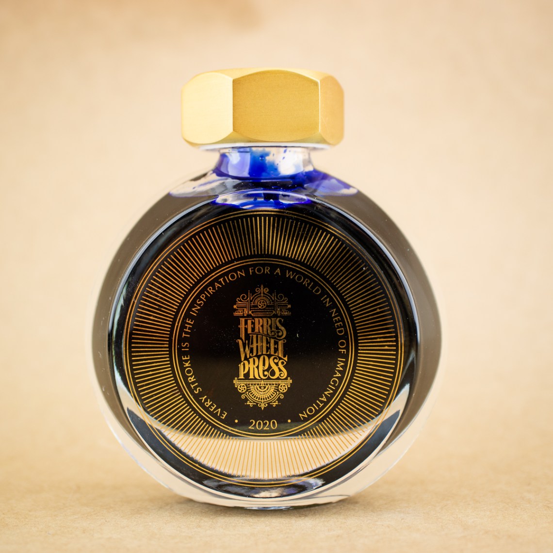
The packaging and bottle is lovely. There is gold foil stamping on both the box and and the bottle. The bolt cap is heavy metallic painted a brushed gold. Inside the cap is a rubber gasket which keeps the ink from leaking.

The 38ml bottles are flat on the front and back providing good real estate for branding and labelling the ink colors. This is an upgrade from the larger 85ml bottles which are almost completely spherical but are more difficult to label once removed from the box. As such, I much prefer the 38ml bottles. Not to mention, when am I ever going to use 85ml of any one ink?

The color is a bright, vivid Ultramarine blue. It doesn’t have a ton of shading but there is some sheening. Not as much as the new Krishna S Series Paakezah but it does sheen.


Even on Rhodia paper, the sheen will show with wider strokes and heavier ink coverage.

In regular writing, there is very little evidence of the shading and, with an EF nib, very little evidence of sheen. But the color is deeply saturated and bright.


The ink is water soluble. And when wet, the ink shows some evidence of a soft lavender undertone.

On Tomoe River, the results regarding the color are consistent to the results on Rhodia — not much shading, a little sheen. Timeless Blue is a little dry, it’s good for EF nibs and everyday paper since it is not likely to spread as much as other wetter inks. The ink has a little bit of a gritty quality which is more noticeable on smooth paper or with pens that have particularly smooth nibs. The ink adds a little tooth to the writing experience. If you prefer wetter, more lubricated ink, the Pilot Iroshizuku Asa-Gao would probably be a good alternative.

When compared to other inks, as mentioned above, Pilot Iroshizuku Asa-Gao is a good option as well as Monteverde Sapphire, Penlux Cobalt Blue (a Sailor made ink so it’s probably lubricated as well), Private Reserve Cosmic Cobalt and Monteverde 2018 DC Supershow Blue (which is very hard to tell apart from Sapphire Blue).
I don’t have a swatch of the white whale of the ink world: Parker Penman Sapphire but the swatch Jesi included in her review can be cross-referenced here too:

I think Parker Penman Sapphire has more sheen and is a little less violet in hue, even with the sheen.

This is definitely an ink color category that is thick with competition. These colors are all very similar. If I inked up seven pens with each of these colors, I think I’d be hard-pressed to know which ink was which. If you haven’t acquired any of these inks, Timeless Blue is a good option, albeit a bit more expensive than Monteverde or Private Reserve (at least in the US). If I was trying to find a good substitute for Parker Penman Sapphire, I don’t think Timeless Blue is quite there but its probably close enough for many who have not seen the Parker ink in person.
Side note: I created my own version of the Ink Journal Ink Collecting Guide Sheet (FREE) for the Traveler’s Notebook. If you are interested, I can add it to the Guide Sheets. Let me know in the comments if you’d like my version.
Tools:
- Paper: Rhodia Uni-Blank No. 16 with 7mm guide sheet, Curnow Backpack Notebook with custom guide sheet
- Pens: James Finniss Serendipity Hybrid Pen ($79AUD) and Franklin-Christoph with Fine Italic nib, Tachikawa dip nib holder ($7.75 and up) with Zebra G titanium nib ($33.50 per 10-pack) and Toronto Pen Company PENtastic CxPO Tester Pens (set of 2 for $40CAD), Kemmy’s Labo Corset Glass Pen ($35) and Wing Sung 3008 EF Fountain Pen (via Ebay)
- Swatches: Col-o-Ring Ink Testing Book ($10) & Col-o-dex Rotary Cards ($15)
- Brush: Kuretake Water Brush – Medium ($6.75)
- Ink: Ferris Wheel Press Timeless Blue Ink (2020 Special Edition) ($18 for38ml bottle)
DISCLAIMER: The items included in this review were provided free of charge by Vanness Pen Shop for the purpose of review. Please see the About page for more details.

These are my working conditions! Cute, but quite the Ollie-obstacle.
Thanks for this review! I was tempted by this ink because (1) it’s blue and (2) it’s a limited edition and those two things in combination make it hard to resist (I, of course, purchased the Krishna Paakezah, but that was mostly because I couldn’t resist the cute critter-like bottle). But seeing how similar it is to other inks I already have, I can safely leave this one on the shelf, as it were. I’d definitely be interested in seeing what your version of Ink Collecting Guide Sheet looks like.
Ana,
I second Judy's request for the Ink Sheet! I'd love a smaller version to use, one that I can print on paper I choose.A hopeful New Year to you!
Ruth
Hi! I am currently been a big fans of FWP.
May I ask to buy your bottle?