
I know it sounds like a tired cliche, but pride goeth before the fall. You may have noticed that I didn’t post last week on my regularly scheduled Tuesday. Ana noticed and reminded me that even though I had just finished bragging about how reliable I was at knit night, I completely forgot to do last weeks post. Oh, the irony.
So today I’m making up for it with something special. I know I’m a bit late to the party, but a few weeks ago I watched Mike’s Friday stream in which he showed Taccia Sabimidori. This ink is FUN! It has a few tricks up its sleeve and ends up in my favorite color family.

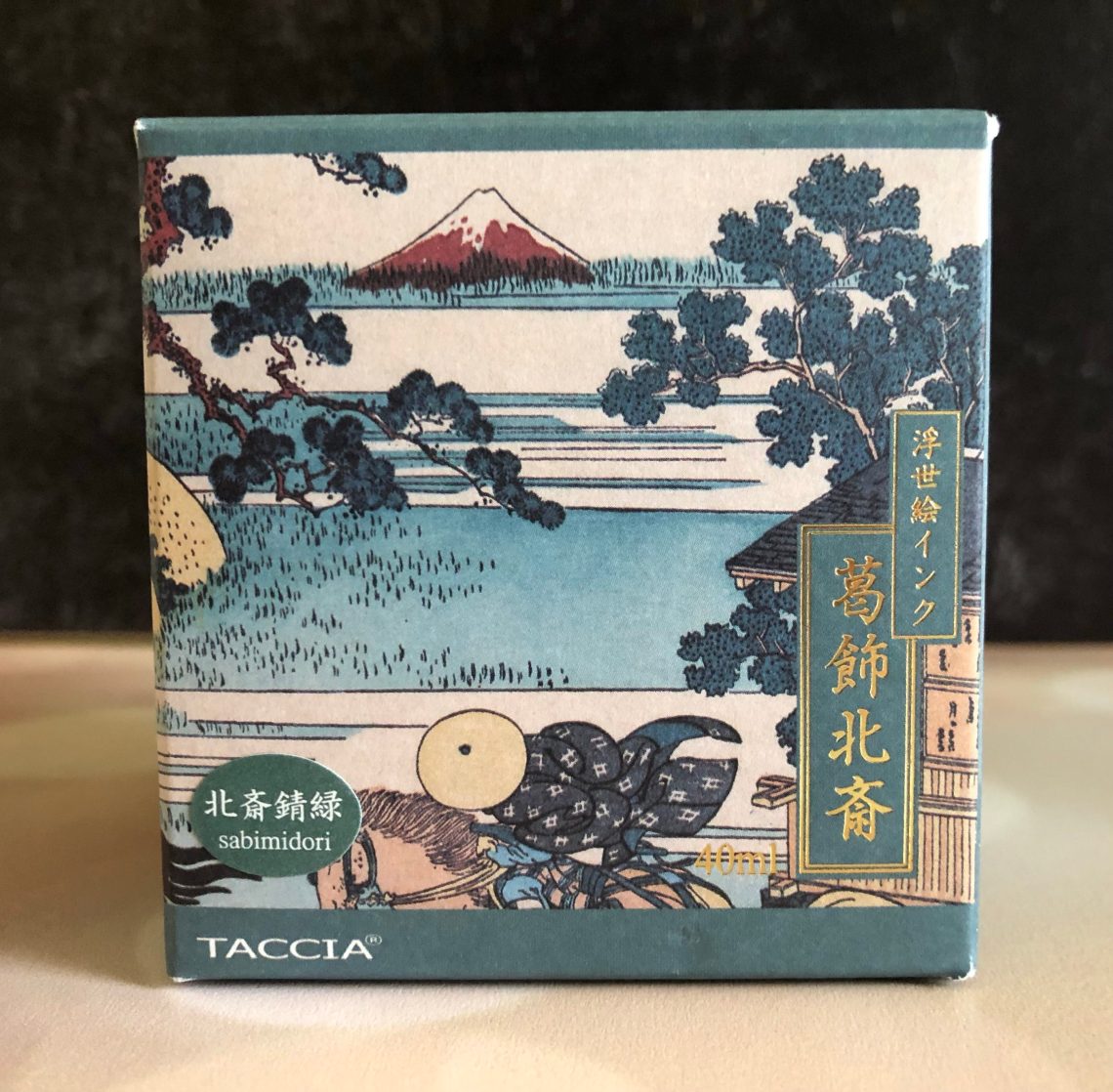
So I went ahead and ordered a bottle of Taccia Hokusai-Sabimidori (40 mL, $23.00) so I could play on my own. Sabimidori is a rusty green invoke by the opera “The Village of Sekiya on the Sumida River.” The Taccia inks come in gorgeous packaging inspired by Japanese paintings and Sabimidori is no exception.
The surprise is that when you open Sabimidori, it’s all teal blue. And yet, as you watch it dry (and it’s pretty quick) it slowly fades to a rich green with hints of blue and yellow and almost a rust-colored sheen. It reminds me of iron oxidizing, and indigo dyeing in the way it changes colors.


The ink itself is sort of average in terms of the wet/dry spectrum. It goes down nicely with some shading and dries quickly, all without being too dry. I decided it was a good color for my Diplomat Traveler in Flame.

In comparison to other inks in my collection, I did find a few that were close, but nothing quite the same. Diamine Twilight had the right shading but was definitely bluer. Starry Night Silent Corderite has the right colors, but is a bit light and of course also has sparkle, which Sabimidori doesn’t. KWZ Iron Gall Turquoise is a bit similar, but again too blue.

What fountain pen would ink up with Sabimidori?
I’m not a fan of that ink, but the box sure is gorgeous!