The Trigg Life Mapper Planner (£20 for a 2023 edition, £19 for the undated version) is a goal setting planner system that takes cues from many of the popular ideas regarding planning with a bigger picture in mind. But first, let’s review the basics.

The Trigg Life Mapper is an A5-sized, hardcover book with ribbon bookmark and vertical elastic closure. The book contains over 365 pages including one-day-per-page for the work week, Saturday and Sunday are half pages and then additional pages for monthly reviews, monthly goal planning and more.

The exterior of the book is a faux leather with a bit of texture and debossed design on the front, back and spine.


Each month is delineated with a color along the edge making it easy to find quickly.

The binding is sturdy and the pages are all stitched into the book in a way that allows the book to lay flat and remain pretty duarble.

The paper is a warm white overall with lots of color accents throughout. The front piece has a quick summary of the goal of the planner as well as a place for personal contact info and a mission statement of sorts. I’m not sure I’d want my mission statement next to my contact info. Should I misplace the book I would hope someone would flip to the first pages and find my contact info but not necessarily need to read that “I want to be retired by age 60, a fully trained flamenco dancer and published author” — that feels a little personal. So, I would recommend if you fill this out, don’t misplace your planner.

There are several pages in the front of the planner to help explain the system that has been created and also what various symbols mean and how they can be used. First, are the icons relating to the most common categories one might try to plan and organize. The colors associated with each icon are the same as the colors used to color code the months. As I dove into the planner, I discovered that this color coding also allowed for each month to be a chance to focus on a specific aspect of your goals. I.E. In January, the prompts at the beginning of the month suggest focusing on personal goals like health, wellness, etc. Since January is often the month that we set goals for ourselves like “exercise more” or “eat less junk” it seems like a good match. Each month rolls through each of the monthly goal focuses.
I really like this set-up. It makes it a little less intimidating. As I looked through the planner, I was encouraged that I would not have to tackle ALL the goals every month. You certainly could but, by focusing on one specific area in your life, the likelihood that you build an achievable goal seems far more attainable.

On each daily page, at the top is the grid. In the front of the planner the diagram above explains how or what sorts of tasks could be assigned to each section. I like that they made the main area the same size as a sticky note so that it would be possible to just move those “must do” tasks to the next day as needed.

The start of each month is a one-page spread that includes some prompts for thought around goal setting and space for a single goal for each life category and two or more actions that could be taken to achieve said goal. Again, one goal per month per category and a maximum of two actions seems doable. For self, the goal could be walk 3 days a week. The action item might be to get up an hour earlier to make time or buy new sneakers. Relationships goal could be “plan Madeline’s birthday party” and the actions are “order cake” and “make her a new scarf”. You get the idea. The goals don’t always have to be the 10,000 foot goals.

So, here is one of the daily pages above. One each weekday, there is an inspirational quote at the top. Then there’s the grid and then a half a page to list appointments or other notes.

At the beginning of the planner, in the middle and at the end are opportunities to reflect on the bigger goals and also prompts to help you focus and clarify your goals.
I’m surprised how much I like this planner from a content standpoint. I was initially inclined to be a little judgy about it. I often get a little salty when things feel to woo-woo or verge into “The Secret” territory of “you can do anything if you set your mind to it” nonsense. The writing in the planner is positive without being toxic. It’s uplifting without making me wretch from the saccharine. (See my Grievance Journal review for my dark heart revealed.)
Now for what you’ve all been waiting for, the paper and ink tests:

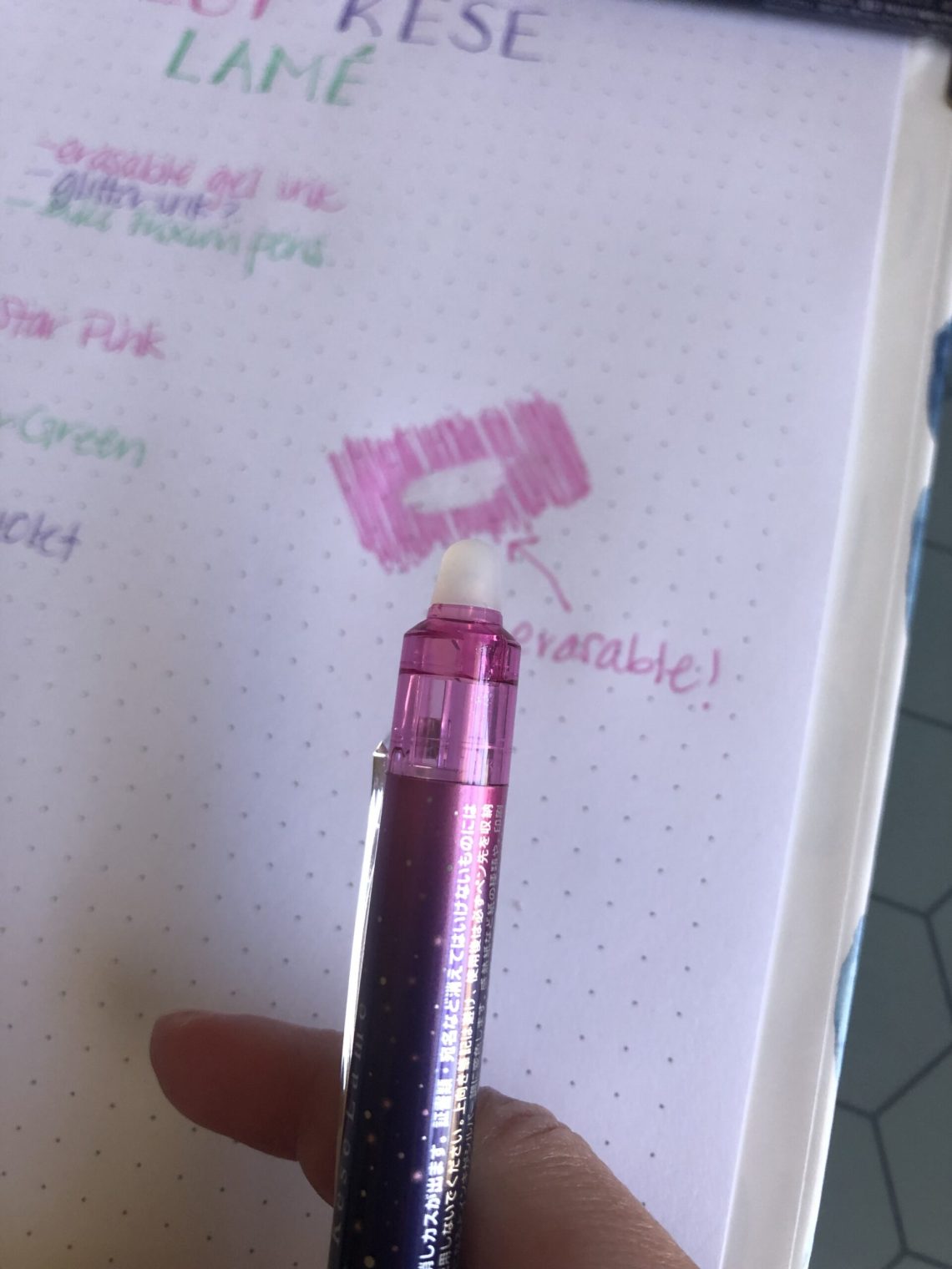
The paper is pretty lightweight so I was expecting average to sub-par test results with fountain pens. I was pleasantly surprised to discover that the paper didn’t feather but there was some bleed through with wetter inks.

There was also so bleed through dots from the liquid ink rollerball pens I tested. The most unusual thing I discovered when testing the paper is that the paper is very soft and so some extra fine pens caused some indentions in the paper. I write with a very light hand and still got some indents in the paper so a writing board or guide sheet in between pages would definitely help mitigate dents to the next page.

Despite the less-than-fountain-pen friendly paper, I really like the Trigg Life Mapper planner. I normally prefer blank or minimal planners but the Life Mapper has just the right combination of structure and inspiration to make me want to keep up with a more thoughtful, well-planned life.
DISCLAIMER: The items included in this review were provided free of charge by Think Trigg for the purpose of review. Please see the About page for more details.