Review by Tina Koyama
What is all the fuss about a “long point”?
For this long-time colored pencil user, long points are not needed (or wanted) for most colored pencil purposes. So when I first began using graphite pencils more seriously for drawing and writing and became involved in the pencil community, I was fascinated by the deep discussions I observed regarding sharpeners that can produce the longest points. I’ve been using a KUM Automatic Brake Long Point two-step sharpener on graphite pencils for years, and it makes a nice long point, though I don’t think of it as special. However, the Möbius & Ruppert Pollux seems to be the most popular for producing both a long and highly esteemed concave point. I know of no other sharpener that can do this except the newish one from Blackwing – the one-step long point. I decided to try it.
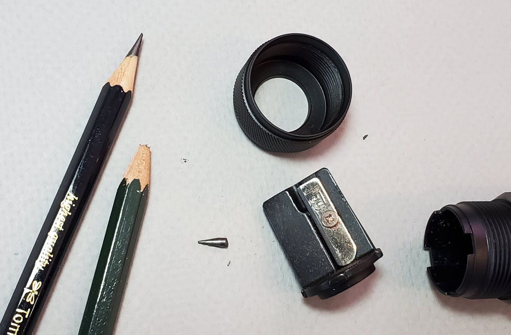
True to Blackwing’s branding and form (and expected for the price of $20), the sharpener comes in a sturdy, matte black box with a drawer that slides out. The sharpener, too, is all matte black except for the glossy logo. Its shape reminds me of my Redline flashlight. The asymmetrically placed hole apparently bothers some people, but I like it as a design element. When the top is unscrewed, the blade unit is easily removed (you’ll soon learn why this is important), and the large-capacity canister can be emptied. It’s a simple, elegant design.


For my first tests, I chose Blackwing pencils, of course. I just happened to have on my desk a brand new, turmeric yellow Volume 3 limited edition pencil dedicated to Ravi Shankar. Typically with a new, unsharpened pencil, I would not use a handheld sharpener; I would shove that baby into an electric. But it was important to test a pencil from its bluntest of all stages (plus I was eager to sharpen that sunny yellow beauty). I also picked out a Blackwing already in use that was in need of sharpening – in this case, a Volume 211.

It was a bit tedious to use a hand-held sharpener from the beginning, but the one step’s barrel is comfortable to hold. There is no “stopper” feeling as I’m used to with the two-step KUM, so I took the pencil out several times to see how much I had sharpened.
The point that resulted is indeed long, but it looks a bit rough and not exactly concave. I thought the wood, especially at the top of the collar, also looked a bit ragged.


The 211 came out with a better-looking long point without ragged edges and with concavity. The collar looked better also, but still not as smooth as other sharpeners I use. I was satisfied, though, that the Blackwings had been sharpened adequately for basic use.


Next I picked up three other pencils that needed sharpening – a Mitsubishi Hi-Uni HB, a Tombow Mono 100 4B, and a Musgrave Unigraph 2B. The only casualty was the Musgrave, whose lead snapped while I was sharpening. This is where the easy opening and disassembly came in handy: I could remove the blade unit and tap it vigorously against the side of my wastebasket to try to dislodge the broken lead piece. That didn’t work, so I had to use a ballpoint pen to poke it loose. All three sharpened up with good points.


Although I knew that the one-step is intended for use with graphite pencils only, I also knew that any sharpener I carry is likely to be used with a colored pencil eventually, either intentionally or inadvertently. (Better to find out how it performs at the comfort of my desk than when I’m standing on the sidewalk trying to finish a sketch.) First I tried a Caran d’Ache Supracolor water-soluble colored pencil, and it sharpened like a champ! I don’t need or want it to have a concave point that can be used as a weapon, so I stopped a bit short, but I think it looks better than some of the graphite pencil points.

Finally, I spotted a Staedtler Mars Lumograph 8B that needed to be freshened, so I gave that a sharpen, too. Not bad at all. The one-step can take thick cores as well as average cores.

Final Impressions
I’m satisfied with all the points I got. After scribbling with all my test pencils, I’m not sure I fully appreciate the benefits of concavity. However, none of the tippy-tips immediately snapped off as often happens with freshly sharpened pencils under my heavy hand, so that’s probably one benefit. I think I’m going to stick with my policy of putting new, unsharpened pencils into an electric or hand-crank desk model instead of the Blackwing. For whatever reason, all the refreshed points came out better than the new Blackwing I tried.
Finally, is it worth the $20 price compared to a $5 plastic KUM (or all the many other inexpensive, plastic handhelds I own)? It looks better on my desk and feels better in my hand. It will likely last longer. I can’t honestly say it sharpens better.
(I purchased this sharpener with my own money.)

 Tina Koyama is an urban sketcher in Seattle. Her blog is Fueled by Clouds & Coffee, and you can follow her on Instagram as Miatagrrl.
DISCLAIMER: Some items included in this review were provided free of charge by JetPens for the purpose of review. Please see the About page for more details.


 First, I have some big news! Jaclyn Myers of


 I highly recommend Sailor Colorado, although I may be biased by the name and the color (not to mention the sheen and lack of smearing). The price per mL is on the high end ($1 per mL), but for those who love purple inks or those who love Sailor inks, Sailor Colorado is a winner.