Review by Laura Cameron
It’s been a long year so far and no pen shows to break it up! So when Franklin Christoph announced their Virtual Pen Show, I decided I’d have a little look-see. And wouldn’t you know it…something caught my eye!

Months ago, Franklin Christoph did a limited run of a color they called Salmon Glow in the Pocket 45 model. During the sale they had a few pens left in a variety of models and I jumped at the chance I missed. Since I only have Pocket 45’s I decided to opt for something new: a Pocket 20 with a clip!
The Salmon Glow lives up to it’s name. It’s a positively glowy pinky orange. When I went looking for an ink to match I chose none other than J. Herbin’s Corail des Tropiques. I think it matches perfectly!

The Pocket 20 is fairly close in size to the Pocket 45 coming in at 4 5/8″ to the 45’s 4 3/8″ inch. They are also similar in weight – 17g for the 20 and 14g for the 45.

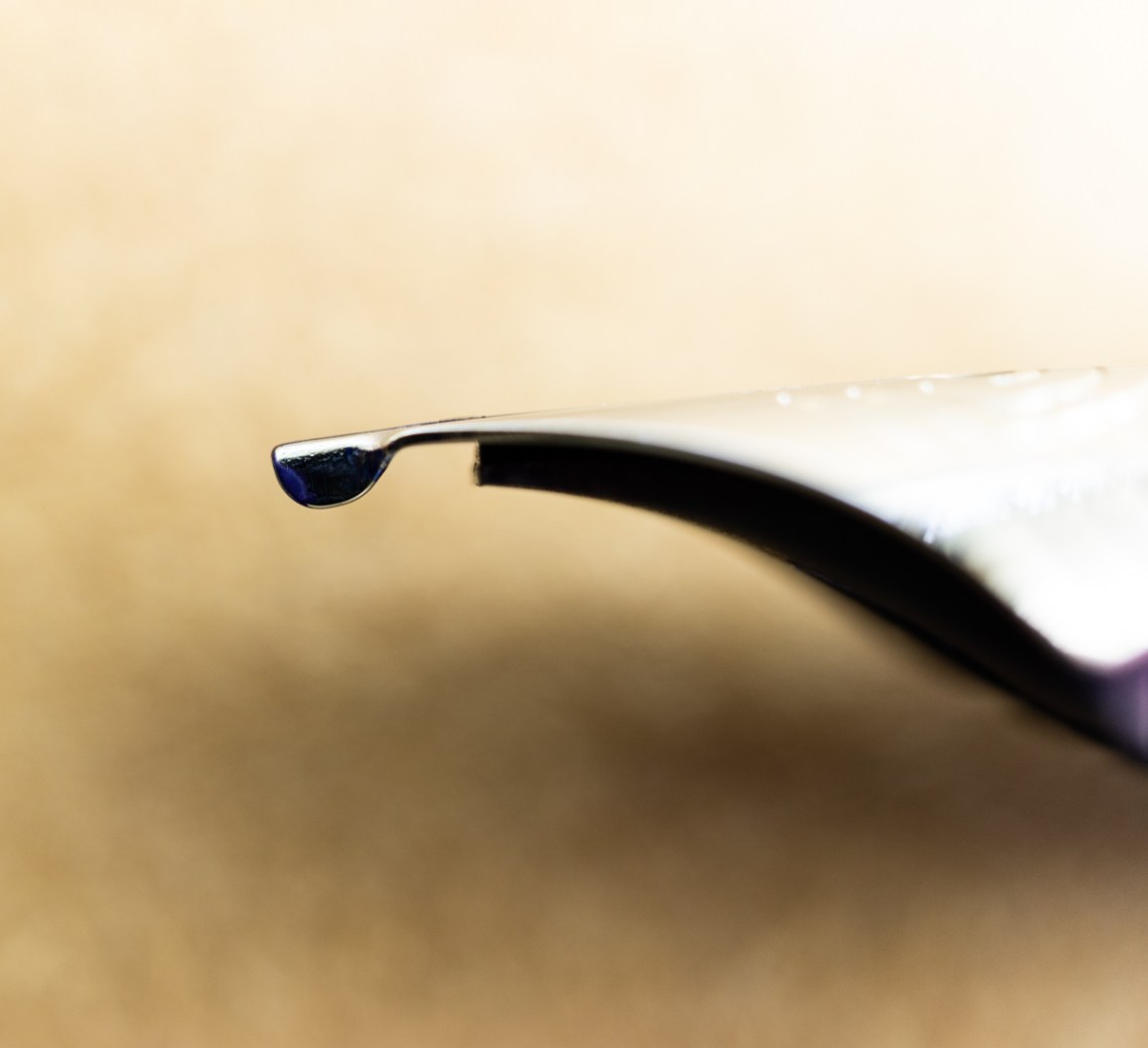
There are a few major differences in the models though:
- The 20 features a #6 nib (I got a steel fine), whereas the 45 features a #5 nib.
- The 20 features a friction cap, whereas the 45 features a screw cap. This is IMPORTANT to remember as I’ve eye dropper filled both pens, and that 20 could get quite messy if I forget!
- The 20 has a clip, whereas the 45 does not. At first I wasn’t sure if I would like this aesthetically speaking, but there is something nice about having a pen that won’t roll away from you (or off the table!)
- The body shape of the 20 is more rounded, whereas the 45 is slightly more angular.

 Overall the pen performs beautifully right out of the box – I would expect nothing less from a Franklin Christoph. If you get down to it, I bought this pen solely because I loved the body material and I have been kicking myself for missing the previous version. Other than the color, the body material is very similar to that of my special Vanness exclusive Franklin Christoph Pocket 45. I love the vibrancy of the color of both, but also the translucency in the body. Okay okay… I kind of wanted them as a pair!
- Papers:Ghost Paper Notebook ($25)
- Pen: Franklin Christoph Pocket 20 in Salmon Glow ($145-165)
- Ink: J. Herbin Corail des Tropiques (10ml for $6)
DISCLAIMER: Some of the items included in this review were provided to us free of charge for the purpose of review. Please see the About page for more details.