Recently I wrote a post about a local art supply store (Meininger’s) that happens to have a wonderful selection of ink and fountain pen friendly paper. Well, I did forget to mention it also has a huge variety of pens. Among these pens I forgot to rave about are Sailor pens. But last weekend, there were so many more Sailors!
On February 9th, Sailor sent a representative (Rachel) to our little corner of the world to offer Coloradans a chance to use all of the standard Sailor nib sizes, see all of the standard Sailor pens side by side, hold and see up close the newest North American exclusive Sailors, and to even see a few King of Pens and Bespoke nibs. The event was called the Sailor Trunk show and there was a great turn-out of pen folks.
Later in my visit, I learned that my new friend Rachel (the Sailor representative) had the privilege of being the one to choose the names for the most recent North America exclusive Sailors – the 4am and the Lucky Charm pens.

I had a terrible time trying to decide between these pens. The ruthenium trim on the Sailor 4am called to me, even though I typically stay away from the 1911 series in favor of the Pro Gear Slim (these two models only differ in the shape of the end cap and finial). But it was the teal color and the two-tone nib that won me over in the end. Pro Gear Slim pens do not often offer a two-tone nib and it looks amazing on the Lucky Charm pen.

The size of the nib was another factor that pulled me toward the Lucky Charm pen – a music nib. Over the years, I have acquired each Sailor nib size offered in the standard line-up (no special Bespoke nibs). Since I typically prefer fine line widths, I stayed away from the Zoom and Music nibs – these produce a much broader line. But last year I dove into a Zoom nib and found that I loved the experience.

The Sailor Zoom nib is a nib that changes line width based on the angle at which it is held. When the pen is held at a low angle (closer to horizontal), the width can be quite broad (broader than a music nib). As the angle increases (going toward 90 degrees away from the page), the line changes to fine. The nib can even be flipped over – reverse writing – and the line is extra fine. The nib on the left is a Zoom nib.

I have yet to find a Sailor nib that I dislike. Below are nib sizes (from left to right) Zoom, music, broad, medium, medium-fine, fine, and extra fine.

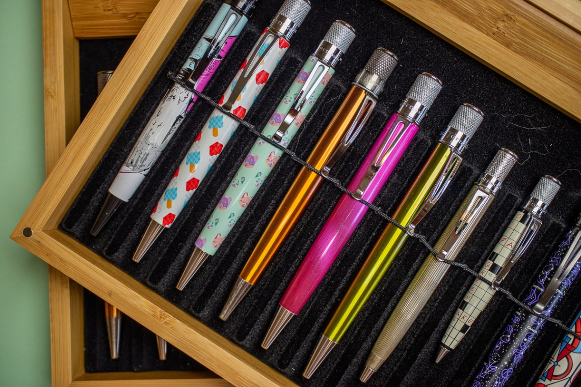
Here’s a view of the pens themselves.

I was a bit tickled when I found out that I had several Sailor models that my new friend Rachel had never seen! With the incredible number of Sailor variations and special editions available, it shouldn’t be surprising, though. Sailor seems to have a special talent for colors and combinations that make each pen into a story.

Thank you to all of the staff at Meininger’s and our Sailor representative Rachel who had to deal with many very excited pen fans! I hope this gathering is not the last of its kind!
DISCLAIMER: All of the items included in this review were purchased with my own money for the purpose of review. Please see the About page for more details.