
Congrats to the winners of our Monteverde Sweet Life ink giveaway.

Linda wins the Cherry Danish ink!

And Alan wins the Blueberry Muffin ink.
Congrats to both our winners and look forward to more giveaways soon.

Congrats to the winners of our Monteverde Sweet Life ink giveaway.
Linda wins the Cherry Danish ink!
And Alan wins the Blueberry Muffin ink.
Congrats to both our winners and look forward to more giveaways soon.

Once again, I don’t know if the internet is on the same wavelength as I am or if it’s purely coincidence but there are several posts this week that were just what I wanted…
I was just talking about getting a new tattoo and want to have it themed around vintage botanical art and, wouldn’t you know it, there are now 15K free images available for use. Thanks, internet!
I went to a brainstorm session at work yesterday around ideas for Lego and TWO links popped up today about Lego. What are the odds?
I’ve been reading a fiction book about antiquarian booksellers and BOOM! the internet provides a trailer to a new film about … you guessed it, antiquarian booksellers.
I recently received my Vaughan Oliver Archive book and then heard he had passed away. If you too were a fan of 4AD records and the fabulous album covers, this book is a must.

Finally, I have switched my diet over the last few months and am eating what I refer to as an “accidentally vegan” diet. I am one of those people who have been developing an intolerance for dairy over the last couple years to the point where I cannot eat it at all. Then I was hit with the no-meat stick thanks to a film I watched. That said, I’ve tried vegetarianism several times throughout my life but this time, I think it will stick. So, thanks internet for recommending a new vegetarian cookbook.
Review by Laura Cameron
Almost two weeks ago Retro 51 announced that they would be retiring and closing the business at the end of the year. This has caused quite a bit of discussion in the fountain pen world. When I heard the news, I immediately thought about how Retro 51 was really my introduction to the pen world. 
(L to R: Black Cherry Tornado Fountain, Tornado Rollerball Pink, Tornado Rollerball Silver, Fahrney’s Cherry Blossom Fountain Pen LE 2018, Limited Edition Twinkle Popper, Cioppino Fountain, Fountain Aquamarine)
In 2016 or 2017, after listening to Ana talk about Retro 51 Tornados, and using a few of hers, I bought my first Rollerball, the Tornado in Pink. I loved the feel of the metal pen in my hands and it wrote so smoothly. Soon another came to live with me, the Limited Edition Twinkle Popper.
From there, I branched out into fountain pens. I had a brief dalliance with a Lamy Safari, but I found the grip uncomfortable. My first fountain pen was the Black Cherry Tornado. Again, it felt weighty in my hand and wrote smoothly. The grip was comfortable to me (though I know others had complaints) and I happily still use that one today.
More followed: the Fahrney’s special Cherry Blossom in 2018, came to live with me as a 40th birthday gift from a friend. While I was confused why the US Treasury building was featured so prominently, I also got tickets to see Hamilton for my 40th, so it seemed oddly appropriate!
Perhaps my most treasured Retro 51 is my Cioppino Fountain Pen. Although Retro 51 re-released the Cioppino last year, mine is one of the original versions from the 1980’s. I bought it from a vintage dealer, and that part I love the most is the two toned nib, imprinted with the Tornado logo, so different looking from the JoWo nibs they use today!

It has also been fun to share my love of Retro 51s with my dad, who is also a fountain pen enthusiast. For Father’s Day a few years ago, I got him a Black Cherry Tornado Fountain Pen just like mine. When he received it, he called to let me know that he had another one in blue! And when we went through his pen collection, he pulled out the Tornado Rollerball in Silver and told me I should take it. I love that there’s a pen company that we enjoy together.
There have been so many versions of the Retro 51 that I have talked myself out of bringing home. They’re an amazingly creative company who makes so many amazing special editions. I regret missing the Vintage Surf Edition, I ogle Ana’s collection regularly, and I’m still dithering over this gorgeous special edition from Vanness Pen Shop. I’m looking forward to seeing Retro 51’s final releases and I’ll miss seeing them in the future. Luckily I have my own little collection to enjoy.
DISCLAIMER: Some of the items included in this review were provided to us free of charge for the purpose of review. Please see the About page for more details.

It takes a lot to convince me to review a new pocket memo book. To be honest, many of them are just variations on a theme and theme is “another Field Notes”. However, when I saw the new designs from Newton Design Co., I knew these were something a little different.

The Newton Design Co. Memo Books ($10 for set of 3 books) are hand screenprinted with Zach’s stellar sense of humor and superior design chops. Printed in yellow on black cardstock covers, the books are classic in looks but modern in sensibility.

The books measure 4.5×6″ and feature 60 pages of paper in either blank or dot grid.

I was tickled to discover that the paper was more resilient to fountain pens than most Field Notes. None of the pens I tested feathered or created wider-than-expected results.
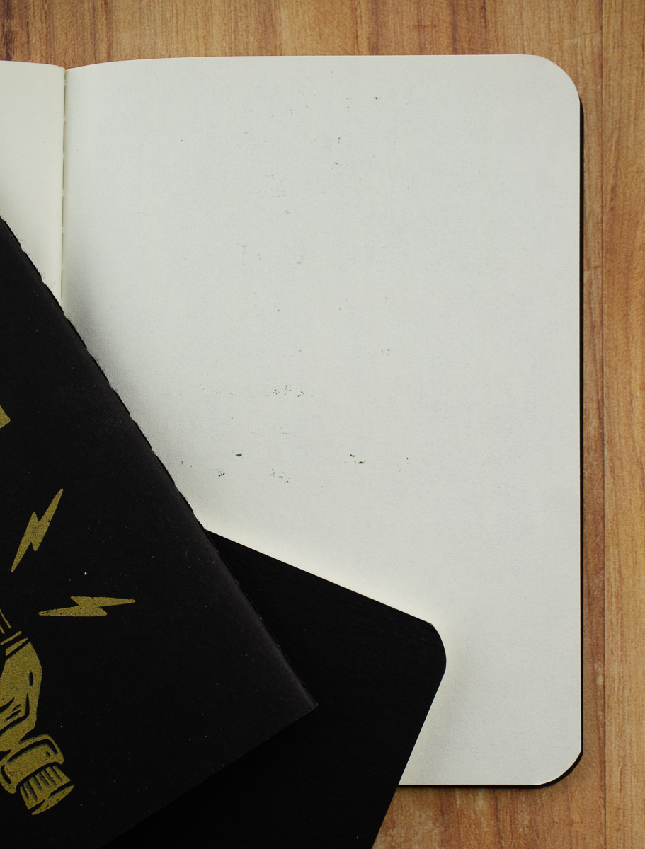
The dots visible on the reverse side of the paper are due to ink that wasn’t dry on the facing page. There was no actual bleed-through or show-through.

When adding in some brush pens, I still had no real issues… other than my green fountain pen ink was not drying in a timely manner and I kept sticking my hand in it. I do not blame the paper as all the other inks dried at a consistent and fast rate.

Even from the back of the page, there was no bleed-through and only some show-through.
These memo books are witty and well-designed and stand up to most day-to-day pen carries. While this particular edition is currently sold out, a new limited edition of black-on-black “Crook Looks” is available. Get them while you can!
DISCLAIMER: The items included in this review were provided free of charge by Newton Design Co. for the purpose of review. Please see the About page for more details.

Today’s post is not about a brand new ink line and not a new company. Instead, this collection is from a well-trusted company with a fun twist on a collection of bright, happy inks; Monteverde Sweet Life! Please note, these inks are named after popular desserts but they are not scented. They may make you crave sweets, though!

Monteverde Sweet Life consists of 10 inks; Pumpkin Cake, Iced Cookie, Chocolate Pudding, Cherry Danish, Strawberry Shortcake, Birthday Cake, Blue Velvet, Key Lime, Mango Mousse, and Blueberry Muffin. These inks are packaged in a durable box with a magnetic flap closure inside a brightly colored sleeve.

It bothered me at first that each ink was again packaged in its own box (excess packaging is never good), but I realized it helps tremendously to protect the bottles from hitting each other during shipping.
First, swatches of all ten inks together. I’ll get into comparing each ink to others below.

Starting with the reds.

Monteverde Strawberry Shortcake is a bright, cheery red, somewhere between Taccia Aka Red and KWZ Grapefruit.

Monteverde Cherry Danish is darker, very close to Robert Oster Burgundy.

A couple of brown inks now.

This ink is a somewhat unique color – Monteverde Pumpkin Cake. Akkerman SBRE Brown is the closest in my collection. There’s a hint of orange in the brown.

Monteverde Chocolate Pudding almost shows a black sheen in the brown. There’s still a good amount of orange in this brown, but Chocolate Pudding is much darker than Pumpkin Cake.

The two brightest inks in the collection!

Monteverde Mango Mousse is slightly closer to orange than Ferris Wheel Press Buttered Popcorn and shows up darker in writing than Stipula Sapphron. Lots of shading as well.

Monteverde Key Lime Pie is probably my favorite in the Sweet Life collection. It is a vibrant green, close to Robert Oster Green Lime but Key Lime Pie is not as likely to show crystallization on the pen nib.

Now to the blues in the collection.

Monteverde Iced Cookie is a beautiful turquoise/teal close to Private Reserve Ebony Blue and shows plenty of shading. I love this color and it has been in a pen at all times since I received the collection.

The second blue in the collection, Monteverde Blue Velvet Cake, has a beautiful dark red sheen that isn’t overpowering. Since the sheen is a secondary color for the ink, smearing isn’t an issue.

I’ve saved the best color for last. PURPLE.

Monteverde Blueberry Muffin is a beautiful purple (ok, not quite purple really) that leans heavily towards red, almost a burgundy. Robert Oster Dark Chocolate is probably the closest. There is a faint dark green sheen in heavily inked areas.

Monteverde Birthday Cake is a gorgeous mid to dark purple. Writing with Birthday Cake shows lighter than the swatch – TWSBI Royal Purple is the closest in my collection although it has more red undertones.

Now for the most exciting part! We will be giving away two bottles of Monteverde Sweet Life inks to two different lucky winners! Monteverde Cherry Danish and Monteverde Blueberry Muffin. Rules are below the photo – good luck to everyone!

TO ENTER: Leave a comment below and tell us your favorite dessert. Play along and type in something. It makes reading through entries more interesting for me, okay? One entry per person.
If you have never entered a giveaway or commented on the site before, your comment must be manually approved by our highly-trained staff of monkeys before it will appear on the site. Our monkeys are underpaid and under-caffeinated so don’t stress if your comment does not appear right away. Give the monkeys some time.
FINE PRINT: All entries must be submitted by 10pm CST on Tuesday, February 4, 2020. All entries must be submitted at wellappointeddesk.com, not Twitter, Tumblr or Facebook, okay? Winners will be announced on Wednesday, February 5, 2020. Winners will be selected by random number generator from entries that played by the rules (see above). Please include your actual email address in the comment form so that I can contact you if you win. I will not save email addresses or sell them to anyone — pinky swear. If the winner does not respond within 7 days, I will draw a new giveaway winner. Shipping via USPS first class is covered. Additional shipping options or insurance will have to be paid by the winner. We are generous but we’re not made of money. US and APO/AFO only, sorry.
DISCLAIMER: The items included in this review and giveaway were provided free of charge by Yafa for the purpose of review. Please see the About page for more details.

This week has had some unusual ups and downs. In pen news, I broke my favorite Caran d’Ache 849 fountain pen. The plastic threads on the grip section cracked so the grip no longer connects to the pen barrel. I was able to reach out to Creative Art Materials, the US distributor for Caran d’Ache, and they are sending me a replacement nib unit. It lasted about three years with almost daily use and the rep at Creative Art Materials said that Cd’A was aware of the issue. Maybe that means that the replacement nib unit is made from slightly different plastic or material that is a little more durable? I’ll keep you posted.
In the meantime, I HAD to get a new Caran d’Ache 849 to tide me over until I have a new nib. Luckily, I have access to an instant-gratification pen shop. I ran across the street at lunch and purchased a lime green 849 (this week’s featured photo) so that my life was not too disrupted. (Keep reading… you’ll understand why I needed one less disruption.)
In non-pen news, Bob and I finally updated our antiquated iPhone 6 phones — to clarify, these were five years old and could not be updated to the new ios13 operating system. My phone was no longer holding a charge and basically made me tech-less for the last month. Not only have I been tech-less, but my beloved car has been in the shop since December 30. I got a call today to say he is finally repaired and ready for pick-up!

And finally, once my new iPhone was set up, I discovered that someone had hacked my Spotify account. What does this mean? They filled my library with garbage playlists and my listening history was horrifying! I was able to reach tech support at Spotify and they were able to back-up my playlist library to one week prior which removed the 50+ garbage playlists. Unfortunately, they could not do anything about my listening history so I have Spotify playing non-stop from my playlists for the next month to correct my listening history and, thus, my recommendations.
Review by Tina Koyama
When I started using the Mitsubishi Kohitsu 10B “brush pencil,” I thought I had the softest graphite core I would ever meet. I figured graphite couldn’t go much softer without needing to be mixed with something else like carbon before it loses its stability. But when I saw that the Staedtler Mars Lumograph now comes in 12B ($2.20), of course I had to try it.

I use several other grades of Mars Lumograph, and when compared grade for grade, Staedtler is typically at least a couple of grades harder than Mitsubishi Hi-Uni or Tombow Mono 100 (my two favorite lines of Japanese graphite drawing pencils). The Mars Lumograph in 10B is harder than the Kohitsu 10B and the Hi-Uni 10B, so I expected the 12B to be no softer than either of those 10Bs. While the 12B is not quite as silky-soft as that Kohitsu “brush pencil,” it does feel slightly softer than Hi-Uni’s 10B.


So while it may not be the softest, the Lumograph 12B is among my four softest graphite pencils. And when compared to the other three, its core gets the prize for being the thickest (in my photo, it’s the top blue one).

It’s a joy to use at life drawing, where that 12B graphite can be smudged with a tortillon almost like charcoal (though without as much smeary mess, of course). I have hit an occasional gritty spot, however, which I’ve never experienced with Hi-Uni or Mono 100.

Even non-sketchers can have fun with a core this thick: Take a knife to it and cut a chisel “nib”!

I write with it like a fude nib, but I bet calligraphers would really go to town with it. I hope one of you will!


 Tina Koyama is an urban sketcher in Seattle. Her blog is Fueled by Clouds & Coffee, and you can follow her on Instagram as Miatagrrl.
DISCLAIMER: Some of the items included in this review were provided to us free of charge for the purpose of review. Please see the About page for more details.