Sometimes I am challenged to come up with a cohesive title and theme for Link Love. I like a snappy title. It helps me remember what might be in any given week of Link Love. So, while the two celebrity related posts are not entirely stationery-related, I decided to take creative liberties with the title. You’ll forgive the discretion this time?
As for the posts, check out Other Interesting Things for the posts in question.
Pens:
- 2-Fold Nibs (via Crónicas Estilográficas)
- Platinum 3776 Century in Carnelian: A Review (via The Pen Addict)
- Pen Review: Platinum Procyon (100th Anniversary Edition) (via The Gentleman Stationer)
- Review: Pilot Penmanship Fountain Pen (EF nib) (via Parka Blogs)
- Write With Glass: Introducing Glass Dip Pens (via The Postman’s Knock)
- Manuscript: celebrating the handwritten legacy of Birmingham (via INKED HAPPINESS)
Ink:
- Diamine Inkvent! (via Inkdependence!)
- Ink Review #1023: Troublemaker Milky Ocean (via Mountain of Ink)
Pencils:
- Pencil of the Week: an analogue pencil “blog” (via Polar Pencil Pusher)
- Review: Uni Posca Colored Pencils (via Fueled by Clouds & Coffee)
Notebooks & Paper:
- Just Right: The Theme System Journal (via From the Pen Cup)
- The Best DIY Planner Supplies to Make Your Own Planner (via JetPens)
- 2020 Planner Set-Up. (via The Finer Point)
- How Reporters Take Notes (via Notebook Stories)
Art & Creativity:
- John Garcia’s Sketchbooks (via Notebook Stories)
- 6-month lightfast test with random watercolour (via Parka Blogs)
- Minimal Kit Check-in: Green, Gray, Bigger Book (via Fueled by Clouds & Coffee)
- A change in my palette (via Liz Steel)
Other Interesting Things:
- Unsubscribing (via hjertnes.blog)
- How this Japanese method of saving money changed my life—and made me richer (via The Cramped)
- My 2019 Retrospective (via The Gentleman Stationer)
- Towards a fuller picture of the reading life (via Austin Kleon)
- Brother HL-L2300D Monochrome Laser Printer (via Tools and Toys)
- Tom Hanks Downsizing, Knocks Back Treasured Typewriter (via oz.Typewriter)
- Steven Soderbergh’s Media Diet for 2019 (via Kottke.org)
- 10 awesome tools to help you be more productive in 2020 (via Creative Boom)
- Do nothing more often: 3 tips (via Flow Magazine)


 The XS is a machined pen made out of aluminum (available in silver or black) or a limited edition Titanium version. The site makes mention of a brass version, and I see that in the Kickstarter, but it doesn’t appear to be available currently on the site. It is a 12-sided pen, designed that way so it doesn’t roll away from you! It is embellished with black rubber rings on the finials and near the section and two extras are included with the pen in case you need replacements.
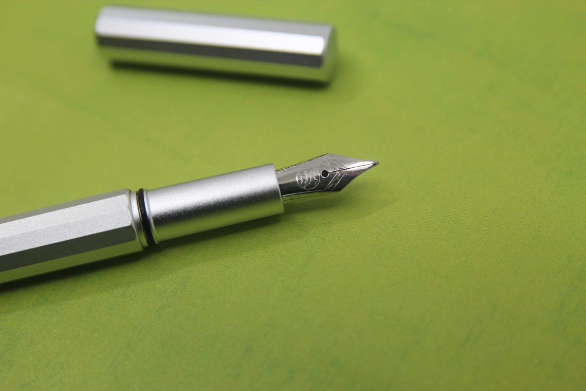

 The most interesting factor on this pen, at least for me, is the weight. It weighs in at just 9.7g because of the aluminum body. If you’re into lightweight pens, this one’s for you! (Titanium weighs in at 15g.)