Review by Laura Cameron
I recently went on a bit of an ink buying spree. Rather than grab the newest, hottest colors, I went back and added a few inks I missed along the way. The first of those is Diamine 150th Blue Velvet (40mL for $16.00).

Blue Velvet is a beautifully rich cornflower blue.

It is bright, clear blue and has so many yummy shades. It has the intensity that I’ve come to admire in many of the Robert Oster blues, and yet this one doesn’t lean teal at all. Just rich, cobalt blue.

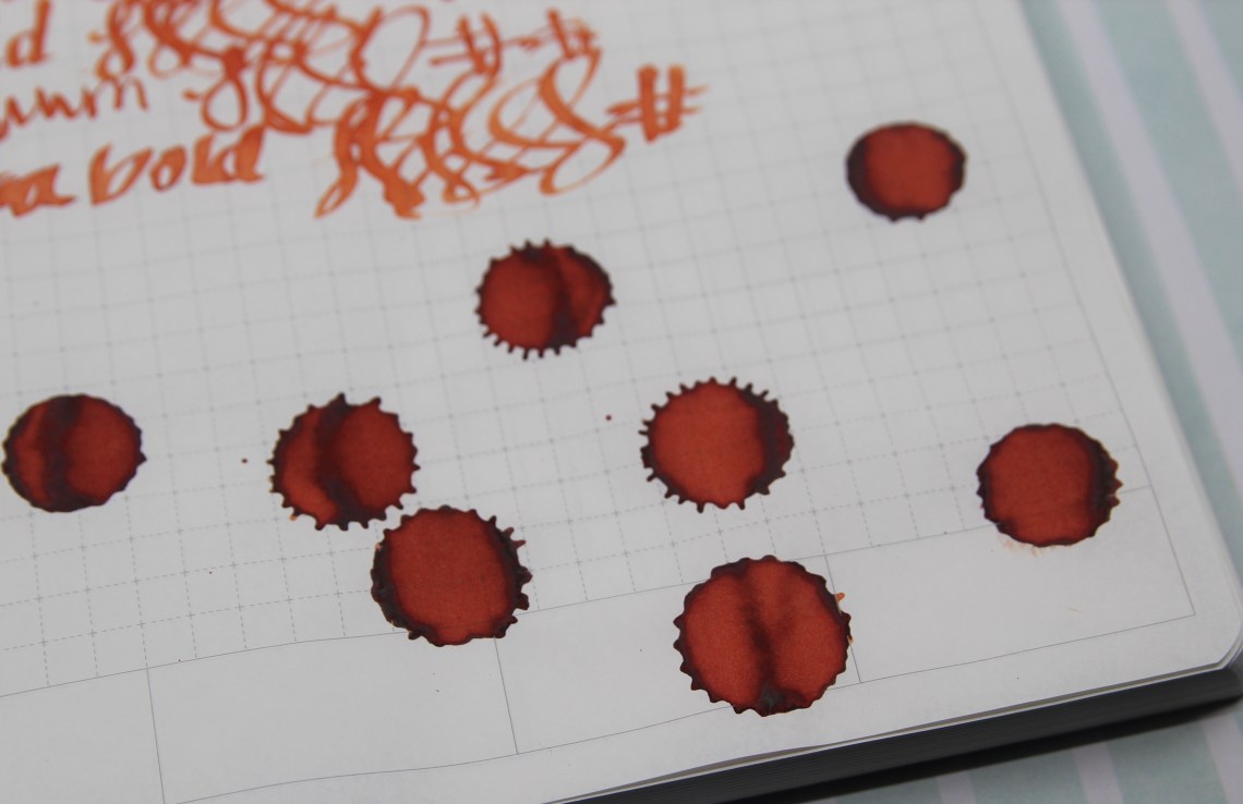
As you can see the ink shades beautifully, and in super heavy applications had something of a sheen. I can’t even decide exactly what the sheen is – maybe a black with a tinge of yellow or red? In person it’s super, super dark.


Ok they were blue suede shoes, not blue velvet, so I took some license here, but I think it works! (please forgive the lack of artistic skill.)

Honestly, I had a hard time coming up with a comparison to this blue in my stash of swatches. Almost everything I brought out wasn’t the right shade, even if it matched in intensity. Pilot Iroshizuku Ajisai is sort of close to the lighter shades of Blue Velvet, but it’s still a bit too much on the periwinkle side. Robert Oster Soda Pop Blue was too turquoise, and Deep Sea was too teal. Faber Castell makes a Cobalt Blue but it is nowhere near as brilliant as Blue Velvet and even Pelikan Edelstein looks muted in comparison.


Overall I’m thrilled with this one because it’s not a shade I currently have. My only problem is deciding which pen to fill up first!
- Papers: Maruman Mnemosyne N182A Inspiration Notebook A5 ($10.50) and Crossfield Journal ($24.00)
- Pen: Delike Glass Signature Pen ($37.80)
- Swatches: Col-o-Ring Ink Testing Book ($10) and Col-o-Dex Rotary Cards ($15)
- Inks: Diamine 150th Blue Velvet (40ml for $16.00)
DISCLAIMER: Some of the items included in this review were provided to us free of charge for the purpose of review. Please see the About page for more details.