I’m writing Link Love from a truck stop this week, somewhere in the southwest United States on the way to LA for the pen show. This is my first multi-day, cross-country pen show trip. Traveling puts a pause on the world and while simultaneously hyperfocusing everything. We have no time and nothing but time. It’s a strange in-between that full of anticipation and anxiousness.
Pens:
- Getting the white glove treatment with my first Montblanc nib exchange (via UK fountain pens)
- Regalia Writing Labs Steel Flex Nib (via Gourmet Pens)
- Nakaya Decapod Twist vs PenBBS 380 (via Hand Over That Pen)
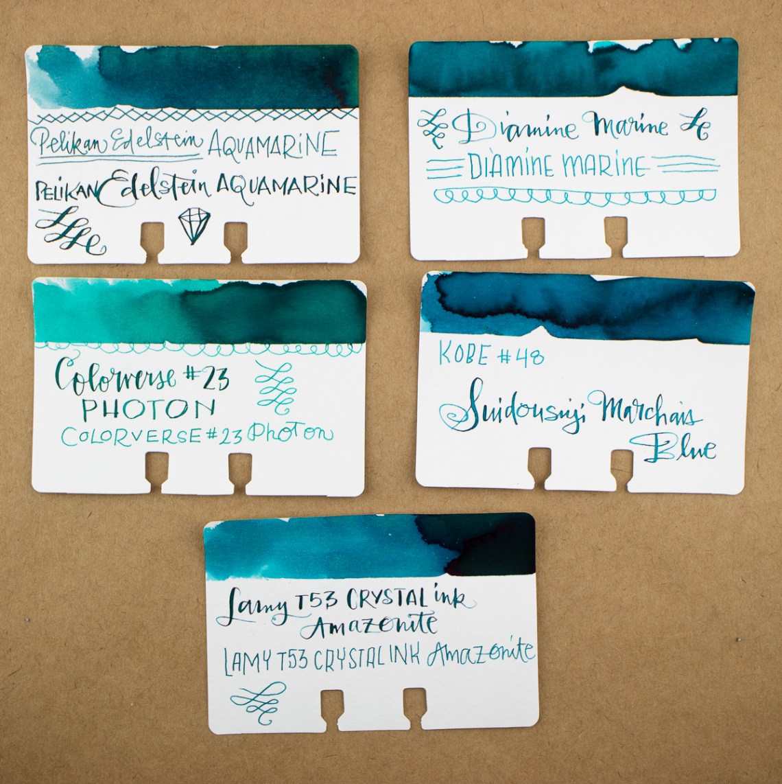
- News: M101N Grey-Blue (via The Pelikan’s Perch)
- Exploring Stock Stub Nibs, Part II: Higher-end Options (via The Gentleman Stationer)
- Hero 616 Standard “Bobby Launch” Fountain Pen |(via Comfortable Shoes Studio)
- Video: My Favorite Pens – Waterman 12 – Jacob Ruppert (via Anderson Pens Blog)
- Who Backed the Baux Pens? This Guy. (via The Gentleman Stationer)
Ink:
- Diamine Robert (via Mountain of Ink)
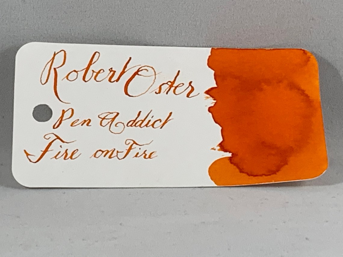
- Points of Interest: Fire on Fire Edition (via Looped Square)
- Papier Plume Eleven (via Mountain of Ink)
Notebooks & Paper:
- Taotree Dot Grid Notebook (via Comfortable Shoes Studio)
- New! Lighter dot grid pages in the Rhodia Goalbook (via Rhodia Drive)
- Notebooks from My Cross-Country Road Trip (via Notebook Stories)
- Write Notepads ZHŪ Winter Edition. (via Pencil Revolution)
- Blackout Pocket Notebooks! (via Notebook Joy)
- Marie Curie’s Notebook (via The Cramped)
Art & Creativity:
- Vintage Colored Pencils: A. W. Faber “Castell” Polychromos (Contemporary Polychromos Comparison) (via Fueled by Clouds & Coffee)
- What Makes A Watercolor Painting Really Special? (via Doodlewash)
- Lili Wronker, Calligrapher and Illustrator, Is Dead at 94 (via The New York Times)
Other Interesting Things:
- The religion of walking (via Austin Kleon)
- Q&A With Richard Koehler, Art Director at Retro 51 (via The Clicky Post)
- How To Improve Your Handwriting (via Fountain Pen Love)
- Valentine Printables Round-Up (via Letter Writers Alliance)
- Confessions of a Letterhead Collector (via Kottke)
- Julia Cameron Wants You to Do Your Morning Pages (via The New York Times)
- Podcast: “Find Your People with Naomi Bulger” (via Art Supply Posse)
- Podcast: “Snail Mail Superstar Sara McNally” (via Art Supply Posse)