
Inkmas has reached Day 8 and I reached into my stash to find KWZ Maple Red, the Scriptus 2018 exclusive color. I picked this up in Toronto at the Scriptus Show and paid far more than the original price because all I had in my wallet was a credit card and US currency. Unfortunately, the table set up to sell the ink didn’t take plastic so I ended up paying for the ink dollar-for-dollar with US currency. But that was the only way I was going to get a bottle of this ink. FOMO runs deep and I was willing to pay for it. Besides, it was probably cheaper than shipping to the US or trying to get a bottle of this on the secondary market.
That said, let’s talk about the color.
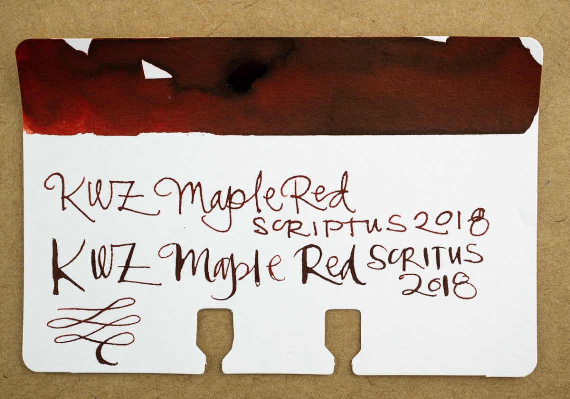
When applying the ink to my Col-o-dex card, it was the vibrant red of an autumn Japanese Maple tree. However, as it started to dry, it deepened into a more brownish red, and in writing, started to look almost walnut brown.

As you can see in the writing sample, the color is more of a warm brown than a flaming red orange. The water test spot hints at how bright the color was when wet. With water, the bright orange is far more vivid.
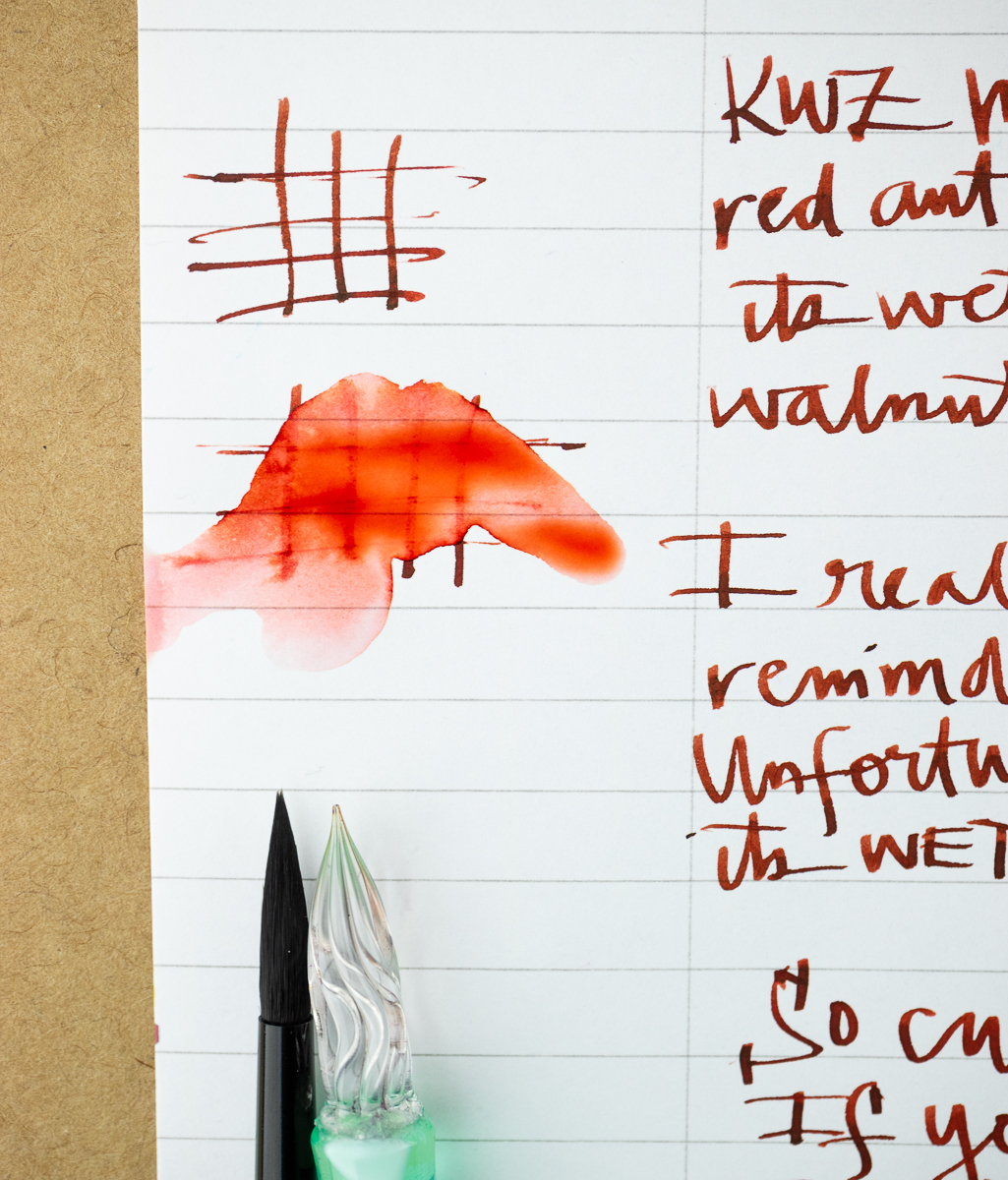

In this close-up, the lettering seems to get progressively darker as I was writing. Though there is some nice shading this ink did not show any sheening properties either. Though I’m hard pressed to think of a single sheening red. It must be a very difficult task to make red ink sheen.

When I put Maple Leaves next to other warm red-orange and deep reddish brown inks, it became clear to me that there are definitely alternative options to Maple Red since this was a limited edition ink.
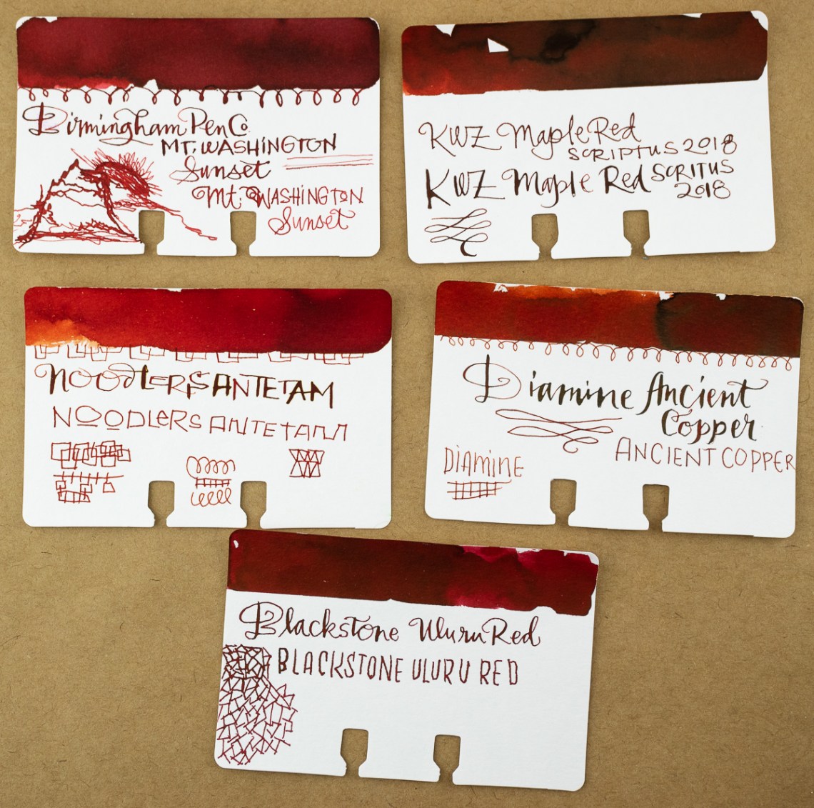
Birmingham Pen Co’s Mount Washington Sunset ($7.99 for 30ml bottle) is a pretty close match though ever-so-slightly more orangey. To be honest, if you are looking for an ink that reminds you of autumn leaves, Mount Washington Sunset is a great option. Diamine Ancient Copper ($15 for 80ml bottle) is also a good option. Noodler’s Antietam ($12.50 per 3oz bottle) is more fiery and Blackstone Uluru Red ($8.50 for 30ml bottle) is just a hint more reddish-pink.
With these comparisons, and my feeling that Maple Red dries a little too brown, I think there are good alternate options if you’re in search of a ruddy red. Which, look on the bright side, means you don’t have to beg, borrow or steal to get a bottle of this limited edition ink.


