Review by Jessica Coles
It’s no secret that I (Jesi) love Esterbrooks. I believe for the price and quality, there is no single pen better as an introduction into vintage pens. Of the Esterbrook models, the one that is most prolific on the market today is the J series due to its popularity at the time of production and the durability of the pen itself.
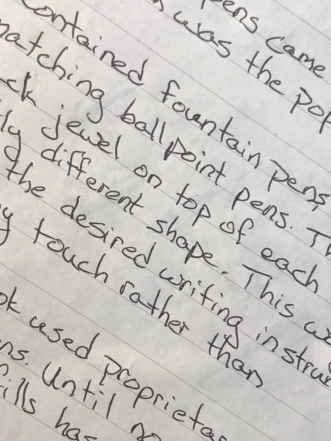
The J series contained fountain pens, pencils and, later on, matching ballpoint pens (which were denoted FJ). These three used a black jewel on the top of each, but the shape was slightly different for each tool: domed for the fountain pen, concave for the pencil and pointed for the ballpoint (below, the ballpoint pen is the one on the left).
This small detail allowed the user to find what they needed without looking. An amazingly helpful detail if you had chosen all three in the same color or if the were grabbing a pen from a shirt pocket or a purse.
As a person who loves to collect, I mean sell, Esterbrooks, especially the J series, I have been hesitant to sell the ballpoint Js. Esterbrook used propriatary refills for their ballpoint pens and until now I have never found a suitable replacement. But a then I was sent a sample from John Hubbard whose company, Bamapens, has invested thought, time, and knowledge of vintage pens into creating a solution!
 First, let me apologize. When I received the adapter, I didn’t stop to take a photo. I popped it into the nearest Esterbrook ballpoint and started writing. Since these are vintage pens, most of the time they are not clean inside by the time they come to me. Hence the ink and dirt residue on the adapter. It was actually a beautiful white when received! However, I think the reside lets the labeling stand out beautifully.
John was kind enough to include a pen refill with this as well and he chose a great one.

This is a D1 sized Uni JetstreamSXR-200-07. It seats perfectly in the adapter, no wiggle room but also easy to install.

The adapter itself is 3-D printed by John through Shapeways where they are available for sale and are printed to order. You need an adapter? Well, let me just print that for you. I love it. So much like the Jetsons!

The adaper fits perfectly into the pen.

But how did it perform during a writing test? Once again, perfectly. The D1 refill is a great fit and this adapter still allows you to click away and annoy those around you.

I am a recent convert to Uni products and I love using them. Combine that with an Esterbrook? As far as ballpoint pens go, I think it just doesn’t get any better. Thank you, John, for bringing life back to the Esterbrook FJ!


 Lots of paper love this week plus a couple reviews of the new Karas Pen Co. Starliner pens. Lots of arts and creativity action which is great because summer and the extra sunlight make me want to spend more time making art, sewing and being generally more arty. Susan at the Pen Addict wrote the first review I’ve seen of the Col-o-dex rotary cards and two of my favorite inks got reviewed this week: Pigeon Blue and California Teal. Finally, the Pelikan Hubs were announced for this year! Hope everyone had a good week. And if that’s not enough, check out #MPRraccoon on twitter. I think the trash panda made it to

