There are some great inks that overlooked because some new, hot colors/brands, etc just got released. I thought it might be a good time to take a minute to remember one of those tried-and-true classic inks (and brands) that often get overlooked: Waterman. While it drives me absolutely insane that Waterman insist on changing the name of their inks every couple of years, I’m glad they keep their ink colors and formulas consistent. As a classic brand with a rich history, it would serve them well to lean into their tradition. But don’t listen to me, what do I know, right?
Today, I’d like to review Waterman Audacious Red ($11.30 for 50ml bottle). It is a bright, vivid red that still ships in Waterman’s classic bottle with the angled base making it easy to tilt it to fill your pen and get those last few drops out of the bottom of the bottle.

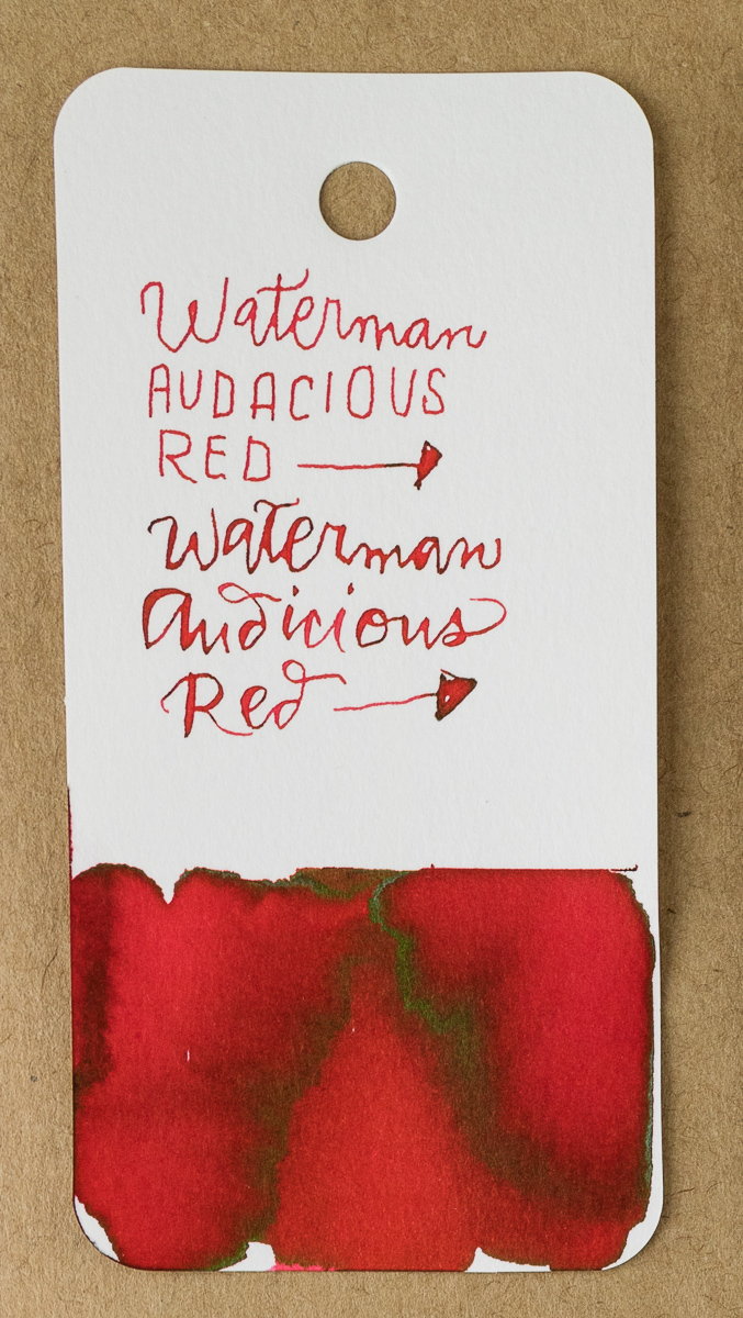
In the swatch, a green-gold sheen is evident around the edges of the vivid red color. There is a slight hint of watermelon red in the lighter shading areas so the red appears clean with a pink undertone rather than an orange cast.

In writing, Audacious Red just had good flow. There was a bit of shading with the fine nib and a tiny bit of the green-gold sheen. It would probably be more noticeable in a large nib.

Compared to other inks in my stash, KWZ Grapefruit and Bookbinders Snake Ink Red Spitting Cobra are both a little more orange. Conway Stewart St. Blazey is a pretty close match but is not widely available and Sietz-Kreuznach Tomato Red is a close match but a touch more pink. Everything else was either much darker (browner or blacker), much pinker or much more orange. Even the J. Herbin Rouge Caroubier wasn’t close. Weird, huh?
Tools:
- Paper: Rhodia Uni-Blank No. 16 with 6mm guide sheet
- Pens: Midori bullet pencil modified dip nib holder with Zebra G titanium nib ($33.50 per 10-pack), Acrylic dip nib pen (Approx. $15), Shawn Newton Esterbrook Nib Holder with #9556 nib
- Swatches: Col-o-Ring Ink Testing Book ($10)
- Brush: Blick Synthetic Round #0
- Ink: Waterman Audacious Red ($11.30 for 50ml bottle)
DISCLAIMER: The items included in this review were provided free of charge by Vanness Pen Shop for the purpose of review. Please see the About page for more details.


 Laura is a tech editor, podcaster, knitter, spinner and recent pen addict. You can learn more about her knitting and tea adventures on her website,