Review by Tina Koyama
While woodcased colored pencils are commonplace (a quick search on Amazon resulted in 20,000 products!), colored leads for mechanical pencils or clutches are much harder to come by. They seem like they should be a promising idea – compact, refillable, no need for sharpening – and yet they generally aren’t. I’ve tried several, including the Uni NanoDia (0.5mm), the Pentel Multi 8 (2mm), and a really inexpensive 2mm set from Daiso. (Ana reviewed the Pilot Color Eno, which I haven’t tried.) While some are better than others, they all fall short of their woodcased sisters in critical ways: the leads are more fragile, and the pigment is paler. They are also harder (probably by necessity), which isn’t necessarily a bad thing, but the first two flaws are usually deal-breakers for me.
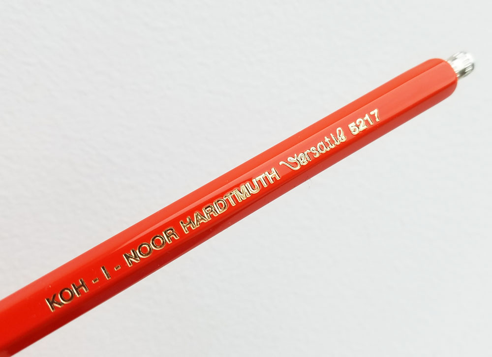
With that as my background, I tried the KOH-I-NOOR Mechanical Pencils (Set of 6) ($30) with some skepticism. A set of clutches in six colors, the Diamond pencils (Versatil #5217) come in a tin box that also includes an L&C Hardtmuth eraser.

Although the barrels are narrower than I prefer, the Diamonds have the classic look of mechanical pencils used by engineers. A textured metal knock opens the clutch “claws” and advances the lead.

To refresh my memory of some colored leads I’d used before, I gave the Pentel Multi 8 and Daiso leads a few scribbles – yup, they were as hard and pale as I remembered them. Then I gave the Koh-i-Noors a try, and I was pleasantly surprised by their relative softness. Also surprising was that the hues are more vibrant.

Mind you, these aren’t comparable to woodcased; maybe it’s just not possible to make leads that are as soft and pigmented as medium-quality woodcased colored pencils and still be sturdy enough to be handled and used without a wood support. Still, I found the swatches to be bright enough that they were worth attempting a sketch. On smooth Stillman & Birn Epsilon paper, the colors applied smoothly and blended well in my apple sketch. Compared to woodcased pencils, I would still put the leads on the hard end of the scale, but they are not at all scratchy, so they are pleasant to use.
I don’t have a lead pointer for 2mm leads, but they are easy enough to sharpen with a knife. (Ed. note: In the silver cap is a claw-like lead pointer. Check out TJ’s Wood & Graphite Lead Holders video around the 0:55 marker for how they work.) They didn’t snap on me at all while making this sketch, even with fairly firm pressure.

While I was coloring the apple’s right side, I started to lose some of the highlight from the paper’s reflection, so it gave me an opportunity to try erasing the Koh-i-Noor leads. The Hardtmuth eraser that came with the pencils made a smeary mess, so I stopped immediately and switched to my electric Seed Sun Dolphin (winner of my Eraser Rub-Off), which took the pigment off satisfactorily. Color swatches above show erasures done with the Sun Dolphin. Shown below is an erasing comparison.

Final Impressions
Encouraged by the softness and vividness of the leads, I then had to get over the thin engineer-pencil barrel, which is not my favorite form factor. Then I had my “duh” moment: They are 2mm leads, which fit in the Pentel Multi 8! I immediately swapped out six of the leads in the Pentel with the Koh-i-Noor leads (which are twice as long as the Pentel leads, so they need to be broken in half). Now I have a very compact way to carry a small range of pencil colors (which was my intention in buying the Pentel in the first place). Win! (Koh-i-noor 2mm Colored Leads (Assorted Set of 6) are available on Amazon.)

DISCLAIMER: The item in this review include affiliate links. The Well-Appointed Desk is a participant in the Amazon Services LLC Associates Program, an affiliate advertising program designed to provide a means for sites to earn advertising fees by advertising and linking to Amazon. Please see the About page for more details.


 Laura and I are hitting the road for


 Laura is a tech editor, podcaster, knitter, spinner and recent pen addict. You can learn more about her knitting and tea adventures on her website,


 Laura is a tech editor, podcaster, knitter, spinner and recent pen addict. You can learn more about her knitting and tea adventures on her website,