Posts of the Week:
I’m handing this award over to Matt at the Pen Habit who rigorously documented his trip to the Arkansas Pen Show in documentary style. He made a series of videos of his adventures in Arkansas that included copious footage of his forays into eateries including his maiden voyage to Waffle House.
- Arkansas Pen Show Vlog Day 1 (via Pen Habit)
Arkansas Pen Show Vlog Day 2 (via Pen Habit)
Arkansas Pen Show Vlog Days 3 & 4 (via Pen Habit)
Post Show Chat with Friends (via Pen Habit)
Pens:
- European pen-makers you’ve probably never heard of (but should) (via UK Fountain Pens)
- The Posh Pen Paradox: when writers and artists fear their tools (via The Cramped)
- The Spirit of 1838 Limited Edition (via Pelikan’s Perch)
- Explaining Fountain Pen Terms: The Nib (via 8BallPens)
- Faber-Castell Ondoro Fountain Pen (via Pens! Paper! Pencils!)
- Kaweco Steel Sport fountain pen (via United Inkdom)
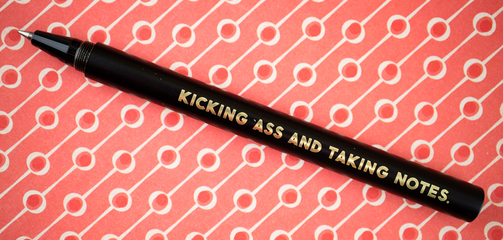
- Mark One Minimal Pen by Studio Neat (via Clicky Post)
- Sailor 1911 Pro Gear Special Edition Earth (via Writing for Pain and Pleasure)
- Aurora Optima (365 Azzurra, Fine Nib) (via Hand Over That Pen)
- Video: Pelikan M200 “Brown Marbled” (via Scrively)
- Conklin Duragraph Review – Merlot Edition (The Poor Penman)
- Moonman M2 Eyedropper Fountain Pen (via Gentleman Stationer)
Ink:
- Help, My Calligraphy Ink is Bleeding!: 5 Ways to Fix This Common Issue (via The Postman’s Knock)
- Pure Pens inks – The Celtic heritage (via The Clumsy Penman’s Inkfusion Site)
- The return of Mabie Todd: Blackbird Inks (via UK Fountain Pens)
- Ink: Water-Resistant ain’t Waterproof (via Writing for Pain and Pleasure)
- KWZ Raspberry (via Mountain of Ink)
- Waterman Audacious Red (via Gourmet Pens)
- Diamine Autumn Oak (via 8BallPens)
- J. Herbin Amethyst de L’Oural (via Alt. Haven)
- Papier Plume Bean & Rice (via Wondernaut)
- Sailor Shikiori Yozakura (via Winter Sharks)
- GvFC India Red (via Wondernaut)
- Sailor Pen’s Alley Shaker Green (via Macchiato Man)
- Let it sheen! Organics Studio – Nitrogen Royal Blue (via The Clumsy Penman’s Inkfusion Site)
Pencils:
- A fake mechanical pencil – Pentel’s Orenz got cloned (via Bleistift)
Paper & Notebooks:
- Cortona Handmade Leather Bound Journal (via On Fountain Pens)
- The Paper Cuts B6 Tomoe River Notebook (Via Gourmet Pens)
- Write Correspondence Pad (via The Looped Square)
- Midori 10th Anniversary White Grid Notebook (via Hand Over That Pen)
- Choosing a Notebook for Journaling (via Notebook Stories)
- Rollo London Hardy Notebook (via The Finer Point)
Art Supplies & Creativity:
- Erik Hagerman’s Sketchbook (via Notebook Stories)
- Aussie Red Gold + Quinacridone Liliac + Sleeping Beauty Turquoise (Limited Palette) (via Parka Blogs)
- Caran d’Ache Supracolor 30th Anniversary Set (via Fueled by Clouds and Coffee)
- The Potentiality of the Page (via Roz Wound Up)
- Do You Struggle to Sketch Regularly (via Liz Steel)
Other Interesting Things:
- Daily Journaling Prompts for April 2018 (via Quo Vadis Blog)