Review by Tina Koyama
A while back Ana conducted a massive Eraser Rub-Off, in which nine erasers battled for dominance in the obliteration of graphite and colored pencil markings. I decided it was time for Round 2, with a little twist. (Sorry, no video from me!)
In addition to the usual eraser needs when I’m writing with graphite pencils, I also have a specialized need: erasing colored pencils. While I don’t often erase large areas of color (if that’s needed, I start over), I sometimes want to brighten a highlight that I’ve inadvertently lost or, more likely, forgotten to save the white of the paper for. That specialized task usually calls for an eraser that can cleanly rub out a tiny area.

My long-time favorite for this task has been the Tombow Mono Zero with a rectangular eraser ($5.25),whose precise corners are ideal for putting in small highlights in colored pencil sketches where I need them. It’s also an all-around great eraser for basic graphite writing, too. So in Round 2, I considered the Mono Zero to be the defending champ. Would any of the new challengers threaten or take its title?

The challengers are:
- Kokuyo Miri 5 Function ($3)
- Kokuyo Kadokeshi 28-Corner ($3.50)
- Moleskine (which comes in a set with a sharpener) ($5.95)
- Pentel Ain Clic Knock ($2.50)
- Uni E-Knock ($1.65)
- Tombow Sand ($2.65)
- Seed Sun Dolphin 3 (electric) ($22.50)
- Palomino Blackwing (10/$2.95 for refills; I used the one attached to my pencil)

The writing utensils I used for the challenge were a Palomino Blackwing Volumes 16.2 pencil (which has a “firm” core), a Mitsubishi Penmanship 6B graphite drawing pencil, an indigo blue vintage Col-erase colored pencil, a scarlet Faber-Castell Polychromos colored pencil, and a bright green Caran d’Ache Museum Aquarelle water-soluble pencil. The colored pencils I chose cover the range of erasability, from most easily erased (Col-erase) to most troublesome (heavily pigmented Caran d’Ache). Since the Tombow Sand eraser is intended for ink and typewriting, on a whim, I decided to toss a Jetstream ballpoint pen into the mix.
The papers I tested on were a Plumchester sketchbook, which has a smooth surface similar to many journals and notebooks, and a Canson XL mixed-media sketchbook, which has a relatively toothy surface.


Before I show you the results, I have to confess that I went into the challenge with some prejudices. I had high hopes for the two Kokuyo erasers with such funky shapes! Surely all those corners and edges would be excellent for making small targeted erasures. And they both get bonus points for cool design, right?

I also had high expectations for the Seed Sun Dolphin electric eraser. I had been wanting to try an electric eraser for a while, but frankly, I was a bit intimidated by some of the fancy models I’d seen in the architectural section of art supply stores. This battery-operated model looked closer to my pace.
OK, now on to the results.

On the Plumchester’s smooth surface, most contenders performed satisfactorily in easily rubbing out graphite writing. The heavy shading from the Uni Penmanship took more effort, but most took the graphite off cleanly. The one exception in both cases was the Moleskine, which was the challenge’s only black eraser. It had a harder time cleaning up the Penmanship’s shading and even the Blackwing’s writing without smudging, or maybe it was just leaving behind some of its own black material. Most of the white erasers created medium-to-long strings that were easy to blow or brush away. The Tombow Sand eraser made small dust particles instead of strings.
As expected, the colored pencils presented a tougher challenge for all contenders. Still, the Kokuyo 5 Function, the Uni E-Knock, and the Pentel Ain Clic Knock did very respectable jobs on the Col-erase and Polychromos – at least as well as the Tombow Mono Zero defending champ. The Moleskine did OK too, at least in taking off pigment, but it also left a dark smudge as it erased. The electric Seed did the best cleanup job on all colored pencils, beating even the champ.
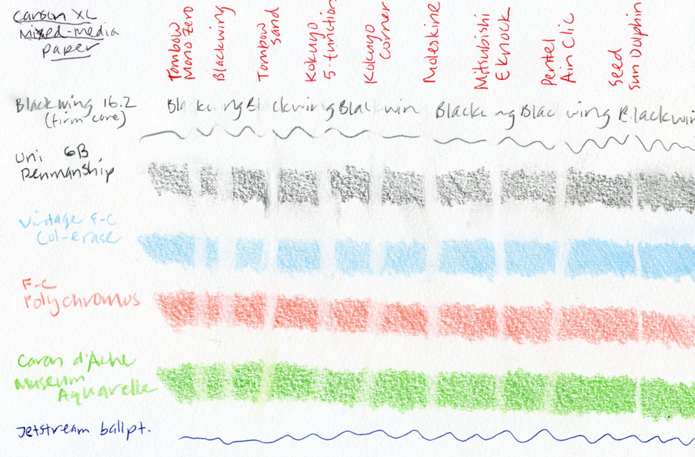
Not surprisingly, the toothy mixed-media sketchbook gave all contenders a heavier workout. Although erasing took more effort, most erasers did satisfactorily on graphite (the Blackwing did a bit worse than others). The Tombow Sand smeared. The Uni E-Knock did a particularly clean job on both graphite and colored pencils. Caran d’Ache’s high pigment content was especially challenging for all but the electric Seed.
Of note: None of the erasers could touch ballpoint pen on either paper – not even the Tombow Sand eraser that is intended for ink. (If you want indelibility, ink still wins.)
You can see for yourself how the contenders performed, but I’ll mention a few other points. While the Sand eraser did a good job of rubbing out colored pencils, I could feel that the paper had been abraded by the eraser’s particles. If you don’t plan to draw or write again on the erased surface, it’s probably OK, but if you rework it, I’d be wary of damage to the paper’s surface.
The two Kokuyo erasers, which I had high hopes for, competed admirably in terms of rubbing out marks, but both were disappointing in operation. Although they have all those small corners and edges that should be able to target tiny areas, I had difficulty seeing where the corners and edges were aiming, so my erasure often ended up wider than I wanted.
The electric Seed Sun Dolphin takes a bit of practice to control and use effectively. The switch feels misplaced on the boxy base, at least for my hand, making it a bit tricky to hold at the right angle for erasing. If you leave it too long on one spot, it can sort of run away with you.

The Winners
The electric Seed Sun Dolphin erased the most completely as well as with the finest point – two of my most important erasing requirements – so I was very pleased by its performance. As a final test, I made the small tomato sketch and deliberately didn’t save out the white of the paper for the upper-left highlight. I used heavily pigmented Caran d’Ache Pablo colored pencils in a Stillman & Birn Alpha sketchbook. After three layers of pigment, I used the electric Seed to erase out the highlight, and since I had practiced aiming and controlling the thing, I was able to point it where I wanted it. The highlight is not as bright as it would be if I had saved the paper, but it’s perfectly adequate for my purposes, and the paper’s surface doesn’t feel damaged. With that, I declared the Seed Sun Dolphin the winner of the Rub-Off!
I realize, however, that it wasn’t quite fair to throw that electric into the mix, and for most people who just want to erase a word or letter, it’s probably overkill. So I also chose a manual champ: The Uni E-Knock. It erased as effectively as, and sometimes better than, my former favorite Tombow Mono Zero. It also has a slightly chunkier barrel than the Zero, which I find easier to hold and use. The plastic body isn’t quite as classy looking as the Zero’s modern styling, but it gets points for being see-through. I just wish it had a rectangular eraser like the Zero. Honorable mention goes to the Pentel Ain Clic Knock, which also did a fine job, and its triangular-shaped eraser has good corners that are easy to aim. However, its body loses points for being as sharply triangular as its eraser and for its strangely robotic-looking knock mechanism.
 Tina Koyama is an urban sketcher in Seattle. Her blog is Fueled by Clouds & Coffee, and you can follow her on Instagram as Miatagrrl.
DISCLAIMER: The items included in this review were provided free of charge by JetPens for the purpose of review. Please see the About page for more details.


($29.37)


 This week was filled with reviews and hands-ons with the Wancher True Urushi Kickstarter Pen which reached its Kickstarter goals in about a nanosecond. They have unveiled the two additional color options for the Urushi already: yellow and green and the backers keep rolling in. It’s all pretty epic.


