Review by Ana Reinert and Laura Cameron:
Since both Laura and I have acquired several of the same products, we have decided to do some “tag team” reviews where we provide two points of view. Since our experience levels differ and our tastes differ, sometimes our opinions will be similar and sometimes they won’t. We hope you’ll enjoy these posts.
Ana:
Oh, Moo, you did it. You made blank and grid and lined notebooks with that fabulous paper and the hint of colored paper sandwiched in the middle that we all begged for last year. You just made them as softcover journals ($6.99 for 64 pages) instead of the larger hardcover notebooks ($19.99 for 176 pages) that we all swooned over this time last year.


I had to doodle on the grey colored paper in the center section first. There are two signature in the center of each softcover notebook of the grey 135gsm Colorplan paper which is perfect for colored pencil, water-based markers and such. There’s no real reason to have the colored paper pages but I like them just the same. I do wish each Softcover Journal had different colored Colorplan paper in them but I can see why they didn’t — too many variables.

I, of course, tested the pastel pink blank notebook because I don’t like to be confined by lines. Some inks bled through a little bit but over all the performance is pretty solid.
The Munken Kristall paper is super smooth with very little tooth so I really liked pencil on it but I prefer harder lead grades so they appeared darker but did not smear. Darker lead grades would be extra smudgy, I suspect.

Hopefully, you can see the couple dots where the Pen BBS ink in the wider nib and the Oster Soda Pop Blue bled through.

The lined paper has very faint lines that do not run all the way to the edge of the page and include space at the bottom of the page for a page number or other marginalia.

The visible sewn binding is neat and clean and tightly done.
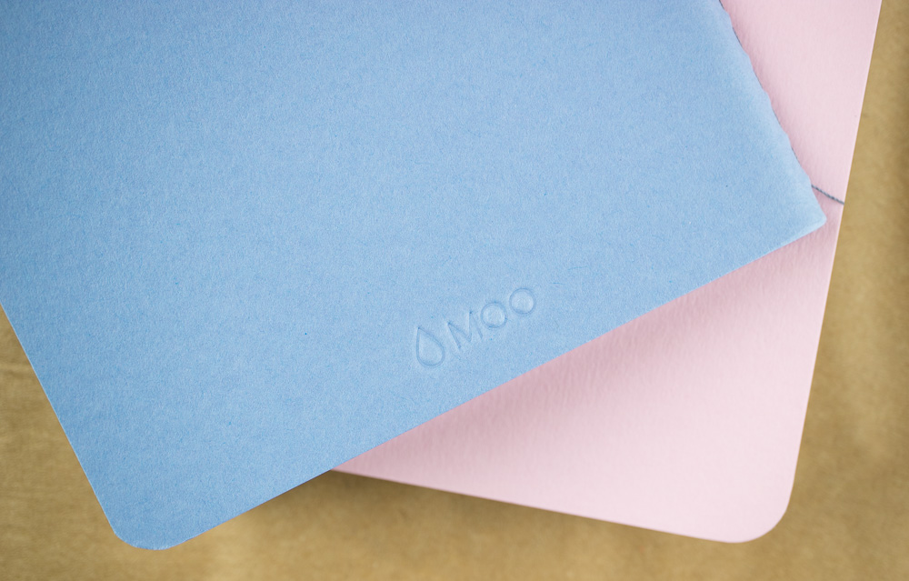
The only branding on the outside of the notebooks is a debossed Moo logomark on the back of the notebooks. Points to Moo for keeping it subtle.
The Moo Softcover Journal is 5.12″ (13cm) x 8.15″ (20.7cm) which is not a true A5 (14.8cm × 21cm) nor is it an American half sheet (5.5″ x 8.5″) so finding a suitable cover or carrying case for it may be a bit of a challenge. Height-wise, it will fit in an A5 Traveler’s Notebook or Roterfaden it will just be narrower than your other notebooks.

Laura:
After Ana reviewed the MOO hard cover journal a while ago, I’ve been eager to try MOO notebooks. So when she offered me my choice of MOO’s soft-covered notebooks I eagerly selected one to test.
I chose the turquoise with a grey dot grid. For 2018, I’ve decided to carry an A5 Hobonichi Techo Cousin, and I found that the MOO notebook, while not quite A5 dimensions, fits neatly into the front of my Chic Sparrow cover as a companion to the Hobonichi.
So far I’ve been using the MOO notebook as a catch-all for everything from to-do and packing lists, to a place to jot down quotes, ideas for projects, test new pens, and more. The 100 gsm paper is nice and smooth and it handles fountain pens pretty well. There is definitely some ghosting, but the ink doesn’t appear to bleed through the page. I’ve tested a variety of fountain, ballpoint and rollerballs in the process and while ballpoint is the clear winner in terms of being able to use every page of the notebook, I think I’m okay with fountain pen ink as well.


Overall, I really enjoyed this notebook and feel like it’s a good, reasonably-priced solution for those for whom pocket notebooks are a bit too small or awkward, but without adding the heft larger bound or hard covered journals.

 Laura is a tech editor, podcaster, knitter, spinner and recent pen addict. You can learn more about her knitting and tea adventures on her website, The Corner of Knit & Tea and can find her on Instagram as Fluffykira.
DISCLAIMER: This item was sent to me free of charge by Moo for the purpose of review. Please see the About page for more details.


