If you’ve ever encountered me at the airport or a pen show, you may have uncovered my other obsession besides pens… I’m a Star Wars nerd, so much so that my suitcase is R2-D2. So, when I got upset last year about the Cross Star Wars pens, it wasn’t an act. I can go off about them at a moment’s notice and I often do. You can ask my poor office mate. He has had to listen to me vent about them more times than he care to count. And I go on and on…
I believe that licensed products (that’s fancy talk for branded merchandise for a given franchise) is a good thing. There’s a lot of fans with a lot of money to spend and they want to spend it on good merchandise like the almost prop-quality time turners from Harry Potter, or the Montegrappa Game of Thrones pens. They look fabulous and to other fans, they know what they are. To non-fans, they just look cool.
And then there’s all the other licensed products out there. The stuff that just has “Gryffindor” printed on it and sells for $29 so your parents can buy you something at Christmas because they know you love Harry Potter. That’s kind of how I feel about the Sheaffer Star Wars products — with a caveat…

First… Can I point out the packaging says that Sheaffer is a “Pen & Art Supply Co”? This is new. I will leave the rest of the description of the company up to you, dear reader, to interpret how you wish.

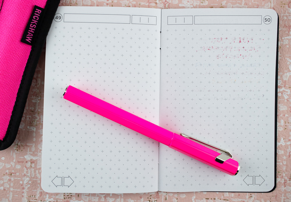
I purchased my rollerball pen ($19.99) and pencil case ($14.99) at my local big box store for full retail price. I couldn’t bring myself to buy the full set of Darth Vader and Yoda pens or the fountain pen versions. The rollerball pen came with a standard black medium point which, for me, writes like a fire hose.

The pen barrel is plastic and screen printed with graphics so the longevity of the designs are iffy at best. The clip and end caps are metal but not very high quality so they are also likely to bend or chip. The grip section has a rubber coating which also has a shelf life. Though the pen does have a replaceable ink cartridge so you will be able to get more than one refill’s use out of it, this is definitely not meant to be a “forever” pen.
The cap does post and it doesn’t make it too heavy or too backward weighted. The pen, capped weighs 16gms.
Capped, its 5″. Uncapped, it’s just shy of 5″ and posted it’s 6.75″ long.

You can see that the rubber grip picks up dust, lint and hair and any moisture or oil will alter the coating over time.

Can you see why I don’t like rollerballs? It makes my handwriting look atrocious! The stock black cartridge is a dark matte black though so if that’s your cup of tea, you’ll be pleased. Me? It makes me write like a grade schooler tweaked out on too much Halloween candy.

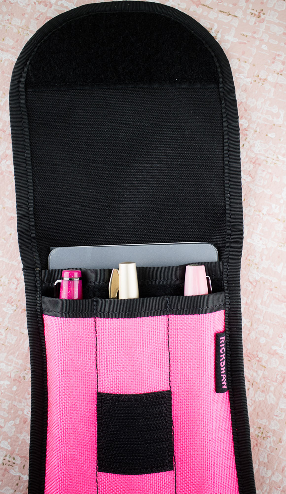
As for the pencil case, there are two inner slit pockets to hold cards or help separate erasers, cartridges or other smaller items from your larger pens and tools. The overall exterior material is a lightweight nylon, lined with black nylon. It does not feel particularly heavy duty. The case measures 9.75″ x 5.25″ so its big enough to hold water brushes, unsharpened Blackwings, paint markers and other longer-than-usual tools.

There is branding inside and outside of the bag as well for both Disney and Star Wars on plasticky tags. Its a bit overkill since the logo is printed on the bag itself too. But No one asked me.
My last note is that while the graphics on the pen are crisp screen printed designs, the graphics on the bag are loose watercolor designs so the set does not really go together aesthetically. I feel the same way about the Darth Vader and Yoda designs too. The whole line feels very hodge podge. And to be honest, the pen should be closer to $10 and the pencil case closer to $8 really though I suspect that the pricing was anticipation for big box markdowns.
Bob is going to field test the durability of the graphics on the pen by tumbling it in his pocket, bag and shop apron for a few weeks to see how long it survives in real world wear-and-tear in the print shop. I’ll post “after” photos in a few weeks.
DISCLAIMER: These items were purchased with my own money. Please see the About page for more details.