Review by Tina Koyama
Most of my childhood memories of using pencils are dismal at best. I recall many papers looking messy as my left hand smudged across the page, even with standard-issue No. 2 pencils. As soon as I was allowed, I switched to any kind of fast-drying pen available back in the Dark Ages of the ‘70s and never looked back at pencils.
Fast-forward several decades to when I started sketching, and even then I went almost immediately to ink. It was my love for colored pencils in recent years that finally helped make graphite pencils friendly to me. In fact, now I love graphite pencils – for both writing and drawing.

I thought I’d preface my review of JetPens’ 2B Wooden Pencil Sampler with that background so you’d understand why I chose the 2B set. JetPens offers pencil samplers in a range of firmer grades that might be better suited to writing, but I tend to favor softer grades for drawing as well as writing. I was hoping 2B would be a grade that could serve as an all-purpose pencil.
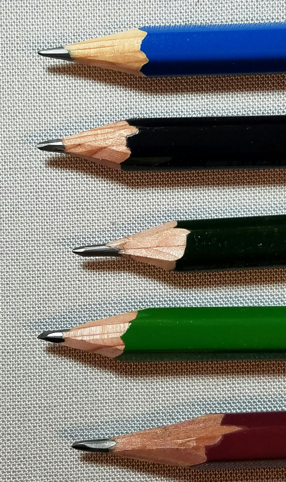
From top, the pencils in the sampler are:
- Staedtler Mars Lumograph
- Tombow Mono 100
- Uni Mitsubishi 9800
- Uni Mitsubishi 9000
- Uni Mitsubishi Hi-Uni

Appearance and Quality
Before I get to the writing experience, a couple things are worth noting about appearance and material quality. Right about the time I had gotten this sampler, I was reading David Rees’ partly practical, mostly satirical book, How to Sharpen Pencils, to improve my hand sharpening technique. The Staedtler Mars Lumograph was the only pencil in the pack that came pre-sharpened, so I was delighted to have four fresh pencils to refine my sharpening skills. The wood casing on both the Uni Mitsubishi 9800 and Uni Mitsubishi 9000 felt harder to cut through than either the Tombow Mono 100 or the Uni Mitsubishi Hi-Uni. At times the wood splintered. What’s more, the exposed graphite cores in the 9800 and 9000 broke when I cut away a bit too much of the wood, so I had to start over. The wood casing on the Hi-Uni was noticeably easier to carve, never splintered, and the core remains unbroken even with the same exposure. I’m not sure if this experience says more about my hand-sharpening skills or about the wood or core quality, but since pencil reviewers rarely mention hard sharpening, I thought I would.

All five pencils are attractive and smoothly lacquered. All but the 9800 have painted caps (I tend to look askance at pencils with exposed ends; they look unfinished to me). The Hi-Uni has a pretty divoted yellow dot in its cap. I give bonus points, though, to the Mono 100, which has a distinctive white band wrapping over the cap – an elegant touch that makes it the most visually appealing of the five. (A practical reason why I appreciate distinctive caps is that I can identify them quickly in my bag, where all my sketching and writing implements stand upright, point down.)

Writing Experience
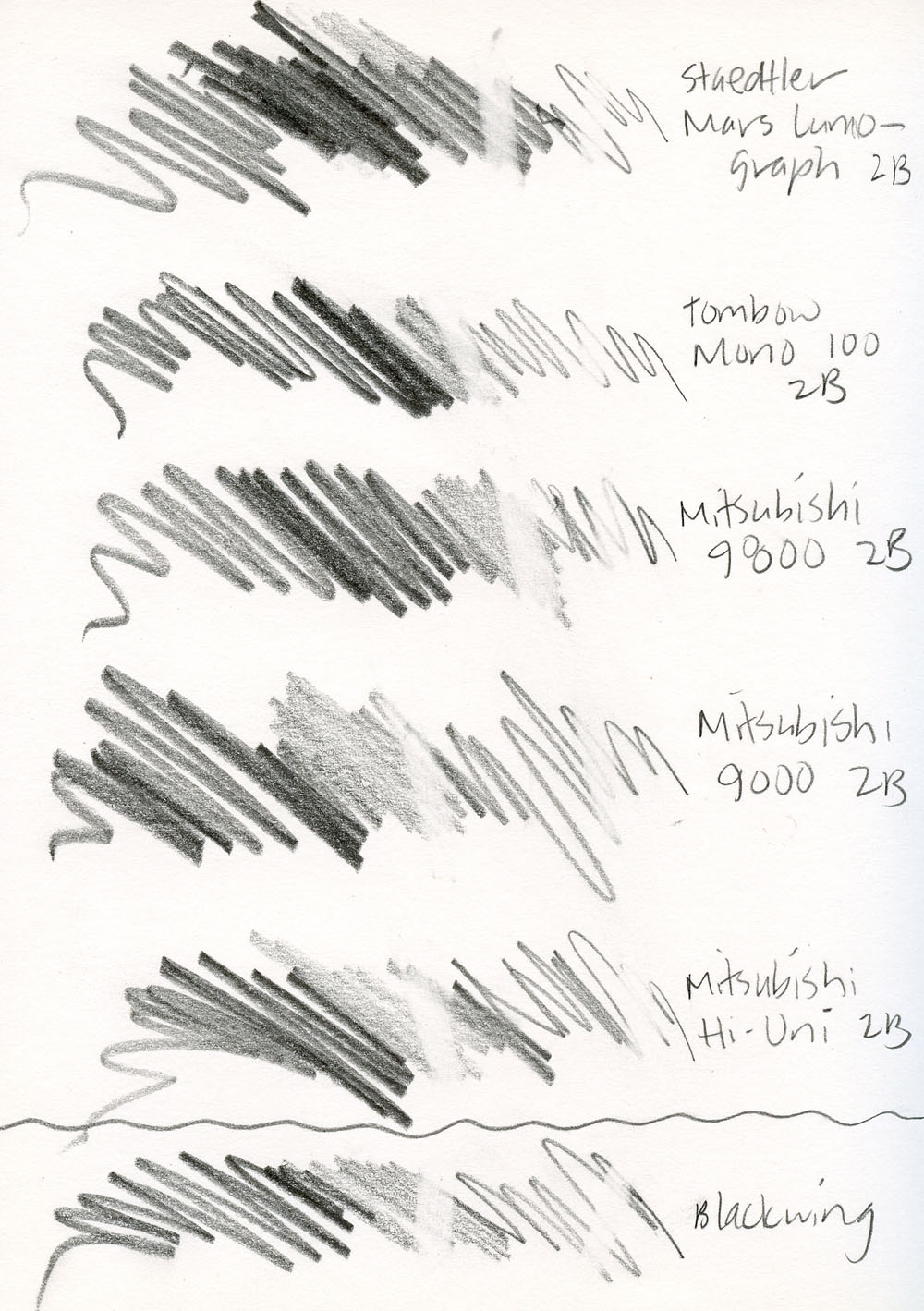
My scribbling, writing and erasing tests and sketches were all done in a Baron Fig notebook, which has just the right amount of tooth for my liking. All five pencils in the 2B sampler are pleasant writers. The Staedtler Mars Lumograph feels the roughest of the five, especially when I shade large areas, but when writing, the roughness gives way to a nice feedback.

The Tombow Mono 100, Uni Mitsubishi 9800 and Uni Mitsubishi 9000 all feel equally smooth when writing. In fact, blindfolded, I’d be hard-pressed to tell them apart. Since I’m familiar with sketching and writing with the Palomino Blackwing, I used it as sort of a “control” factor so I’d have something to compare with. While not quite as soft as the Blackwing (which seems closer to a 3B or 4B), the Hi-Uni and the 9800 feel just as smooth.
Although I don’t usually use an eraser when drawing (or even when writing – I simply strikeout, an old habit from my years of ink use, I guess!), I put a Tombow Mono Zero eraser through my scribble tests to see how they erased. They all erased cleanly, though the four Japanese pencils erased slightly more completely than the Staedtler.
Despite the mild smudging I experienced (unavoidable in the lefty world), I decided that 2B is not too soft for writing in my planner and jotting notes (though I probably wouldn’t choose it for longer drafts). The softness just feels pleasant gliding across the page.
Incidentally, I was a fan of the Tombow Mono (not Mono 100) line and have almost all the grades, so just for fun, I compared a 2B Mono to the 2B Mono 100. I closed my eyes to see if I could tell the difference. Nada. (Maybe their cores are identical and only the branding is different?)
Sketching Experience
As mentioned previously, the Mars Lumograph has a bit of scratchiness that I notice when writing and when using the side to shade large areas. Although the Mono 100 appears just slightly darker and the Hi-Uni is slightly lighter, the four Japanese pencils are equally smooth as silk in just about any sketching application – the point and the side. In softness, however, the Hi-Uni has them all beat. Not by much, but there’s a certain velvetiness to it that makes it nearly silent. (Nothing annoys me more than a noisy, scratchy pencil when I’m trying to sketch stealthily in public!)

In all my sketches shown here, I started with one of the 2Bs and tried to get as wide a range of tones as possible with only that pencil. I found that with a 2B alone, I couldn’t get quite as dark a tone as I wanted for shadows, so I tended to reach for a softer grade to put in the final dark touches. In other words, a 2B is not a standalone grade for my sketching needs. (I wish JetPens had a 4B sampler – I’d have fun testing that to find the ideal standalone sketching pencil.)

Final Impressions
Although I’d be happy with any of the five 2Bs for writing, my top pick for both writing and drawing is the Uni Mitsubishi Hi-Uni. It seems to skim effortlessly and nearly silently across the page; I feel like I could write or sketch with it all day. Since writing this review, I’ve treated myself to the full Hi-Uni range, and the line has surpassed the Tombow Mono as my all-around favorite.

It’s worth noting that my fave is one of the most expensive in the sampler – nearly three times the cost of the 9800. (Only the Mono 100 with its fancy banded cap costs a dime more.) So maybe, I have expensive pencil tastes. But here’s how I look at it: Ranging from $0.85 to $2.60, the sampler pencils average out to $1.70 each. In my mind, the sampler is an excellent value. I got to compare five pencils at a price, per pencil, that’s a lot lower than the two pricey ones – and the cheaper ones turned out to be great pencils, too.
 Tina Koyama is an urban sketcher in Seattle. Her blog is Fueled by Clouds & Coffee, and you can follow her on Instagram as Miatagrrl.
DISCLAIMER: The items included in this review were provided free of charge by JetPens for the purpose of review. Please see the About page for more details.

 Pens:
Pens:


