While browsing around the Ikea site, I found some great research in their Ideas section. It’s divided into categories for areas of your home, organizing, entertaining, and other pertinent categories and then has some wonderful pictorial essays of real people and idea posts about using Ikea products in your home or office to help. Since most of us have or will end up having Ikea furniture at some point, this is a great way to figure out ways to integrate it into our homes creatively and the aesthetic styling is pretty diverse too.
Ikea is great at showing reuse, repurposing and people finding ways to use spaces dual-purpose which is so refreshing. Above is one of their dining tables that has been repainted and trimmed with washi tape. Add a few layers of sealant to keep the tape from peeling if you really like how it looks. Or leave the tape on the top layer and peel it off after a festive dinner party and replace it with different designs in a couple weeks. Its a great way to use up those rolls and change up your decor quickly.
The other two pics above show a woman who uses her bedroom as a space for her creative work too. Its a lovely article under the “bedrooms” header for creative uses of space.
Above are two different home office spaces; one is a shared bedroom/office and one is a dedicated office space but both are open, airy, functional and gender-neutral. You gotta love Ikea for that.
The two photos above are more creative uses for tight spaces. The top image is the space for a young man whose space is his bedroom, study space and hang out space. The use of the bunk bed helped to give him room for his desk and chair and allowed him to keep his vintage family furniture pieces too so their is some warm, bold color as well as modern styling. The perfect space for a young man.
The next photo is a rolling art tabouret in a hallway near a bright window perfect for painting. And shows how creative we can be in finding a little corner to work when there isn’t much space in out homes!
These last three photos are just more great inspiration and show the range of aesthetic, from masculine to feminine. I liked the article about other uses for the magnetic knife holder (lower left photo) like holding paint brushes for artists, scissors for crafters or as a photo magnet rail to hold photos, recipes or inspiration.
I thought I’d already mentioned my plans for my new office/studio redo. I plan on building (with the help of my handy husband!) a Kallax Island for the middle of our office/studio using plans from the Family Handyman. I like having a standing desk/worktable and this will have tons of storage too.
Do you have a lot of Ikea stuff in your home? Have you hacked any Ikea pieces to work for you?
And, in case you want to make your own peppermint mochas at home, try this recipe to make your own peppermint syrup and mocha from the Kitchn. The comments are great for lazy, ghetto solutions too! I’m partial to the one about dropping a couple mint chocolate kisses into a cup of coffee!
I have such a huge back log of Ask The Desk questions that I thought I’d try to get a bunch done this week. I’m so sorry for the delay! I do hope I’ve gotten a bunch answered here. If you are waiting for an answer, please drop me a line and let me know. If you’ve found a solution, please let me know — I’d love to do a whole “TELL the DESK a thing or two” post!
Clara asks:
I need a plain notebook with 100gsm. I’d like a B6 size, but A5 is ok too (just to understand, the ISO A sizes are a little too tall).
I’m looking for a sewn notebook with soft cover, with about 160pages or 192 at most. Its a everyday journal, with sketch, writings and so on.
It seems easy, but it’s not 😀
Paper-oh is perfect, but it has only 112pages, there are opposite review about monsieur notebook (about a bad build quality?). Do you know Nu Elite Kraft notebooks?
Clara, I have wracked my brains (and my endless lists of notebooks) trying to find something that fit into your requirements and I’m coming up empty-handed. If I find the right size, its not the right paper weight. If its the right weight, it doesn’t have enough pages, etc. I have not taken Monsieur Notebooks out for a test drive in a couple years. I know they have been adjusting their materials so I can’t speak to their current configurations. The Nu Elite Kraft notebooks look interesting. For the price point, it might be worth trying it out, though I suspect the paper quality is probably not fountain pen friendly but may be great for pencils and collage.
The Midori MD notebooks don’t list their paper weight but its very good quality, its a soft cover, sewn binding and quite durable. The page count is 88 sheets/176 pages. It is an A5 so it misses there but meets almost all your other criteria.
If anyone has a better suggestion for Clara, please leave a comment below!
Jerry needs:
I have an original Schmidt Rollerball one with a 8126 refill but the length of it is 108mm NOT 98mm as most on sale are. The writing on the refill is “bluRafia Capless System 8126” made in Germany
Can you help with a replacement refill please.
Jerry,
I think you are looking for this:
This would be the Schmidt Long Black Rollerball Refill. Also available in blue. It’s available for $4.50 from our friends over at Refill Finder who pull my proverbial refill out of the fire more times than I care to count.
Steve wants to find:
Do you know where to get instruction manual for swivodex inkwell?
Steve I scouted through all the old posts on Fountain Pen Network in search of any information about the Zephyr Swivodex and all I could find was a photo of the disassembly (in this thread) of a one but no actual operating instructions. Readers, if anyone has any information that might help Steve, please leave it below in the comments. Thanks!
Daphne asks:
I have searched your blogs but would just like clarification before I order anything. Do the six outer rings of a Franklin Covey Classic ring binder match the position of the six rings on a Filofax A5 binder?
I love Filofax’s binders but don’t like the quality paper of their refills. I have used the FC Compact refills interchangeably with Filofax personal binders but I haven’t found a precise answer to my question above for the larger size systems.
Alternatively, could you recommend A5 size dated planner refills that are on higher quality paper?
Daphne,
On your first question, NO. Franklin Covey rings do not align with Filofax rings because that would be too convenient. Steve over on Philofaxy tried to shed a bit of light on this in his deftly titled article The Great Organiser Hole Conspiracy. I’ve looked at the diagram he created several times which makes the whole matter as clear as mud. It’s like all the different computer cord dongles. Why do they all have to be different sizes?
As for Filofax paper quality, I can recommend the new Filofax 2017 Illustrated Inserts. The paper quality is far superior to the regular stock inserts and the designs are actually quite nice. Goulet Pens is still stocking the full line for both personal-sized and A5. Other alternatives are Hello Forever blank refills (which I reviewed here) or Yellow Paper House on Etsy.
Nancy is searching for:
I wondered if these (Frixion) pens would be a good idea for recipe cards? I am making a cookbook for a family member, but I don’t want to use a regular pen. I don’t want to have mistakes crossed out, and it would be inevitable when writing 100 recipe cards. I don’t want to type the cards, since it would be more personable in my writing. Would the plastic pockets in the book protect the writing? I obviously don’t want to write out a ga-zillion cards just to have them disappear when under light. Suggestions?
I think Pilot Frixion Gel Pens would be a great option. One thing to consider is that Frixion pens can be affected by heat, making the ink disappear. However, since the cards would be in the kitchen, any “disappearing ink” can be easily solved by sticking the cards in the freezer for a short amount of time to make the ink reappear.
According the the Pilot UK FAQ:
Our FriXion products’ ink “erases” due to PILOT’s exclusive thermo-sensitive ink technology. When you want to make corrections on your page, simply turn around your FriXion pen and rub with the FriXion eraser tip as if using a regular pencil eraser. While rubbing, the ink heats up to over 60°C and becomes invisible. Conversely, the ink reappears at temperatures of under -10°C.
If this seems to finicky for you, you may want to use a regular pen of some sort and consider making any corrections using correction tape which is fast and tidy.
This week Heather and I round up our favorite gift ideas to get you and your favorite artist inspired for 2017. There’s a ridiculous load of show notes this week too.
Lamy nibs are awesome and if you are ready to invest in a fountain pen over $50, I have plenty of Lamys I can recommend.
Any change you could name a few – would really appreciate it.
As it turns out, Niles isn’t the first person to ask me to provide some clarity around what are my favorite Lamy pens. On many occasions, I’ve mentioned that I really like Lamy nibs and prefer their higher end models over the molded grip Safari and AL-Star models but I have never been specific about which models. Partially because I pretty much have all of them except the Dialog which is enormous and the Imporium which is pretty expensive (but gorgeous!).
For left handed writers, I prefer the round barrel shapes on the higher end Lamy fountain pens like the Lamy Studio, the Lamy 2000 and the Lamy CP1.
The Lamy 2000 is a classic and is totally unusual in the makrolon black material and brushed aluminum grip. It also has the hooded 14K nib which, for many, is their first experience with Lamy’s gold nibs. It’s also a piston filler which is pretty unique in the Lamy as well. It’s definitely the most expensive option I’m listing, retailing for about $160, but it is an icon and something every pen collector should have in their collection.
I find that the Lamy Studio is aesthetically similar to the Lamy 2000 in many ways without the hooded nib, with a more tapered clip and a wider array of finishes available. Pricewise, it’s also not nearly as expensive since it comes with a steel nib. It starts at about $80 but can be upgraded to a gold nib and a palladium finish for about $160.
At present, I don’t own a Lamy 2000 but its mostly because I haven’t pulled the “buy it now” button yet. I do own a Studio in brushed aluminum. I frequently fondle the 2000 in friends’ pen cases and pick them at pen shows debating if this will be the day I finally fold.
The Lamy CP1 is a much more slender pen, available in a black titanium finish for about $56. It’s a very simple, clean looking pen. Very functional and utilitarian. I don’t think it could be anymore German if it tried. The Lamy Logo is very similar but has a spring-loaded clip.
Then there’s the Lamy Scala that also has a spring-loaded clip that I find to be considerably heavy and makes the pen way too top-heavy if you try to post it. Aesthetically, I like the looks of the Scala and the model I have actually has the 14K nib on it which means it writes like a dream but the cap is just too heavy. If you don’t post your cap when writing, then you might consider the Logo as an alternative to the CP1. The price is a little lower. And with any Lamy, you can go crazy upgrade it with a 14K nib.
In part 1 of the brush pen series, I covered felt-tipped waterproof pens. This review is about 11 brush pens with similar compressed-fiber tips but containing water-soluble black inks.
In general, I’d say the tips behaved in the same ways as their waterproof-ink counterparts of comparable size. One of my goals with this series is to find pens that don’t mush down from my heavy-handed abuse, and as it turned out, I didn’t find any in this category with the slimmer felt tips that did tend to flatten in the waterproof group. Most in this review have either a relatively stout bullet-shaped felt tip or a small, firm plastic or rubber tip, and both styles stand up well to my heavy hand. However, the points of the broad end of the Tombow ABT Dual Brush Pen and the Sakura Koi Coloring Brush did flatten after a relatively short while, which surprised me because they look sturdy.
Sakura Koi on Field Notes Lunacy
The pens that are the most resilient tend to make a strange squeaky sound with slight pressure, such as the two Zebra pens (both double-sided and single-sided), the Kuretake No. 55 Double-Sided Brush Pen and the Kuretake No. 33 Brush Pen. Perhaps the squeakiness is related to the type of material they are made of. I know that’s not a very helpful characteristic if you haven’t bought and used the pen yet, but for me the squeak is a good indication that the tip will last. I’ve been using the four named above for a good while, and they are all still pointy and going strong.
Both the Sakura Koi and the Winsor & Newton Watercolor Marker have tips that are a bit too broad for my uses. Even held vertically, I couldn’t get a fine enough point for detailed work (and since the Koi started mushing down quickly, its tip got even flatter). On the other hand, when held at a sharp angle to the paper, the Winsor & Newton marker makes a very wide swath of ink that covers a lot quickly. For that reason, I enjoy using it at life drawing practice with larger paper.
Winsor & Newton Watercolor Marker on 140lb watercolor paper
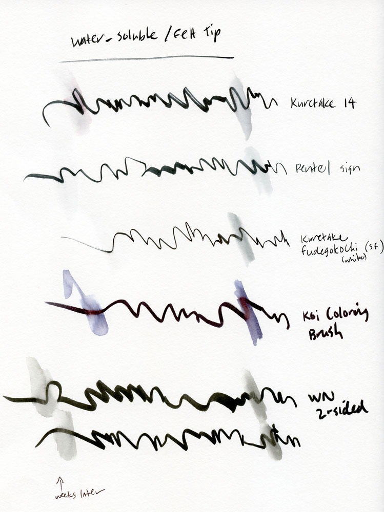
Ink Color & Solubility
Now, on to the inks. My favorite way to use brush pens containing water-soluble ink is to make a line drawing and then use water to wash the line slightly for shading, and I usually don’t add color afterwards. So the quality of the washed line is important to me.
One interesting thing I learned from comparing these pens was how variable the term water-soluble can be – and how long water-solubility lasts. To test solubility, I made a scribbly line on Canson 98-pound mixed–media paper. Within a minute, I ran a waterbrush through the line to see how much it dissolved. (Those water marks are shown on the right side of my test sheets close to the names of the pens.) Although all the inks are roughly the same shade of black when applied to white paper, some look very different after being washed with water. Often the wash is much bluer, and in a few cases turns brownish. The Kuretake No. 14 Pocket Brush and the Pentel Fude Touch Brush Sign Pen both washed with such pale smears that I don’t really consider them water-soluble for my purposes (yet neither is described as being waterproof by JetPens). If I’m going to wash a line for shading, I want the shading to be rich and strong, which is the case for most of the other pens. The Sakura Koi, the Tombow and the Zebra pens all washed to particularly dark shades.
Kuretake 33 on Field Notes Lunacy
Long-term Ink Permanence
The big surprise came a couple of weeks after I made the test sheets. Experimenting with a drawing I’d done earlier, I realized that the ink that had washed previously was now permanent. Curious, I went back to the test sheets and made a new waterbrush mark (shown on the left side of the test sheets) on each of the original lines. Most still responded in the same way as before, but the Zebra Double-Sided Brush Pen, the Kuretake No. 55, the two Kuretake Fudegokochi pens (regular and super-fine) and the Pentel Fude Touch Brush Sign Pen all diminished in solubility. In fact, the two Fudegokochi and Pentel pens were essentially waterproof after the passage of those weeks, showing no solubility at all.
Since I generally finish a sketch in one sitting and wash lines immediately after making them, the delayed permanence is not a factor I would consider as long as I knew an ink was soluble to begin with. But if you make a line drawing first and continue working on it quite a bit later, it’s something to consider. And the delay might be a favorable feature if you want your work to be insoluble for the long run.
Zebra double sided pen on 98lb mixed media paper
All inks behaved well and showed no feathering or significant bleed-through on Field Notes 60-pound Finch Opaque Smooth paper. Even though I know this Field Notes paper is not intended for wet media and has performed poorly with water in the past, just for kicks, I put water on the test lines. As expected, the beautiful washes I got on the 98-pound paper were nearly non-existent on the 60-pound Finch. (My experience with other Field Notes papers is that this difference is primarily due to the sizing on the paper’s surface, not the weight. For example, I get satisfactory washes on Domtar Earth Choice 60-pound paper found in the Field Notes Lunacy edition.) However, even where water was applied, only the Winsor Newton ink bled through.
Field Notes TestReverse side of Field Notes #1Reverse side of Field Notes #2
Although I tested only black inks in this review series, it should be noted that the Tombow, Sakura Koi, Pentel Fude Touch Brush Sign Pens and Winsor Newton markers all come in a zillion colors, and their water-soluble qualities make them ideal for blending like watercolors.
As with the waterproof felt-tip pens, I experienced the same crankiness with some caps that have to be reversed before they can be posted! This time the guilty parties are the Kuretake No. 55 and Kuretake No. 33 (which will both most likely suffer an early demise because I keep inadvertently jamming their tips into the wrong end of the caps when I replace them after posting).
Kuretake No. 55 double sided on Stillman & Birn Alpha
Final Impressions
My favorites from this group? Despite that cranky cap, the double-sided Kuretake No. 55 is my overall fave because the two distinctly different tip sizes offer a remarkably wide range of marks in one convenient pen – important for an urban sketcher like me who carries her studio in her bag. (Conversely, the two tips on the double-sided Zebra and double-sized Winsor Newton are too similar to offer the same range.) Its ink washes beautifully, and the Kuretake No. 55’s notably squeaky tip is also standing up well to my firm pressure. For richness in wash color as well as a good range in line width, I also like both the single- and double-sided Zebras and the Kuretake No. 33.
DISCLAIMER: The items included in this review were provided free of charge by JetPens for the purpose of review. Please see the About page for more details.


 Pens
Pens