By popular request, I finally have a review of Robert Oster Blue Denim. It is one of the many shades of the new Robert Oster Signature Inks that I have and it is a great, shading, sheening color. There is a distinct red halo with this ink, even in finer nibs.It’s one of the first things you’ll notice along with the vibrant deep blue color. It’s definitely a cool blue, despite the red sheen. What a conundrum of a color! A cool color with a warm sheen!
I’ve mentioned it before but I’ll say it here, the only downside with the Oster inks, if you perceive it that way, is the bottle. It’s a plastic bottle. The bottle is tall and narrow which will require a syringe to access inks after a certain point and could be prone to tipping if you are not careful. You may want to decant the inks into a different container if you fill your pens directly from the bottle. However, the bottles are plastic which means they are unlikely to break in shipping and are recyclable which, in another way, is a plus. Also, the bottles are dark so they protect the inks from light so the colors are unlikely to shift due to exposure to light. So, there’s that.
In my writing sample, I used my trusty Esterbrook nib holder and my favorite #2442 fine stub nib which showed more turquoise coloring. I also have the Blue Denim ink in my Karas Kustoms Bar Stock Fountain K EF and the ink looks much darker with the red sheen far more evident. You can see a writing sample in my recent writing samples of the Ferme à Paris Planner writing tests.
Compared to some of the other Oster inks in my cupboard, Blue Denim is probably the closest to a “blue black”. Blue Denim is probably most comparable, color-wise to Pilot Iroshizuku Tsuki-Yo and Noodler’s Navy — at least of the colors I have on hand. But clearly, there are differences. So see? You really do need another blue ink!
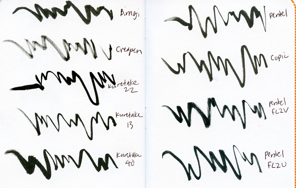
Within the brush pen series (Part 1: Waterproof Felt Tips and Part 2: Water-Soluble Felt Tips), the type of pens I’m reviewing today are probably the ones I use most often – hairy, bristle-tip brush pens containing waterproof ink. Designed to simulate sumi brush pens used for traditional Asian calligraphy, the bristle-tipped pens take a little more practice to manipulate compared to their felt tip counterparts, but the line variation they impart can be very expressive. If you are used to handling paint brushes with ink, these will feel familiar.
As a general rule, bristle tips last longer than felt tips without mushing down from pressure, and their flexibility gives the widest range of marks. For example, I’ve been using the same Kuretake No. 13 Fountain Brush Pen for several years now, and its synthetic brush is still going strong. When I eventually upgraded to a sable hair Kuretake No. 40, thinking it would be even better than the 13, I have to say I was disappointed. The brush performs well, but it doesn’t seem to warrant the price difference compared to the No. 13. In fact, I find that the No. 40’s tip spreads out when pressure is applied and doesn’t pull back into a sharp point when the pressure is released the way the 13 does. I have to roll it against the paper to get the point back. Maybe a painter accustomed to handling natural hair brushes would have better results from it.
Kuretake No. 40 Weasel Hair Brush on Domtar Earth Choice Paper in the Field Notes Lunacy EditionPentel Suki on 140lb watercolor paper
All the other brush pens reviewed here have similar synthetic bristle tips to the Kuretake No. 13 without much distinction. The exceptions are the Pentel Tsumi Tip (labeled FL2U on my chart) and the Pentel Suki Tip (FL2V) Brush Pens, both of which are capable of producing particularly thin lines at their very points. See the man wearing headphones that I sketched with the Pentel Suki? I was able to make that very thin line defining his nostril with the tip – it might have been a single hair! You have to hold the brush nearly vertical to the page to get that hairline, so it’s a bit tricky, but it has a beautiful range.
Here’s something to consider if you travel: I carry all my usual sketch gear with me when I fly. Although I’ve heard various warnings, usually related to leaking fountain pens, the only time I’ve ever had any kind of leakage problem was with reservoir-type brush pens such as the Pentel Tsumi and Suki and the Kuretake Zig Cartoonist Brush Pen No. 22. They are prone to making a huge mess! This goes for driving to high altitudes, too, not just while flying. Believe me, I only made that mistake once! Wrap carefully if you plan to take them with you.
Bristle Brush Pens Waterproof Tests
Ink Color & Permanence
As before, water tests were done on 98-pound Canson mixed media paper. Most of the inks are waterproof as soon as they dry, within a minute or so. The exceptions are the Pentel Tsumi and Suki, which remain water-soluble for quite some time. Two weeks later I tested again, and they were permanent. I started using both the Pentel Tsumi and Suki pens as if they were water-soluble inks, washing lines for shading. I wouldn’t use them with watercolors or even with a gel pen, however, since those products would become muddy when mixed with the inks. If you’re planning to wait a while before painting, however, these inks could be considered waterproof also.
Those two Pentels were also the only ones containing inks that looked slightly gray to me compared to the true black of the others.
Waterproof Bristle Pen Tests in Field Notes
All inks behaved well, as expected, on Field Notes 60-pound Finch Opaque Smooth paper. The only spot that bled through slightly was where I had made an especially thick line with the Kuretake No. 40 (containing Platinum Carbon Black ink).
Field Notes Brush Pen Bristle tests from the reverse side
Refillability
It’s important to note that the Kuretake No. 13, Kuretake No. 40 and Pentel Kirari Pocket Brush Pen can all be refilled just like fountain pens. They come with waterproof ink cartridges when purchased, but you can install a converter or simply syringe-refill the used cartridges with whatever ink you want. My favorite waterproof fountain pen ink is Platinum Carbon Black (*Editor’s Note: Mine too!), which puts out an especially rich, black line in all of these refillable pens. I have a second Kuretake No. 13 that I fill with water-soluble Diamine Chocolate Brown ink. So although I’ve classified these pens as waterproof, the type of ink used is up to you. (However, I recommend sticking with one type of ink per pen, since the brushes are difficult to clean.) Since the bristles have proven to last a long time, their refillable quality makes these pens a particularly good value.
The Kuretake Zig No. 22, the Pentel Tsumi and the Pentel Suki can all be refilled with proprietary cartridges. (Actually, the cartridges look like they can be refilled with fountain pen ink too, though I haven’t tried it.)
Bimoji Brush Pen on 140lb watercolor paper
That makes the Kuretake Bimoji (medium), J. Herbin CreaPen Pinceau and Copic Gasenfude the only disposable pens in this bunch. I try to avoid pens that must be tossed after their inks are gone, so that puts these otherwise good brush pens at a disadvantage. A couple of things to note: For some reason, the J. Herbin CreaPen ran dry after only a short time, despite being stored horizontally. And the Copic Gasenfude, despite bearing the Copic name, contains ink that is nothing like the alcohol-based markers most people think of when they see the name Copic! This is very important to me, as I can’t stand stinky markers.
Kuretake No. 22 with Gelly Roll on 70lb French PopTone in the Field Notes Sweet Tooth Edition
Final Impressions
If you’ve read my other reviews, you know I get cranky about caps that don’t post as expected. In this group, only the Kuretake Bimoji has a cap that must be reversed to post (and yes, it still annoys me). All other caps posted properly and securely.
Reviewing bristle-tip pens right after all the felt-tipped brush pens drove home an important point: Bristles are far more durable and able to withstand pressure while continually bouncing back compared to felt tips. It occurs to me that this is the reason most of the felt-tipped brush pens are disposable – the tips wouldn’t last beyond the initial ink, even if they could be refilled.
For my money, that makes the refillable fountain-pen type brush pens the best value as well as the hardiest performers. However, they make a very different type of mark from the felt tipped pens and require more control, so value isn’t the only factor to consider. Personally, I carry at least one bristle tip and one felt tip at all times because I like the variety of marks each type offers me.
There’s only one part left in this series – bristle-tip brush pens containing water-soluble inks. That group contains a huge variety of form factors! Stay tuned.
This week, we lost another great, a true hero. Astronaut and politician John Glenn passed at the age of 95. The fact that for the last two days I’ve been awakened by an internal soundtrack of David Bowie singing “Starman” and “Major Tom” seemed to be a clear sign I needed to recognize our collective loss.
John Glenn was born with The Right Stuff and he was the last surviving astronaut of the Mercury program. He is also the oldest man to ever go into space having gone back out on the space shuttle in 1998 at the age of 77. So, in honor of the legend, this week’s Fashionable Friday is interstellar and out of this world, just the way John Glenn might want it. Godspeed, John Glenn. The stars await you.
Massdrop did a mass drop on me this week with some of the new products they are stocking from Ferme à Papier. They sent me the new Yearless Planner (currently $21.99), the Desk Calendar (currently $24.99) and the boxed Thank You Cards (currently $19.99). The planner is 5″x8″ with a perfect bound spine and decorative gold foil details on the cover. Inside, the paper is a crisp, heavyweight white paper with minimal black printing. Since the calendaring is dateless, you need to write, draw, stamp or embellish a lot of the details yourself. Luckily, the paper is heavyweight enough to hold up to both lots of types of pens and inks including rubber stamping inks.
I’m not too scrapbook-y but I like using some stamps, arrows, washi tape and arrows to embellish and color code notes in my planners. The bright white paper gave me lots of freedom to plus up the planner. Inside the front is a forward-planning spread for the whole year — not much to plan for 2017 yet except pen shows and some knitting events but there’s still plenty of room to add birthdays, anniversaries and other dates to remember.
Following the forward planning is a monthly calendar across two pages. I stamped the numbers for the days in January and added the few upcoming events I know thus far. While I included the Philly Pen Show on the calendar, I don’t know if I’ll actually be able to go but I like to keep track of these events.
After the monthly spread are a series of weekly pages. I used number stamps for the days and added a few of the meetings I know I’ll have when I return from the holidays. Not much yet but it will get filled up fast!
In the back of the book, I did a series of pen and pencil tests and was pleasantly surprised to discover how well the paper handled most inks. There was no bleeding or feathering issues . I didn’t use any super wide nibs since the book is not huge but a fine italic fountain pen, Le Pens, rollerballs, Papermate Flairs and even a fairly fine brush pen all did well so I feel confident that a range of tools for convenience and decorating options will be open for users.
Above is the pen testing page, viewed from the back. There’s a little tiny bit of show through but its only from the thicker markers like the Pentel Touch and the Kuretake Fudegokochi which is to be expected. So I’m quite pleased with the paper quality.
My only peeve with the planner is that the spine really needed to be worked to loosen the glue to get the book to open up. It does not lay flat very easily on its own. The binders put way too much glue on it and in some of the spreads you can see that it cuts into the usability of the space in the left hand edge of the right hand page — parts of the text fall into the gutter that is in the binding area. And while the Yearless Planner concept is interesting the layout really forces users to still start the planner in January rather than a format that allows for users to start the planner in any month and use it for 12 months. So its still a bit limiting. That said, the paper quality and the compact size and the ability to do a lot of decorating or no embellishing at all make it quite appealing.
There are eight different cover options to choose from and the Yearless Planner has met its Massdrop goal so its at the lowest price of $21.99.
Next up is the Desk Calendar which is a 12-month cardstock calendar in a walnut, wood slat base. The wood base is a bit wider than the cards, and all the cards fit into the stand so you can keep them altogether.The cards also stand more rigid and upright if you keep all of them in the stand together. I think the wood stand could be re-used at the end of the year for personal ephemera so I think there’s some longevity to it as well.
The designs of each of the calendar cards have a Memphis-style vibe in graphic pastels.
The visible design is about 5″x5″ and the base adds another 1.5″ to the height and about 3″ to the width.
The cactus montage on the September page is my favorite. I can’t believe I’ll have to wait nine whole months to gaze at it! The Desk Calendar is currently at $24.99 and needs 3 more purchases to be a fully funded drop. There’s only three days left too. It’s a pretty unique desk calendar and would make a nice gift.
The last item from Ferme à Papier is a set of eight Thank You cards in an acetate box with kraft envelopes. I received the box set of Black Carrara with gold foil stamped lettering on the cover. I also received a single sample of the Purple Floral design but I forgot to photograph it (so sorry!). As the holidays are rapidly approaching, its important to have some thank you cards on hand and these simple, universally appropriate cards would be perfect to give to your boss, co-worker, friend, or family member. I am always looking for thank you cards appropriate to give to my gentleman friends or for work colleagues that are not overly flowery or floofy. These cards are perfect for that.
My only fuss with them is the foil stamping is a little rough. It appears that way in the photos on Massdrop so there is no false advertising so I’m wondering if that was the look the designer was going for because its almost consistent on every card. I’m particularly picky because I do a lot of foil stamp design work for my job but I just thought I’d point it out. Alternately, I don’t often find such simple cards where I work so I guess I should pick my (picky) battles.
The Thank You cards boxed sets are $19.99 and need 10 buyers to meet the drop and there’s just three days left.
DISCLAIMER: This item was sent to me free of charge by Massdrop for the purpose of review. Please see the About page for more details.
Garden District Azalea is the last of the three color I purchased from the New Orleans ink collection from Papier Plume. I laughed because earlier this week Sarah mentioned in the comments for the Streetcar Green that she specifically passed on the the “pink ink” and here I was thinking I was saving the “best for last”.There’s a color for everyone.
Alternately, there’s been a lot of other folks who have come around to appreciating pink inks, myself included. I think Callifolio Andrinople and the Sailor Pink Love helped to woo us over to the “pink love” for sure. But since this spring, I’ve been slowly adding new pink inks to my collection and coming to appreciate a few that have sat idle in my collection.
The Papier Plume Azalea is a good pink addition. It shades nicely and is not too pinky-pink, leaning more towards a reddish pink than a candy watermelon pink. I didn’t notice any sheening in the color. I found the ink a little on the dry side so I think it might perform better in a wider nib pen than an extra fine. When painting the title, it did take a bit longer to dry and I got a bit impatient — especially considering I managed to misspell GARDEN. Doh! Overall, I like the ink and the price point cannot be beat.
Compared to other pink inks in the Desk vault, Garden District Azalea is closest to J. Herbin Rouge Opera which is a very wet, runny ink and a touch more red. Andrinople is a tiny bit darker and moodier than Azalea and Iroshizuku Tsutsuji is more magenta pink. Both Sailor Sakura-Mori and Iroshizuku Kosumusu are more peachy pink (watermelon-y) and the Kobe #41 is more purply-pink.
I hope that gives you a good idea where Garden District Azalea falls in the pink spectrum. Would bright up any black pen — would probably make the Black Pen Society guys weep so don’t tell them I said that.
This week on Art Supply Posse, Heather and I spend the episode trying to describe bookbinding basics using hand gestures and rattling tools you can’t see. So we’ve got lots of links to videos to help illustrate our points. We also talk about the best basic tools for bookbinding like paper, string and pointy things. All super technical. Show notes are available here.


 Tina Koyama is an urban sketcher in Seattle. Her blog is


 Pens:
Pens: