After my review of the Zebra Sarasa Milky scented ink gel pens, I couldn’t resist trying the Chupa Chups versions as well. There are five scents available in the Chupa Chups range, mostly in the warm colors plus one light blue. Each pen is a standard Sarasa retractable 0.5mm gel with grippy silicone grip and spring clip. What makes these unique (silly, fun, collectible, whatever!) is the printed barrel graphics, the printed disc “charm” on the clip and the scent added to the ink. They all write exactly as you’d expect a Zebra Sarasa to write — smooth and silky!
The light blue is vanilla and turned out to smell just like the Milky blue which I was not a fan. Whatever that scent is, it’s not vanilla! The yellow orange is pudding which features creme brulee graphics and had no discernible scent at all. It turns out to be the same ink color as the lemon Milky but without a fun scent or the awesome glitter barrel the Chupa Chups pudding isn’t much to marvel about. The Chupa Chups red orange is orange ink and orange scent and essentially identical to the Milky orange in color and scent. The orange is mango and has a mildly peachy scent. This one was my standout favorite since I love peach so had it smelled like mango I would have been thrilled but peach is a fine alternative. The last one is the red pen which is cherry. The first thing it reminded me of was Luden’s cough drops or cherry lifesavers but that was a huge improvement of the Milky strawberry scent,
So, in the scented gel pen showdown, the Chupa Chups and Milky pens are pretty much tied in my book. The Milky have the green tea matcha and the awesome lemon squash which are both winners in my book but the Chupa Chups cherry and mango are both good choices. The orange scents are equal from either so I’d recommend grabbing what you can if they are still available and you are feeling kind of playful. Each pen is available for $3 each. And the Milky Fujiya sets are back in stock!
DISCLAIMER: This item was sent to me free of charge by JetPens for the purpose of review. Please see the About page for more details.
I was a little hesitant to get another TWSBI simply because I already own a Mini and a couple of 580 models so I saw no real reason to purchase to budget-priced Eco model, until they released the lime green model and then my urge was entirely based on aesthetics.
When looking at the Eco, the only thing I can tell that happened to bring the price down was to remove some of the metal hardware on the higher priced 580 line. The clip is simple and the only metal components are the clip and the band on the cap with the branding.
The logo on the end cap is inset red plastic which actually looks quite nice. And both ends terminate in a hexagonal shape. The pen seems similarly weighted and balanced to the 580. In actuality, the Eco is 23gms, filled and capped and the 580 weighs 30gms. The Mini weighs 20gms comparatively. The Eco is the same length as the 580 but the barrel is a smooth, round tube where the 580’s is faceted. The Eco cap is a straight hex tube to the 580’s tapered cap and end. Also the ink capacity looks a little bit smaller but its still considerably larger than most cartridges or converters.
The cap posts with a click which seems pretty secure but I wonder if, for newbies, might lead to twisting to remove it leading to releasing the piston a bit? The hex grip on the end was the first thing my husband grabbed and started to hold as he attempted to remove the cap leading to releasing the piston and the cap simultaneously. Awkward.
The nib is the same design and material used in all the other TSBI pens so its the one area that is consistent. I had a scratchy nib in a previous TWSBI so I was a little gun shy to get another EF nib but this one is sharp and hard as nails but not scratchy.
In writing, the pen performs without any false starts and stops and the EF writes fine enough to be a good gateway for someone transitioning from a rollerball or gel pen in a fine diameter. Liquid fountain pen inks will still present new challenges in regards to paper choices but overall, the TWSBI is one of the best options for someone who is looking to move into fountain pens for the first time, especially if the lure is bottled ink.
Being able to get a piston-filling pen for $28.99 and a full-sized pen is a great option for folks just starting out. Being able to swap out nibs makes it extra appealing for folks who are still trying to find their way in fountain pens. My only complaint would be about how hard the nibs are but I’ve been writing with a lot of gold nibs lately so I may be to a point in my fountain pen life where I’ve moved past these pens. That said, I really like it and have already recommended it to folks who are starting out in fountain pens. If you’re coming from rollerballs and ballpoints, you’re not as likely to notice quite how hard the nib is. The clear ink reservoir is conversation starter wherever I go too.
Of course, the Eco is available with other cap color options, I chose the lime green for obvious reasons. Do you own one? If so, which color and nib combination did you pick?
DISCLAIMER: This item was sent to me free of charge by Anderson Pens for the purpose of review. Please see the About page for more details.
Its getting to be holiday season so I thought a few crafty books might be a good option this month. These might be good to get you in the mood to decorate for the holidays or as idea starters for gifts.
When I found this book, I thought it would be kind of cute but it turned out to be quite clever. The photography is lovely and the book includes not only projects but also tips for the best tools for writing on washi tape and storage of washi collections as well. If you are someone like me with WAY too much washi tape (or you know someone who owns way too much washi tape), you might want to pick up a copy of this book. While many of the ideas might seem obvious once you look at the book, its nice to have a pretty little resource for quick and easy ways to dress up your surroundings with all your wonderful washi tape. I scored this book secondhand which is a fine way to purchase books if you have that option. You could easily combine this book with a couple rolls of washi tape and it would make a lovely gift for a friend of loved one too.
I picked up this book a few months ago and have really enjoyed the diverse mix of projects inspired by ideas you can find in your library. I also like some of the reference material included in the book about copyrights and how to find resources at your local libraries including online resources and special collections. It’s just a great resource for finding new sources of inspiration and information to inspire you, even if the craft projects might not necessarily be your cup of tea. I think any book that helps people better leverage library materials near and far for creative endeavors of any sort is a good thing. IF you can turn those into an embroidered cushion, knitting project, wall hanging or inspiration for your next art project than that’s even better! I found my copy at a local secondhand book shop for a few bucks and it was money well spent.
I mentioned this book on an episode of Art Supply Posse recently. I borrowed the book from my work library but ended up buying a copy because I liked the book so much. It is filled with projects based on techniques of famous artists like Any Warhol’s bloopy pen drawings, Matisse’s cut paper collages and so forth. Throughout the book there are spaces to try out the exercises, workbook-style and there are pages in the back that can be removed to use for the cut paper exercises. The text is all handwritten and all the tools are hand drawn beautifully. The chapter titles are done in a beautiful, loose brush script and the whole book is printed on a soft newsprint-like paper making it feel un-precious and playful. A co-worker said they found a copy of the book in their local bookstore in the kids section and several people who’ve looked at it have commented that it would make a great resource for introducing children to some of the techniques used by famous modern artists as teaching tools. If you know an art teacher, this would make a great gift for sure. Or if, like me you are a bit of a kid at heart, you might need a copy for yourself.
First, I’d like to welcome Tina to The Well-Appointed Desk and thank her for stepping in and helping with reviews. This is her first (and hopefully not her her last) review here. I’m thrilled to have Tina on board bringing a new perspective and point of view. Please give her a warm welcome! –Ana
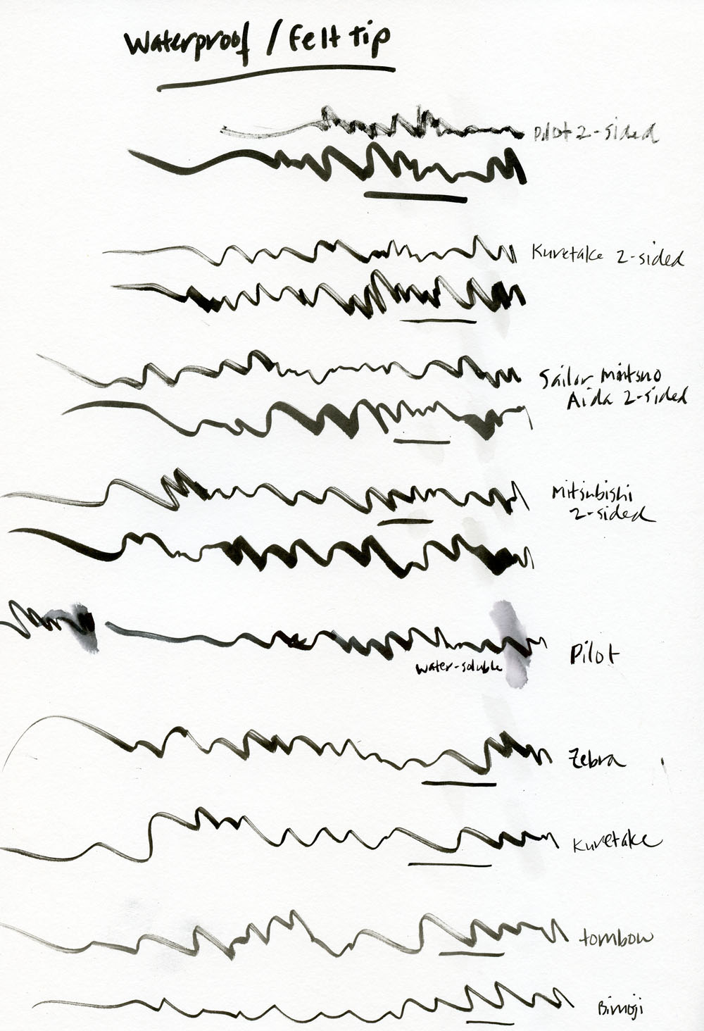
As an urban sketcher who draws way more often when I’m outside my studio than inside, I value any product that’s portable and can be used easily and conveniently in the field. And if there’s one drawing medium that piques my interest, it’s a brush pen that gives me the variable marks of an actual brush without the fuss and mess of bottled inks.
Art material junkie that I am, I have tried quite a few brush pens. A major issue I have is that some brush pens mush down on me relatively quickly. They still have plenty of ink in them, but I don’t want to use them after their formerly sharp tips turn into fuzzy flatness. I don’t know if the types of materials brush pens are made of tend to wear out quickly, or I just have a particularly heavy hand. In any case, I have made it my personal quest to find brush pens that can stand up to my abuse long enough to use up the ink they contain, so that’s one focus of this review series.
The term “brush pen” is used for two primary types of tips: those made of a compressed fiber or rubber that flexes slightly (I’ll use JetPens.com’s term “felt tips” to refer to them), and those made of natural or synthetic hairs or bristles like an actual brush. Some contain waterproof ink while others contain water-soluble ink. Given that I have nearly four dozen brush pens to compare (and that’s only the ones with black ink!), Part 1 of this brush pen series covers only the 14 felt tip pens containing waterproof ink.
The scribble/waterproof testing was done on Canson XL 98-pound mixed media paper. The bleed-through testing was done on 60-pound Finch Opaque Smooth paper in a Field Notes notebook.
First, let’s talk about ink. All pens in today’s review contain black inks that are completely or nearly completely waterproof within a couple minutes of application. The hard tip Pilot Pocket Brush slipped onto my test sheet inadvertently because I assumed it had the same ink as its soft tip counterpart, which was indicated on JetPens.com as having waterproof ink. It turns out that it only becomes waterproof after several days. I generally use a waterproof ink when I’m thinking I might want to apply watercolors or some other liquid medium afterwards, and I’m definitely not going to wait several days to do that, so I consider that ink to be water-soluble.
Sailor Mitsuo Aida 2-sided brush pen in Field Notes Lunacy Edition
All inks performed comparably with no bleed-through on the 98-pound paper, as expected. They also performed surprisingly well on the Field Notes paper, although several bled through at points where I paused briefly or, in the case of an actual sketch, colored some areas solidly. (None of the inks bled through at all under any circumstance on Field Notes Lunacy’s Domtar Earth Choice 60-pound paper, however, which has a very different sizing.)
Back side of Field Notes with 60# paper using Zebra gray body brush pen
All pens contain highly saturated black inks with the exception of the soft tip Tombow Fudenosuke and the fine/medium Sailor Mitsuo Aida, which look a bit grayer to my eye. For my sketching purposes, though, I’d say the inks have negligible differences in appearance.
As expected, the biggest difference among the 14 pens is in how their brush tips perform or in the marks they make.
The pens tested here include a wide range from fine (such as the Tombow Fudenosuke and the fine Kuretake Bimoji) to bold (such as the bold Sakura Pigma Professional Brush Pen). You’d probably choose a tip based on the size and type of work you do and personal preference. I tend to favor bolder marks, but that means I want the tip to retain a fine point so that I can get a full range of marks from it.
While I initially liked both the Marvy LePen Technical Drawing Pen and the Deleter Neopiko Line 3 brush tip pen for their soft, slender, flexible nibs, they both mushed down on me quickly. I prefer softer fiber-tipped pens because they seem more responsive to variations in pressure, but their ink supplies long outlive their tips. Ultimately, this review taught me that pens with firm but spongey, thicker tips stand up to my heavy-handedness longer. My favorites are the fine/bold Mitsubishi double-sided brush pen and the fine/medium Sailor Mitsuo Aida. These two are also the best value and serve my need for compact, road sketcher materials because the double tips are like having two pens in one.
I also like the medium side of the fine/medium Pilot Futayaku double-sided brush pen, but for some reason, the fine side is scratchy and acts like it’s out of ink, even though I store it horizontally, so I know it’s got the same amount of ink as the medium side.
I’ve also learned that since these stouter brush tips don’t flex as much, I have to vary the angle they are held to the paper to get a wider range of marks – the more perpendicular they are held to the paper, the finer the line. Now that I’m used to this, I can get a pretty good range, but it took a while to train myself.
Kuretake 2-sided brush pen on 140lb paper
The bold Sakura Pigma Professional Brush Pen has a sturdy tip that would probably also hold up well, but something about the cap design gets ink all over the inside of the cap, which then transfers to the rear end of the pen when I post it – and then when I cap the pen again, the inky rear end makes a mess on my hands and bag. I stopped using it early in testing because that mess annoyed me too much.
One characteristic of most of these pens, probably due to the material their tips are made of, is that they can make a split or dry-brush-like mark when dragged quickly on their sides, especially the finer-tipped pens. In some cases they can look like they are running out of ink. It’s a nice effect if you want it, since it mimics an actual brush. If you don’t, the Sakura Pigma Professional Brush Pen and the broader sides of the two-sided Pilot, Sailor and Mitsubishi pens are more likely to retain a consistent stroke.
Zig Mangaka on Field Notes Lunacy Paper
I have one idiosyncratic quibble: pen caps that don’t post properly – or that post backwards! The caps on the fine/bold Mitsubishi double-sided brush pen post insecurely, so they are always at risk of falling off while I’m in the field (and a brush pen without a cap is going to die very quickly). And the two Kuretake Bimoji pens and the fine/medium Kuretake Disposable Pocket Double-Sided pen have caps that must be turned around before they will post. Needless to say, I have absent-mindedly jammed those tips into the wrong end of their caps many, many times (probably shortening their lives, even if they haven’t mushed down on me yet).
DISCLAIMER: The items included in this review were provided free of charge by JetPens for the purpose of review. Please see the About page for more details.
This week’s Art Supply Posse episode is all about Copic Markers and features my good pal and co-worker Hannah spent some quality time in Japan where she acquired an epic set of Copic markers and a crash course in how to use them. She also colored this week’s awesome artwork which is a terrarium coloring plaque from Hallmark using Copic markers.
Hannah talks me and Heather through some tips and techniques for using Copics in new and better ways. Check out all the notes on the Art Supply Posse site.
Bob and I both tried our hands at some of the Hallmark coloring pages with Copic markers too. The pages are from the Cocktails & Coloring Calm the Hell Down book. How did we do?
There are a coupole of projects on Kickstarter right now that Well-Appointed readers might want to know about and maybe, just maybe, you might want to back them.
The first one I wanted to bring to your attention is the COMP notebook project. I’ve mentioned a couple times in the past about how Michael Beirut, a designer of some note, has used plain composition notebooks to document his creative life. Well, Aaron Fay, a designer who works for Michael finally took notice and decided to build a better composition notebook. Hallelujah! I’m backing this project but this is seriously a notebook built for someone like me — a designer, a paper snob, a fountain pen user and someone who can name check both Michael Beirut and Pentagram at the drop of a hat. But don’t let that stop you from backing the project and, in the future, also being able to become someone who name checks Michael Beirut, Pentagram and becomes a paper and pen snob too.
Nitty Gritty COMP Notebook info:
Available lined or unlined
9.75″ x 7.5″
148 pages
Offset printed covers
Sewn and cold glued, square back, boards on, layflat binding
120 gsm ultra white, semi-smooth, uncoated interior paper
Excellent writing surface for fountain pen, pencil, ball point pen, and many other instruments
Color-through dyed black endsheets
Thick hardcovers wrapped with a custom designed pattern printed on the finest micro-embossed paper
Square corners
Black Italian cialux cloth
Interior lines (for lined version) printed offset with stochastic screening
The COMP is definitely a notebook speaks to me. Its simple but has improved upon a classic in all the ways that are important: paper quality, binding and overall quality. I hope this product does well and can be produced for a long time to come because a composition book with good quality blank pages would be a thing a beauty!
The second project is the Slice planner. I’m pretty sure Gentleman Stationer has waxed on about it already but if you’ve ever wanted to get all crazy with the visual planning system of the Chronodex system best known through the work of Patrick Ng of Scription fame, than you might want to try the Slice planner. The Slice Planner combines paper and digital components to create a modern planning system that is the best of both worlds.
I haven’t backed this yet because I haven’t quite figured out how to visualize using the chronodex model. I’m not sure my brain works like that but maybe yours does? And I already backed another planner on Kickstarter. How many planners can I use in a calendar year anyway? How many can you?