
I couldn’t resist sharing this office supply themed art by UK-based artist Ruby Taylor. I love her art. She does a lot of work for the magazine Flow from the Netherlands and there’s a darling video on her About page which makes me like her even more.
Podcast: Art Supply Posse Ep. 15 “Owing a Lot to Marty Owings”

This week on Art Supply Posse, we chat with YouTube art supply reviewer, artist and art enabler Marty Owings of Owings Art who inspired and entertained us with his velvety voice and enthusiasm for all things creative.
Link Love: Whole Lotta Inkin’ Goin’ On
 Pens:
Pens:
- Visconti Homo Sapiens London Fog (via Pen Addict)
- Delta Dolcevita Stantuffo Oro (via Alt. Haven)
- Delta Dolce Vita Mid-Size Fountain Pen (via Sparetime Today)
- Kaweco Special Dip Pen (via The Desk of Lori)
- Paper Mate Flair Ultra Fine (via Pen Addict)
- 1 Week, 1 Pen/Pencil Mini Series – Week 1 Review (via The Finer Point)
Ink:
- Bookbinders Ground Rattler (via FP Quest)
- Laywine’s Kind of Blue Pacific Blue (via Gourmet Pens)
- Sailor Jentle Oku-Yama (via Pencil Case Blog)
- Diamine Pumpkin (via A Fool With a Pen)
- De Atramentis Standard Inks (via Fountain Pen Inks & Bleach)
- De Atramentis Document Inks (via Fountain Pen Inks & Bleach)
- Pilot Iroshizuku Kon-Peki (via Pen Chalet)
Pencils:
- Guide to Graphite Drawing Pencils (via JetPens Blog)
Planners & Organizers:
- Bullet Journal 101 – Pre-Planning (via Boho Berry)
- Many Uses for Planners (via Quo Vadis Blog)
Notebooks & Paper:
- New Republic Article on Notebooks and Bullet Journaling (via Notebook Stories)
- 7 Tips on Finding Your Ideal Journal (via Seaweed Kisses)
Handwriting & Penmanship:
- We need handwriting. (via The Ink Smudge)
- The comeback of cursive (via The Economist)
Art Supplies:
- Water-Soluble Colored Pencil Comparison (via Fueled by Clouds & Coffee)
- Permanent Fountain Pen Inks For Ink & Wash Sketching (via Liz Steel)
Other Interesting Things:
- Video: California Typewriter Teaser on Vimeo (via The Cramped)
Pencil Review: Pilot Color Eno Mechanical Colored Pencils


I was very curious about the Pilot Color Eno Mechanical Pencils ($2.75 each) so I bought all eight colors. The are 0.7mm colored pencils in mechanical pencil form and they are supposed to be erasable in the same vein as the Col-Erase but in mechanical pencils which means that pencil sharpeners would not be needed. So, I thought these would be worth a try. Each pencil is $2.75 each and there are replacement colored leads ($1.65 per tube) in the original formula and newer Neox leads ($3.30 per tube) as well and there are replaceable erasers too. ($1.65 per pack of 5)

Because the leads are 0.7mm, you can get a fine line but there are some sacrifices. If you press too hard on the fine 0.7mm lead, it will snap. But with some of the lighter colors like the yellow, you can’t really see the color unless you bear down on it. Some of the other colors, like the blue, is just too hard and scratchy. You can’t get a rich, creamy color like you can with other colored pencils because the lead had to be formulated such to hold together in such a fine diameter. So, yeah… sacrifices.

Based on my experiments, I wouldn’t recommend getting ALL the colors. I’d recommend getting the “animator’s friends” which would be the soft blue (AKA non-photo or non-repro blue) and red (which is similar to the beloved Col-Erase Vermillion or Carmine Red favored by animators). I would recommend, if you like thes ecolors, to then upgrade to the Neox leads though.
I also like the violet and pink pencils for sketching. The violet is actually quite dark and smooth and, conversely, the pink is pretty light. I liked the pink so much, I actually upgraded the lead to the Neox which doesn’t seem to wear down quite as fast. I burned through three of the standard pink leads in about a week.


Above are some quick sketches using the Pink Neox and the standard soft blue leads.

The colors I wouldn’t recommend are the yellow and the blue. The yellow was just too light to be useful and the blue was the hardest lead of the lot. Maybe I got a dud lead but it was super scratchy and uncooperative. I just couldn’t get it to lay down any color. I might try the Neox lead for the blue pencil to see if I have better luck because the stock lead did not do me any favors. I found the orange and green to be acceptable but not colors I’d race out to buy again.

As for the erasability, I’d not recommend the erasers anymore than I do the erasers on Col-Erase. They do erase a bit but its by no means a complete success. They are just OK. I would recommend trying other erasers like a foam or plastic eraser for better success. The nice thing is that the pencils are not super smudgey like graphite and that their erasable tendencies mean that if you use these as part of a base drawing for a painting or inked artwork, you can choose a color that might coordinate with your overall color palette so that it will blend in and disappear as color is added where graphite might gray your colors.
For sketching in meetings, the Pilot Color ENO mechanical pencils are a lot less intrusive to use rather than being the d-bag who brings in the handheld sharpener and leaves a pile of shavings on the table. They also make it easier to have a good portable kit for travel as the pipe for the lead is fully retractable into the plastic barrel so it will not be damaged in transport.
Note: These pencils were tested on the Block Bitacora spiral-top 90gsm bond paper made by Minerva from Peru. Acquired in one of the many kits received from Rad + Hungry.
DISCLAIMER: This item was sent to me free of charge by JetPens for the purpose of review. Please see the About page for more details.

Ink Review: Kobe 41 Suma Rikyu Rose

I think I spent more time editing my photo export settings trying to get the color to look just the way I wanted it to than I did actually writing this review. And to be honest, I’m still not entirely happy with the outcome. As the days get shorter, I have less daylight to work with and so its harder to capture the perfect color. And with a color as bright as Kobe 41 Suma Rikyu Rose, I wanted the lighting to be just perfect. But as the saying goes, sometimes “done is better than perfect” and I knew there were people waiting on these reviews so I wanted to get them out. So… put your rose-colored glasses on and pretend these are the bestest lit photos ever.

Kobe 41 (Suma Rikyu Rose) was one of the three bottles of ink I purchased from the Kobe table at the DC Pen Show. There was such a fervor about the Kobe inks on the opening morning of the DC Show it was practically palpable.
The only enthusiasm greater was for the the Kanilea Pen Co. debut. I could afford ink. I did not have it in my budget for a Kanilea Pen though I stopped at their booth immediately and dreamed about my Hawaiian pen fantasy which would look great with my tiki mug collection.
Back to the Kobe inks. I was working for Vanness Pens for the DC Show so I had to wait for a window of opportunity (read: a lull in the crowd) to hop over to their table and snag a couple bottles. The enthusiasm for the Kobe inks was so great by Friday afternoon, two-thirds of their stock had already been sold. These inks are not usually all that easy to come by in US and for many folks, this was their first chance even seeing them. The colors are all themed around the colors in the Kobe region of Japan which gives them an extra something special as well.
Brad, Father Kyle, Matt and I had spent the morning making plans to purchase ink in such a way that we might be able to swap a few sample vials amongst ourselves in order to extend our ink sampling opportunities. However, once at the Kobe table, the depleted selection lead to each of us having to choose from what was left. That somehow lead to Brad and I both choosing Kobe 41! Since both of us own Sailor Pink Love pens, I guess it was inevitable that we would gravitate towards another shade of pink that might so closely match our pens.
The Kobe 41 shades nicely but is a bit more of a raspberry/purple-pink than the original ink we chose to match the Sailor Pink Love which was the Callifolio Andrinople. The Kobe 41 does have a bit of a gold sheen which is visible in the swatch. Its a good wet ink with some nice shading that shows to good effect with the music nib in my Pink Love. And I do really like the color a lot but, as a match for my Pink Love, its not such a good match. I might actually switch to the Pilot Iroshizuku Tsutsuji for my next fill as its a warmer pink. I don’t normally match my inks to my pens, but for some reason, the Pink Love seems to demand it.

At the moment, there are no US sources for Kobe inks but you can purchase them through the Nagaswa Shop online shop if you’e brave enough to stumble through awkward online translation or speak Japanese. Or you can cross your fingers and hope that they come back to the DC Pen Show next year. Should I hear news that any of our favorite online retailers start stocking Kobe inks, I’ll be sure to let you know.
Stylish Sunday (AKA Really Late Fashionable Friday): Washi Tape Love

Wow! Fashionable Friday is so late its Stylish Sunday! I’ve been itching to do a little sewing this fall and I’ve fallen in love with the Washi Dress pattern $16. Its a simple dress which was stitched up in a washi tape print fabric so, seriously, how could I not love it? The fabric used for the original pattern is no longer available but a clever crafter created a similar design on Spoonflower, available in several different colorways and, with Spoonflower fabrics, there is a choice of fabric options in woven and jersey materials from organic cottons to heavy twills and sateens. Prices for the fabric start at $17.50 per yard.
- Sailor Storia Pigmented Inks in Balloon (teal), Clown (green), Dancer (pink), Fire (fire), Lion (brown), Magic (purple), Night (blue), Spotlight (yellow) $18 per bottle – gotta catch ’em all! (via Pen Chalet)
- Mark’s Maste Multi-City 3 Washi Tape, Pack of 3 for $10.50 (via JetPens)
- Delta Journal Fountain Pen in Matte Ivory with Fine Nib $120 (via Anderson Pens)
- Fortuna Mosaico Barcelona Fountain Pen in Turquoise €210 (via Fontoplumo)
- Lamy Safari Dark Lilac Fountain Pen Set with Nibs and Cartridges $74.95 (via Goldspot Pens)
- Taccia Kimono Chirimen Single Pen Wrap in Lilac $19.95 (via Anderson Pens)
- Robert Oster Signature Yellow Sunset Ink (50ml Bottle) $16 (via Anderson Pens)
- MT Patterns Washi Tape in Plum Blossom Nejiriume Haru (Spring Pink) Pattern (15 mm x 10 mm) $4 (via JetPens)
- Up your wrapping game with a wax seal from Kustom Haus, starting at $29.95 AUD
- Palomino Blackwing Colors $20 (via Fresh Stock Japan)
Review: Kaweco Special Dip Pen

Sometimes the right tool shows up at just the right time and your whole work process just falls into step. For me, that tool was the new Kaweco Special Dip Pen. This elevates the dip pen out of the realm of old school or art school into a classic, modern tool for the modern calligrapher. The material for the Kaweco Special line is a matte black, faceted, anodized aluminum that has a nice weight to it. At the end, where the nib is inserted, there is a nice shiny bit of chrome giving the pen a polished look. It’s a lengthy tool, like a paint brush for a bit of an artsy look.
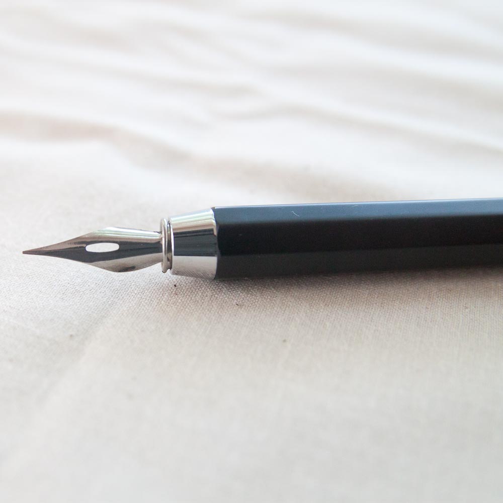
The pen comes with a fairly flexible nib (totally unlabelled so I have no idea what it is) but it will hold any standard nib so you can replace it with your favorite nib like a Zebra G, Nikko G or anything else, vintage or modern. I do recommend scrubbing the nib with standard white toothpaste to remove the oil from it in order get inks to adhere to it before using it. Lindsay over at The Postman’s Knock has several other tips for removing oil residue but toothpaste has become my recommended method.

I used the Kaweco Special Dip Pen to annotate all my new ink swatches from all the pen shows I’ve gone to this summer. I also used my favorite paintbrush for the ink swashes. It’s a Silver Black Velvet #6 round watercolor brush and the swatches are done on the last of my Maruman Mnemosyne Word Book cards. I don’t know what I will do when I run out of these cards.

Overall, the Kaweco Special Dip Pen is more expensive than a Speedball plastic nib holder but I think its worth it. If you’re the kind of person who would drop $100+ on a fountain pen than $36 on a dip pen nib holder probably doesn’t seem crazy. The Kaweco Special Dip Nib Holder feels nicer and weightier in the hand and looks much better too than a cheap $7 plastic one. If you know someone who uses a dip pen, it would make a good gift too.
The Kaweco Special Dip Pen is available from JetPens.
DISCLAIMER: This item was sent to me free of charge by Kaweco for the purpose of review. Please see the About page for more details.