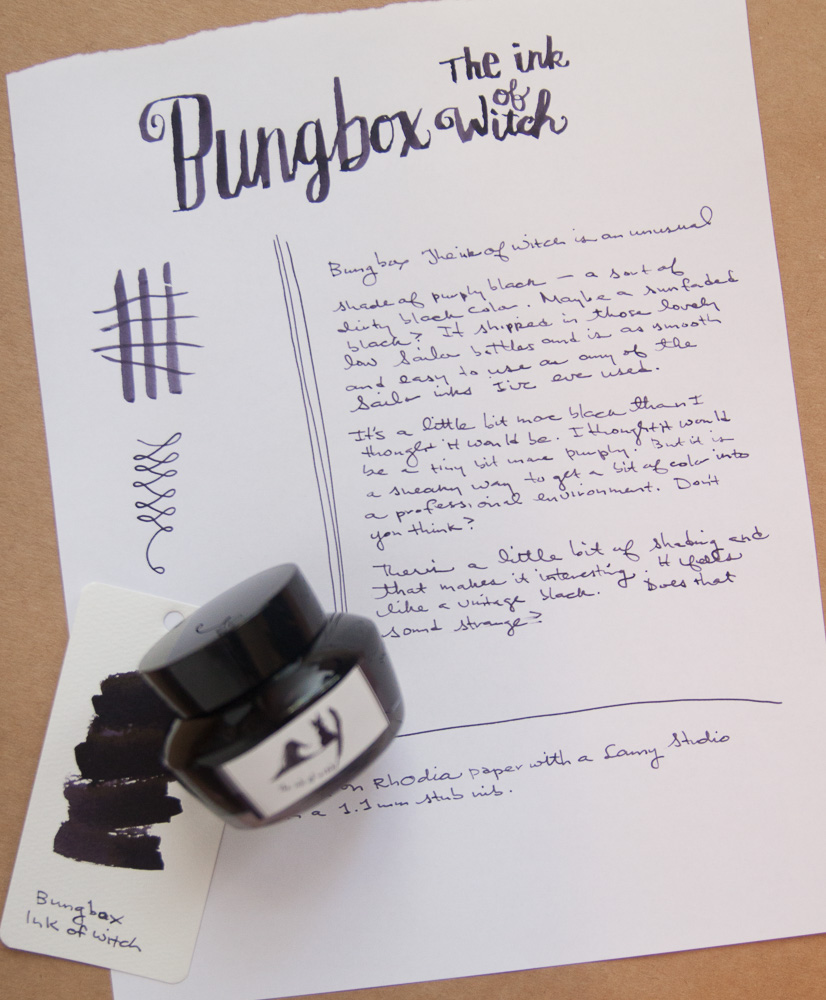
Book Review: The Life-Changing Magic of Tidying Up

The Life Changing Magic of Tidying UpIn the wake of the new year, I decided I might try to read up on how to get more organized. One of the first books to come into my field of vision was The Life-Changing Magic of Tidying Up by Marie Kondo. Its a thin volume with a very repetitive set of instructions on how to best de-clutter and the order in which to tackle the task.

As I was reading it, there were some keen observations. I specifically liked thinking about her suggestion to “hold each item in your hands and ask yourself if it brings you joy”. While this is appealing in theory, the practical application is not. I read Tif Fusel’s review of this book and her husband’s response: “my leaf blower and lawn mower bring me no joy, i do not need to hold them in my hand to know that. shall i thank them, then get rid of them so we can slowly be buried under a pile of yard waste?” And this, is the crux of my issue with the whole book. There are lots of things that we keep in our homes that bring us no joy — snow shovels, for example — but that we need to keep for those moments that require their use. We might be required to dress in a certain way for work that may provide us with no joy but is required like a suit or uniform. Though I suppose from the book, we could glean that we should limit how much this un-joyful stuff should take up in our homes and our hearts.

However, we also keep many things in our homes that bring us no joy, that we hold onto out of obligation (“But grandma gave it to me for Christmas!”) and things we think we might need one day (I really want to learn to arrange flowers, needlepoint, whittle, play the harp, etc). These are the things that Ms. Kondo is trying to convince us to unburden ourselves of keeping.

There is a large focus in the book about weeding out excess clothing, books and papers that is at the core of many people’s personal clutter. She did not go into any detail about how to balance the clutter of work-at-home offices or anyone with a specific hobby that may occupy a good deal of space. She filed all of this in her “miscellany” category which I think is a bit short-sighted.

As a product blogger, much of my excess is in the form of piles of notebooks, pens, inks and other office supplies.  I have some ideas about how to remove a lot of the excess from my stash but it will require time and effort on my part which is why I haven’t tackled it yet. Sadly, for me, its not laziness but a limit to the amount of time I have to accomplish MANY tasks and a need to prioritze which gets done this week and what has to wait. I think that applies to many people as well. Whether its cleaning out a clothes closet or sorting through bank papers — how much time to we have to devote to these tasks rather than spending time with friends, family or a favorite book.

Ms. Kondo also talked repeatedly about removing bags upon bags of garbage. The environmentalist in me got itchy at the idea of all this stuff ending up in landfills. As I attempted to integrate some of her ideas into my own life, I made bags and boxes for charity and put my paper shredder to use so that most of the paper materials I got rid of could be recycled. I’ve already taken three bags to charity and four boxes to the second-hand bookshop and that’s just the tip of my efforts to get rid of excess.

In the end, the perspective that she provided about thinking through what we own and why we hold onto things was enlightening. And her parting message is that by clearing away the detritus — those unloved, ill-fitting, no-longer-interesting things from our lives — we leave room for new things and new experiences. This is that part that was appealing.

Link Love: Pens at the Ready for February

Link Love Link MascotThis week is International Letter Writing Week which is a perfect time to tackle those thank you notes and dust off your letter writing skills in preparation for February which is LetterMo/A Month of Letters and InCoWriMo. So, I thought I’d include a few inspirational posts in honor of this the lettery-ist time of the year.

Fountain Pens:

Ink:

Pencils:

Notebooks & Paper:

Other interesting stuff:

Review: Platinum Preppy 0.2 EF Fountain Pen

Platinume Preppy EF 0.2 fountain Pen

Whenever someone mentions a cursory curiosity in fountain pens, I recommend trying a Platinum Preppy. Personally, I find the nib to be fine enough on the Platinum Preppy not to scare away a new user accustomed to rollerballs, ballpoints and the occasional gel pen. And at $4, its the financial commitment equivalent of a venti mocha at Starbucks. But now, there’s another option: the Platinum Preppy 02 EF, an even finer version.

For me, the Preppy 02 is a good entry into the world of needle fine Japanese fountain pens. And its cost is a more like a venti peppermint mocha with an extra shot ($5). So, still… not a huge financial commitment.

Platinume Preppy EF 0.2 fountain Pen

With the introduction of the Preppy 02 EF, Platinum is re-branding the whole Preppy line. Instead of having tinted nibs to match the ink colors, all the Preppies will have silver tone nibs and the ink colors will be indicated by the design details on the pen. I preferred the aesthetic looks of the old Preppy design but I’m willing to overlook the aethetics for a $5 EF Japanese nib. Because, let’s be honest, Platinum decided to use the mass market disposable pen approach to the graphics on the new Preppy line. I’d rather the clear plastic show the inner workings than mucking up the whole pen with silvery printed graphics. But that’s just me.

Platinume Preppy EF 0.2 fountain Pen

If you’ve not tried the original Preppy, its a fully plastic pen with a Platinum fountain pen cartridge. Some people do modify these pens to be eyedropper pens though I don’t know if the new design will support this (I haven’t looked for holes in the plastic that would inhibit this use). Its a fairly lightweight pen with a cap that will post to give a bit more weight to the pen. The clip is also plastic but its pretty sturdy for being plastic and looks similar in construction to the original Preppy.

Platinume Preppy EF 0.2 fountain Pen

In writing tests, this pen performed exceptionally well. I used the stock cartridge that shipped with the pen and started writing. It is a tiny bit scratchy — not rough in writing but I could hear the sound of my writing on the paper as a “scritch, scritch” which I suspect is a result of how fine the nib is. But I really like it. I’m a little ashamed to like writing with a $5 pen so much when I have a cupboard full of much more expensive pens. But this is a good pen to try if you’re curious about an ultra-fine Japanese nib. It won’t be for everyone but at $5, its worth taking it for a test drive.

I purchased mine from Goulet Pens but other retailers are starting to stock the Preppy 02 EF so you have options. In the meantime, if you preferred the look of the original Preppy pens, go grab them now because all the Preppy line will be replaced with the silvery painted versions soon. I suspect the markers and highlighters will also get the updated look. Ugh.

Did you know…?

housekeeping

Just thought I’d provide a little housekeeping info here.

I recently updated by username on Instagram. If you’d like to follow me there you can find me @wellapptdesk. Be prepared for pens, paper, knitting and the occasional cocktail photo.

If you don’t already follow me on Twitter, you can also find me as @wellapptdesk.

There is a Facebook page for the Well-Appointed Desk though I’m not a frequent user of Facebook. I check in here about once a week and will reply to comments.

And finally, if you have any questions, comments or suggestions for the site, please use the Ask The Desk link at the top of the page. I reply back to almost all emails, unless you’re that Prince from Nigeria – I told you, man, its over between us!

(image borrowed from Envision The American Dream)

Show & Tell: Field Notes DDC Factory Floor Edition : “Simple Minded Silver Streak”

Field Notes DDC Factory Floor Silver Streak

This is my first DDC Factory Floor edition of Field Notes. These were released for the Draplin Design Pop-Up Store in Portland but a handful were made available on the Draplin website. I was able to score two 3-packs.

I’m feeling oddly collector-y about these. Usually when I buy two sets of Field Notes, I give one set to my husband and as soon as he saw these he was all grabby hands and I swatted him away.

Each of the three books has a different color cover: metallic silver, orange and a copper-y color made from combining the orange and silver inks. Inside is bright white 50# paper with orange grid ruling. All of this information I’ve had to cull from the internet because I can’t bring myself to break the shrinkwrap seal yet. For a more in-depth review, check out the Gentleman Stationer who had the decency to take these out of the wrappers.

Field Notes DDC Factory Floor Silver Streak backs

In retrospect, I think I should let these be opened and used in the manner they were designed to be used. Leaving them in shrinkwrap indefinitely is no way to live. I think in 2015, I hope to stop “collecting” and start using the Field Notes I’ve accumulated.

How about you? Collector or user?

Kickstarter: Code & Quill Notebooks

Kickstarter: Code & Quill Notebooks


Code & Quill Notebooks
are a new Kickstarter project that was designed to appeal to anyone who needs to combine note taking with sketches or more freeform content. The “indentation rule” is particularly unique in that it provides tick marks along the line to help with indentation often used in coding. I’ve seen this type of indentation in some Japanese notebooks as well to space kanji characters properly but it has not appeared in any western notebooks that I know of.

The Code & Quill notebooks are available in either softcover or hardcover editions. Both books are 5.5″ x 7.7″ (a little smaller than A5, AKA approx. US half-sheet). The softcover books feature 300gsm glossy covers and the hardcover books are covered with a textured PU material which is a leatherette coated with polyurethane for added durability. I like the stitched labels on the cover that give some subtle, unique branding to the books.

Inside, both versions feature 100gsm eggshell white paper with minimal grain. On the left hand side of each spread is a dot grid pattern and on the right hand side is “indentation rule,” both printed in light gray to provide a visible guideline but not so dark as to inhibit visibility. The paper has been tested with a fine nib Lamy AL-Star with Noodler’s Waterproof black, Noodler’s Heart of Darkness and Lamy black. The fountain pen test done thus far met the expectations of the creator.

The books were designed here in the US but the final production will be in China in order to meet demand and keep prices competitive. All production will be closely monitored by the US design team to meet their exacting standards.

The softcover edition is called the Traveller and a pledge for one notebook starts at $15. The hardcover edition is called Origin, and a pledge for one starts at $20.One of each is $30. US backers will receive free shipping but international backers will have to cover shipping.

The Kickstarter launch ends Feb. 5 so there’s still time to back this project if its of interest to you.

Kickstarter: Code & Quill Notebooks