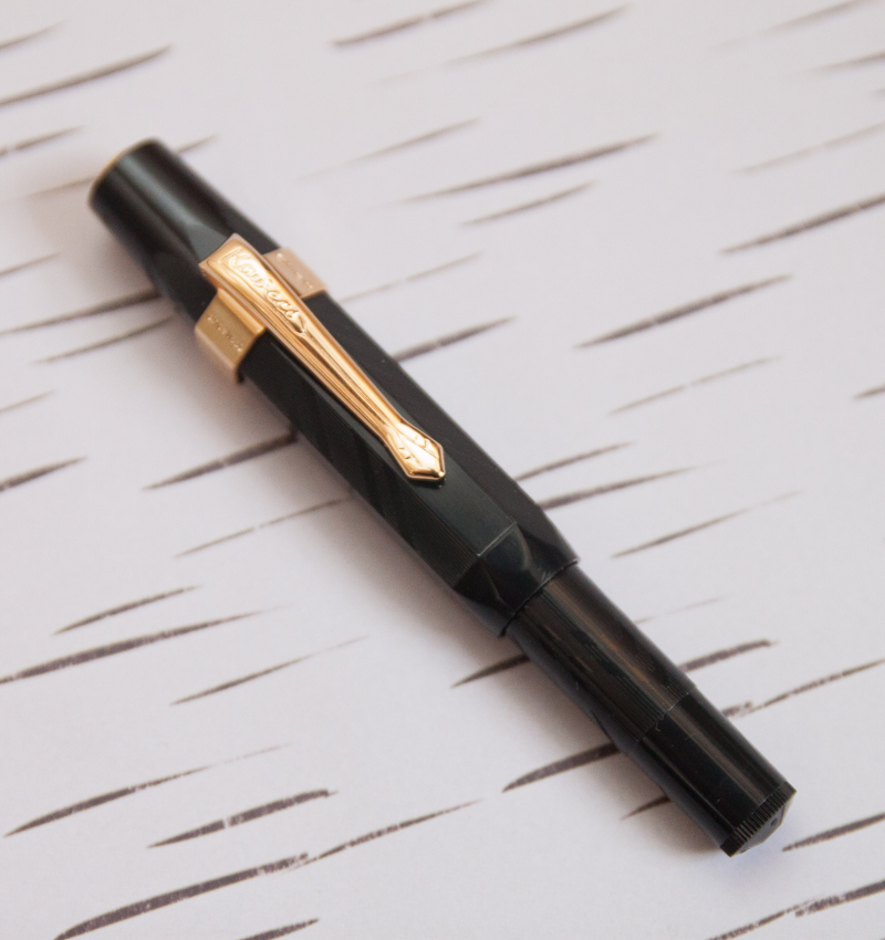
Back in November, I saw the new Sport N Clip style clip from Kaweco and thought that it would be perfect with my well-loved Kaweco Sport Guilloch 1935 pen. I ordered the clip and, somehow, in between the time I ordered the clip and it arriving, I lost my Guilloch 1930 (see comments for explanation of naming incosistencies). I looked high and low thinking I might have left it in a pocket but after a month of searching I had to admit it was gone for good. Luckily, Fontoplumo still had the pen in stock and my darling husband worked with Frank to get me a replacement in time for Christmas.
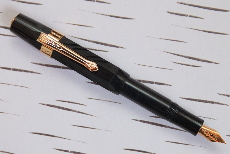
What makes this pen particularly special is the geometric lines engraved into the plastic. Its a technique called guilloché that has been used for centuries to create decorative patterns into metal, wood and other materials. The way that the engraving was done on this pen is very reminiscent of art deco designs hence the “1935” name. The engraving is on the cap and on the back half of the barrel though with regular use, I wore most of the guilloché off the body of my previous pen. I was not gentle with the previous Guilloch 1930 though. It spent most of its life in my pocket or tossed in my purse so it held up well despite the abuse.

This one, though, I think will get a slightly nicer treatment. Maybe a nice carrying case this time?
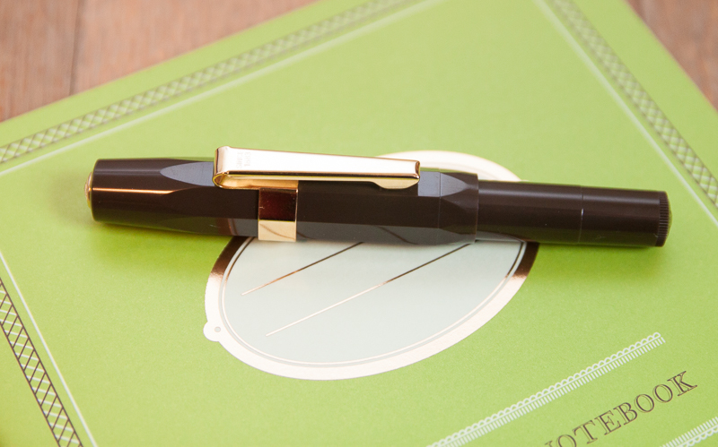
The addition of the curved, retro clip only adds to the overall vintage look of this pen, I think.

Writing with the new Guilloch are consistent with the previous model. I got this one with the F nib rather than the EF nib because I don’t notice a huge difference between the two on the Kaweco line.
If you’ve got a soft spot for a truly vintage looking pen with all the modern conveniences of a cartridge-filler, this is a pen to add to your collection. The price is reasonable and the stocks are limited.
The Kaweco Sport Guilloch 1935 is still available through Fontoplumo for 22,95 € (about $26US).
PS: The Private Reserve Sherwood Forest ink cartridge I used was kindly sent to me by the fine folks at Lanier Pens.
 Fountain Pens: