
There have been a lot of sturdy little boxes that entered my life in the past couple of weeks. Let’s just say that the Pen Addict Podcast Annual Gift Guide episode was hell on my wallet.

Inside the simple paper sleeve with the big P logo on it was a clear window box so that I could marvel at my new Pilot Custom 74 fountain pen before I could even touch it. I purchased the clear demonstrator model with the fine nib during one of Pen Chalet’s epic discount sales.

The packaging was sturdy without being ostentacious which seems appropriate for a pen like this.
Because most of the pen is plastic, its quite light overall. Its just 15gms filled and uncapped and 24gms posted and filled. I found the pen comfortable to use unposted at 5″ long. With the cap posted, the pen is almost 6.5″ long which is a little unwieldy for me. Its not a particularly wide body so I think its a good option for people with smaller hands or looking for a pen comparable in diameter to a Sharpie marker. The Custom 74 might be a smidge wider than a Sharpie but you get the idea.


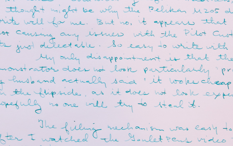
The pen feels quite sturdy but I wonder if the demonstrator clear is not as pricey looking as it could be. When my husband saw it, he said “You paid how much? It looks like a $20 pen!” I think Mike’s blue one looks a little fancier than the clear. I did explain that really what I paid for was the 14K nib but it would be nice if it actually looked like a higher tier pen. That said, let’s talk about the performance.

I immediately filled the pen with Kaweco Paradise Blue using the CON-70 converter that shipped with the pen. Its an unusual cartridge converter that somewhere between a vacuum mechanism and a push-button system. I’ve never had a converter like it. To see it in action, check out Brian Goulet’s video on filling a CON-70.
There is lovely etched filigree on the nib and it looks very fine indeed. The nib alone looks like a million bucks.
After a less-than-stellar experience with the Pelikan M205 with the gold nib that Mike loaned me, I was a little concerned that the gold nib on the Pilot would be equally underwhelming. Boy, was I in for a surprise!

On my standard Rhodia test paper, it writes like buttah. I felt so relieved! The Paradise Blue ink shaded nicely even with the narrow fine nib. And it is fine, but because there is a little spring in the nib, I get a little line variation too. I am definitely starting to understand why this is such a popular pen.
This sample above was written in my standard, over-handed left-handed writing method. Looks good but I wanted to try to flex this a little bit which required trying a more “under handed” method… and by that, I mean I needed to change my writing position and work from below the line I’m writing on.

I was able to get some pleasing shading with just a little bit of pressure. I did not flex a lot since this is not really a flex nib pen per se and I didn’t want to break the tines. Overall, the ink color is darker for me when writing from below the line but the smoothness was the same. With a darker ink, I think I wouldn’t notice much color difference between overwriting and underwriting.
I’ve been loving this pen. I’ve used it all week on office paper, in my Leuchtturm1917 notebook, on Rhodia paper and pretty much anything else that passed in front of me this week. The fine nib even held its line cleanly on cheap office paper which was awesome. Its a great introduction to 14K nib modern pens and has restored my faith in 14K nibs for sure.


