I know this is a little early but with Thanksgiving and the official Black Friday start to holiday shopping just around the corner, I thought it was as good a time as any to talk about how awesome stationery supplies are as stocking stuffers.
Whether you are filling a stocking for a pen collector or your cousin, there is a stationery option of everyone. With washi tapes and stamps, you can find something that aligns with their hobbies or interests. Do they bake? There’s a washi for that! Love cats or dogs? There’s stamps and stickers for that!
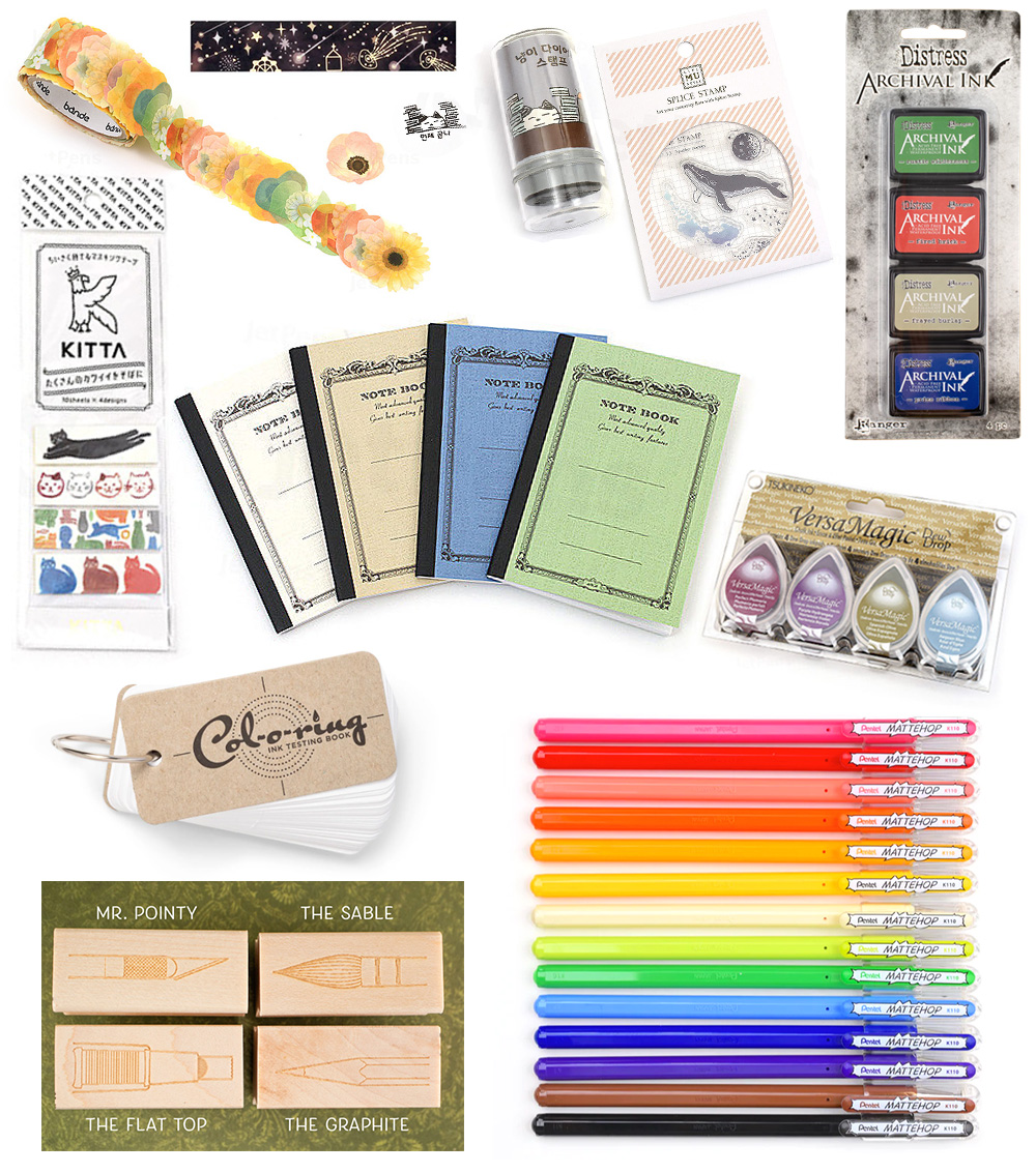
If you are participating in a gift exchange or Secret Santa, a mini notebook and a good gel pen would make a great gift.
Mini Notebooks:
A7-sized notebooks are the perfect size for pocket, bag and stocking. The Apica C.D. A7 Ruled Notebook A7 (4-Color Bundle for $7.50) will fill several stockings. Add in one of these Pentel Mattehop 1.0mm Gel Pens ($2.50 each) to make a fun little gift set. There are so many other options but if you’re shopping for a pen friend, you can’t go wrong with a Col-o-ring Ink Testing Book ($12 for 100-sheet pad)!
Washi tapes & Flake Stickers:
It would be impossible to list all the possible options for washi tape and flake stickers but here are a few of my favorite right now. I love the Bande Washi Tape Sticker Roll ($6 per roll and 12 designs to choose from). These are “flake stickers” so they come on a roll like washi tape but are individually die cut designs and there are lots of choices from flowers (shown) to toast and pancakes and snowflakes, soap bubbles, and more. I think just about anyone would like a roll of these.
King Jim Kitta Washi Tape ($4.55 each and dozens of styles available) are sold in little packets that fit inside a planner pocket or tucked into a backpack pocket. These are small, pre-cut strips of washi tape on peel-away paper so they are easy to use on the go. There are even sticker binders to hold the many, many packets you may collect or give as a gift.
The BGM Washi Tape ($6.50 per roll, lots of designs to choose from, Shooting Star Deep Sky design shown) are painterly and really varied.
Rubber Stamps & Stamp Pads:
I love the Iconic Diary Stamps ($6.40 each, 26 designs available, “Finishing Work” shown above). They are self-inking and have the kookiest line art drawings on each one. They add some humor to anyone’s day-to-day note taking and planning.
MU Clear Splice Stamps (start at $4.40, Whale & Moon set no. 13 shown, don’t forget to add a clear acrylic block, starting at $4.60) are sets of clear acrylic stamps that are stuck to a thin piece of plastic and can be peeled off and attached to an acrylic block to provide stability and stamping. They are less expensive than woodblock or self-inking stamps and store in a smaller space so they are good for travel.
If you are shopping for someone who loves art supplies, the The Daily Grind Series 3: The Art Dept.
(four designs, $11.00 each) are a great option.
If you’re purchasing a rubber stamp. be sure to grab a stamp pad. If you’re looking for water-soluble stamp pads, I recommend the Tsukineko VersaMagic Dew Drop Ink Pad Sets (starting at $11 for a 4-pack, Jewel Box Set shown). For water resistant colors, I recommend Ranger Tim Holz Distress Archival Ink Stamp Pad Mini Kits (Set of 4 for $14.00, multiple different sets available, Kit No. 6 is shown).
What are your favorite stationery goodies to give as a gift? Which of these items do you hope to see in your stocking?
DISCLAIMER: Some items included in this post are from affiliate vendors (we receive a small subsidy for any products ordered from some vendors) and other links are self-promotion links to our own shop. Please see the About page for more details.


