

Jeans. Who would think to make an entire line of inks based on the color of jeans? You probably see blue jeans multiple times in a day and each pair of these pants are typically unique in color, pattern, style, and fit, but they are so common that they fade into the background in our minds.
Well, Taccia has recently presented an ink lineup called Jeans. I obtained samples of each from Vanness Pens (thank you for remembering to put in the last color that I had forgotten to add to my cart!) so I could show all 7 inks together, hopefully making it easier to decide which ink (or inks) are your favorite.
The seven inks in the Taccia Jeans collection are Grey, Light Washed, Classic Blue, Indigo, Dark Washed, Navy Blue, and Black. I can’t tell you how disappointed I was to find no Acid Washed ink; probably wouldn’t have been a great color, though.
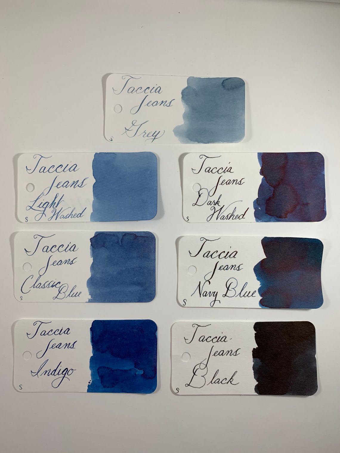
I was surprised when searching my ink swatch library for similarly colored inks; there were a few that had no good comparisons! Taccia Jeans Grey was the first in this category. The color of the swatch is similar to Montegrappa Dark Blue and Diamine Prussian Blue, but Grey is much lighter. My first thought was to compare it to other greys in my library, but it was much too blue to compare in that category. I was impressed at the legibility of the ink since it is so light. Grey is quite easy to read clearly.

Taccia Jeans Light Washed was another shade that was tough to match. Montblanc Miles Davis is brighter but has the same undertones while Organic Studios Wedding Bells is a bit more purple.

Robert Oster Grey Seas and ColorVerse Saturn V are very close to Taccia Jeans Classic Blue, but the Taccia ink is dustier and a few shades lighter than either.

Indigo shows signs of a light sheen (almost haloing in writing, but not quite). Again the Taccia ink is lighter than Robert Oster – School Blue this time.

Taccia Jeans Dark Washed is a great blue/black ink, very close to Manyo Kikyou. Dark Washed shows even more sheen than Indigo, similar to the level of sheen in Diamine Blue Velvet Cake.

My favorite of this batch was Navy Blue. Again, sheen is present but Navy Blue also brings shading. The lighter areas of Navy Blue are a close match to KWZ Blue #6, an iron gall ink, but Navy Blue shades to darker blue with green showing up in heavier applications.

I was surprised at Taccia Jeans Black; I was expecting more of a very dark blue. That brought to mind Kyo-no-oto Nurebairo (not actually a black ink but a super dark blue) but Black is definitely a more neutral black than blue. Monteverde Onyx is a close match here.

The above seven inks have the same characteristics that I have found in all other Taccia inks. Easy to use, a touch on the dry side, wonderful on Tomoe River paper. The 40mL bottles are sold for $18 each. Since my typical daily outfit includes jeans, I’m wondering if I should match what I wear each day to the color of my jeans. Then would spilled ink just blend into my jeans? I think it’s worth experimenting!

Thank you to Davina at Vanness for the beautiful photograph!
- Swatches: Col-o-Ring Ink Testing Book ($10)
- Ink: Taccia The Jeans Collection (40mL, $18)
DISCLAIMER: Some items in this review were provided at a reduced rate for the purpose of this review. Except for the Col-o-ring which was provided to me by a wonderful person who pays me to write blogs by keeping me supplied with Col-o-rings. Please see the About page for more details.