


Two of my favorite things: Colorverse ink and anything featuring my hometown: Chicago… how could I resist? If I were to guess what color someone might create for an ink that embodies Chicago, I am not sure I would guess a dark purple/brown with shimmer particles. I might have thought of the sky blue from the stripes on the city flag, or red to emulate the Fire/fire. Green for the St. Patrick’s Day river dye? Charcoal grey for the color of some of the more recognizable skyscrapers (Sears/Willis Tower, the Hancock building, or the Lake Point Tower)? Once I started playing with the ink, I was more convinced that Colorverse made an interesting choice for a color to embody Chicago.

The shimmer particles in the Chi-Town ink ($12.50 for a 15ml) are more iridescent than gold or silver which is more commonly found in shimmer inks. The particles look blue or green depending on the light, paper or angle.

In the close-up above the ink looks more purply than it did in person which, because of the gold/brown sheen looks more brown in person, at least to me. YMMV.
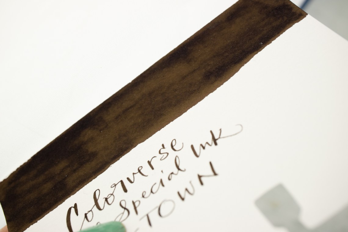
You can ssee in the close-up above how the ink can look sheen-y brown-black rather than purple.

My initial ink comparisons aligned CHi-Town with dark brown inks but on second look, I tried purple and more predominately black inks. I think its safe to say that Chi-Town is more of a purple/black with an emphasis on the BLACK.

Pent Kotobo No Iro Black Lizard and Diamine Winter Miracle are more purply when compared to Chi-Town. Birmingham Pen Co’s Philadelphia Friend Circuit and Coking Coal are closer though Coking Coal is a cooler blue grey undertone and Fried Circuit has a warmer, almost brownish undertone.
So, like the city of Chicago itself, this ink is a conundrum. Some people see Chicago as “the second city” some city it as the jewel of the midwest. The ink is similar. You see what you want to see. Some will see shimmer like taillights on wet pavement, others will see muddy waters or the dark sky of a crowded city. How do you see Chicago? Both the ink and the city?
Tools:
- Paper: Rhodia Uni-Blank No. 16 with 6mm guide sheet
- Pens: Midori bullet pencil modified dip nib holder with Zebra G titanium nib ($33.50 per 10-pack), Acrylic dip nib pen (Approx. $15), James Finniss Serendipity nib holder ($79AUD)
- Swatches: Col-o-Ring Ink Testing Book ($10) & Col-o-dex Rotary Cards ($15)
- Brush: Silverwhite 1500s Round #2
DISCLAIMER: Some items included in this review were provided free of charge for the purpose of review. Some items in this review were purchased with funds from our amazing Patrons. You can help support this blog by joining our Patreon. Please see the About page for more details.
Wow. Chicago is so energetic and vibrant, and Lake Michigan’s vast blue-green surface is the constant, shimmering presence that forms the entire eastern border of our city. I’m sorry to leave a negative comment, but I don’t understand this ink representation at all.
While I agree the color isn’t what I would have chosen, the ink maker is Korean and maybe this is their interpretation of the Windy City? Robert Oster’s Cities of America interpreted Chicago as a smoky blue color and Papier Plume created a silver shimmer grey to represent the Bean (Cloud Sculpture). So there are other options.
Yes, I remember the Robert Oster, too. It seems like our city is sometimes still represented through Industrial Age type imagery.
I think of “the bean”. Could it be Lake Michigan on an overcast day? I like your idea the ink is for skyscrapers.
On a different ink note, I’m waiting on Sailor to make the state of Missouri ink.
I like the thought of a connection to skyscrapers or Cloudgate (i.e., The Bean 🙂 ).
Also, Chicagoans don’t say “Chi-Town,” but that’s another story. 😉
Nope. I was gonna mention it but it felt like a can of worms that wasn’t worth opening.
You’re probably right! Sorry for saying it.
No problem. There are city-specific nicknames that are used by marketing and tourism boards that would never be spoken by locals. We could probably start a list!