
Today is July 4th and Independence Day in America. There will likely be a few sales, lots of watermelon and fireworks. Wishing you a happy 4th!

Today is July 4th and Independence Day in America. There will likely be a few sales, lots of watermelon and fireworks. Wishing you a happy 4th!

At the beginning of the year, I posted about my planner set-up for the year which included the Midori B6 Pocket Planner in the Clover design ($23.50, out of stock but a Birds edition is still available) tucked into my leather B6 cover from Bassy & Co ($81 and up) with my Stalogy Editor’s Series 365 Days ($21) everyday planner and note-taking notebook.

Since the beginning of the year, the pockets of my planner have become filled with an assortment of stickers, postage stamps and washi tape. I’ve gotten into collaging on my daily pages so having a few stickers to add along the way is a great option.
I am still loving the B6 size for my planner. It’s not as small as an A6, which I often felt like I needed more than one-page-per-day, but not as intimidating as an A5 which always seemed like too much space and too large a notebook to tote around everyday. If you haven’t tried B6 yet, I highly recommend it as the Goldilocks of notebooks.

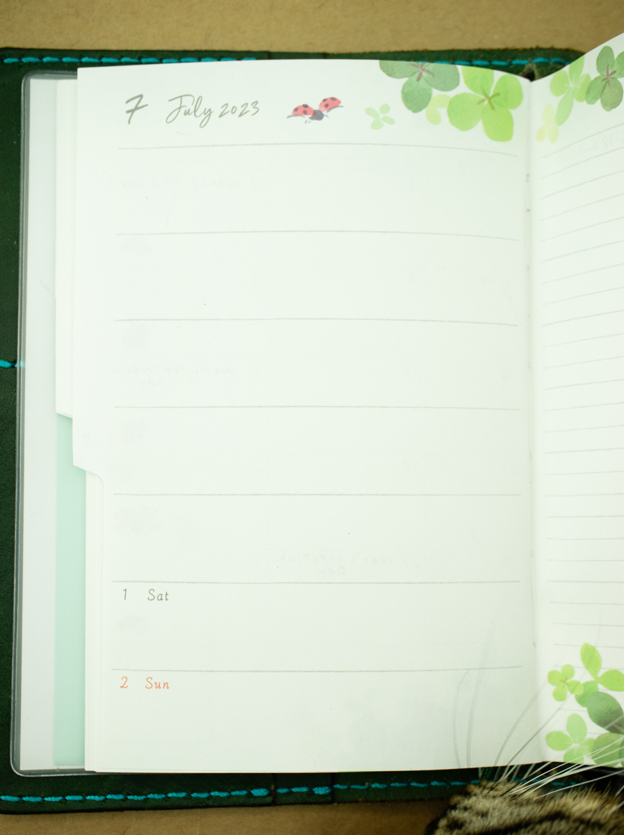
This image above shows that I’ve filled about 2/3rds of the Stalogy daily planner and evidence of collage-y bits can be seen from the edge.

I added the Midori pen clip to the back of the Stalogy at the beginning of the year and have managed to keep it for six whole months without losing it. Good news since my rare Sailor ProGear Slim Stargazer has been riding around in the loop all year.

I mark my place each month and each day with the Midori gold Chiratto Index Clips ($8.50 for 8 clips). It makes getting to my current spot fast and easy.
I’m getting some mileage with the monthly pages to keep track of silly holidays like Graham Cracker Day (July 5), travel, pen shows and birthdays and such but I am not using the week-on-two-pages like I thought I would.
I had thought I would utilize the page on the right of the week-on-two-pages in the Midori for work-related tasks and notes but I have ended up keeping a notebook at work for these tasks and the pages go largely unused. Its extra sad because I really like the paper in the Midori Pocket Planner and the little illustrations throughout are cheery.

The only creature in my house that uses the ribbon bookmark is Apple. He thinks it’s delicious.

In the Stalogy, on days without a lot of activities (like a Sunday when you discover you have Covid-19), I have started adding collage elements with washi, stickers and some rubber stamps. I also bought a Polaroid Mint mini-printer to add the occasional photo to my planner.
I often treat my planner more like a log book of what I did, what I ate, where I went, who I saw, what I read, watch or listened to, etc. so adding photos in is a good way to log activities. If you want to be able to add photos to your journal or planner, many people recommend the Canon Ivy which is currently available. The Polaroid Mint has been discontinued. Both the Mint and the Ivy use Zink 2″ x 3″ printer paper. The color output is not great but the printer uses instant film technology and the printers don’t need ink cartridges making it a little easier to use. So, it makes fun, little retro-looking images that add some much-needed personality to my planner.

Usually, on Sundays, I try to pre-decorate a few pages. Since I am doing a (sort of) page-a-day for my planner/journal/logbook I just add a few decorative elements to add some interest for the week but I am not locked into using a whole page for one day. Some days, I might use two or more pages. I’ve found this open method so much easier for me since there is no pressure from day-to-day. Some days are super busy and active, and some days I skip altogether.
I don’t know how to solve for the largely unused Midori Pocket Planner. I thought about removing the monthly pages and pasting them into the Stalogy but I would want the whole year’s worth of calendar pages so where doe I put them? In the back altogether? At the beginning of each month but what about later months?
I would like to streamline a little bit but I haven’t figured out the best way to do that. As it is right now, the book is quite chonky so I suspect I will try to reduce the bulk I carry on a daily basis a bit.
How’s your planning/journal/notebook set-up serving you? Have you needed to switch it up?

Apple insisted on hanging out with me while I photographed this post so he wanted to put his paw stamp on this post. It’s “Apple-approved.”

The Rainforest Retro51 ($59) is an exclusive Retro51 design from Luxury Brands of America. Limited to just 500 units, the pen is a partnership with the Rainforest Trust, a leading rainforest and endangered species conservation organization. With each purchase of the Rainforest Retro51, a portion of the proceeds will be donated to the Rainforest Trust to help protect and maintain the animals and habitat for the future.


The design is a multicolor screenprint in lush greens on a black background with animals hidden in the greenery including showy parrots, sloths, monkeys and wild cats (my animal identification might be incorrect so if you know more accurate descriptions, please leave them in the comments).

My favorite part is the frog end cap. He’s such a cute little guy who peers at you every time you open your pen case or sticks out of your pen cup.
The classic Retro51 Tornado design with its Schmidt rollerball refill is always a go-to at the Desk for on-the-go writing and especially for gateway gifts for loved ones. If you have a friend or family member who loves the tropics and rainforest conservation, grab one of these before they are gone.
DISCLAIMER: The items included in this review were provided free of charge by Luxury Brands of America for the purpose of review. Please see the About page for more details.

Taisho Roman inks are a new line from Teranishi and I’m continuing on this week with another two colors from the lineup. If you missed part 1 of this review, make sure to go back and read it!
I discovered the entire Teranishi ink brand at St. Louis Art Supply where the ink is offered in 40mL glass bottles for $21.50 (about $0.54 per mL) or in 1.5mL samples for $2.50. Because I have used samples for this review, there is no photo of the actual bottles but refer to part 1 for a look at them.

Taisho Roman Modern Red is a well-saturated red with a hint of shading and a touch of sheen occasionally.
However, I was surprised at how Modern Red reacted to various types of paper. Sometimes this ink shows as a bold, bright red. Other papers reveal the orange and brown undertones of the ink. The ink can also show very different textures on each paper.
Teranishi Taisho Roman Modern Red on Cosmo Air Light 83gsm paper:

Teranishi Taisho Roman Modern Red on Tomoe River (TR7) 52gsm paper:

Teranishi Taisho Roman Modern Red on Midori MD paper:

Teranishi Taisho Roman Salon de Violet is the second ink in today’s review. This purple also has a bit of shading and plenty of blue in the undertones.

Teranishi Taisho Roman Salon de Violet on Cosmo Air Light 83gsm paper:

Teranishi Taisho Roman Salon de Violet on Tomoe River (TR7) 52gsm paper:

Teranishi Taisho Roman Salon de Violet on Midori MD paper:

Which of the Teranishi inks is your favorite?
DISCLAIMER: The items included in this review were purchased by me for the purpose of review. Please see the About page for more details.

As we head into July, stationery and pen fans tend take a moment to rest, enjoy the summer holidays and then re-evaluate their planner or other analog set-up. It’s just how we roll. This week, several posts feature reviews and reflections on goals and stationery plans that were set into motion in January. How have your stationery or planner approach changed since January?
Also, two more sites have taken time to play along with our #21penquestions tag. Some great answers!
(although some people — who shall remain nameless– don’t deserve it!)
We need each other. Please support us by joining our Patreon and be sure to shop with our sponsors and affiliates and let them know you heard about them here. Your patronage supports this site. Without you, we could not continue to do what we do. Thank you!
When is a Platinum Preppy not a Platinum Preppy? When its a Muji Fountain Pen (price not available online). In the past, I’ve acquired other pens from Muji that were “white-labelled” but none more perfectly fits this description than this Preppy.

The exterior is entirely opaque white plastic with a clear ring at the cap band. The clip is integrated into the cap and is smooth straight line with no embellishment.

The only branding is the classic “p” and the nib width indication of “03” which is the fine nib.

The pen performs just as well as a regular Preppy but with a simple, clean exterior. The Platinum nib, as always, is smooth and the snap cap makes it a great on-the-go pen. If you have access to a Muji store, I would recommend looking for this gem.
This pen was sent to me by a dear friend.
A little over a month ago Kansas City welcomed a new stationery store, May Day Paper and Post! While we do have a pen store and the ubiquitous Paper Source, this is an indie stationery store, one that I’m delighted to support. May Day bills itself as a place for all things snail mail.

This past Friday while Ana was at the St. Louis Pen Show, I drove up to check it out! The store is super cute, set in midtown Kansas City. It has a fun, curated collection of greeting cards, notebooks and notecards, journals, stickers, mugs, wrapping paper and other giftables. To be clear, this isn’t a pen store. They did have a fun selection of Gelly Roll pens and a few roller balls and ball points, but it’s primarily about the paper. It’s whimsical, and the owner definitely has a sense of humor.


I was restrained but found a few cute cards on the long wall. My selections were from Black and White and Red All Over and A Zillion Dollars. Both cards are printed nicely, and use recycled content for both the cards and envelopes.

I saw many of the familiar notebooks (Maruman, Kleid, Leuchtturm, and more), plus some from companies I hadn’t heard from. I did pick up one notebook – I’ll share my thoughts on it next week!
Overall it’s a cute shop, and if you’re in the Kansas City area, you won’t be disappointed if you stop by! And if you’re looking for a fun new shop to support, you can also shop online!
P.S. If you stop by, make sure you give shop dog Lucy lots of pets!