In a recent JetPens shipment, I purchased the Uni Color 3 Erasable Multi Mechanical Pencil 0.5 mm in Pure White ($8.25) which is a 3-color multi-pencil. While I suspect you could “build your own” multi-color multi-pencil by purchasing several pencil inserts for a multi-pen, this is a simpler and probably less expensive route for carrying more than one color pencil at a time.

While three color options might not be enough for most people, for quick sketches, proofreading or grading, this might be a perfect solution.
The mechanism for the Uni Color 3 works the same as other Japanese multi-pens. There are three slides at the top of the pen (one being the clip) that will reveal a tip when pressed down until it clicks. Tapping the slide repeatedly will advance the lead, holding down the slide will allow you to push the lead back up into the housing and clicking on any other slide will cause the revealed tip to spring back into the housing.

Because the leads are 0.5mm, if they are out too far, they will break so be careful not to expose too much lead or press too hard when using them.

I’m happy with the color of the red and blue leads though it is fairly easy to find 0.5mm red or blue leads if I wasn’t. The orange, which is more unusual is a bit lighter in overall pigment density. It would probably work fine for underlining or adding small details in a sketch or drawing but it would not be my go-to color in this set. In fact, I would probably consider swapping it out for a standard graphite lead rather than try to replace the orange lead when it runs out.

I decided to test out the Uni 0.5mm Smudge-Proof Lead in F ($2.95) as an alternative to the orange colored pencil lead. While the smudge-proof lead wrote smoothly, this lefty was able to smudge it a bit when I ran my thumb over the scribble swatch. The Rhodia paper is very smooth and may be more likely to smudge than toothier stocks.
In the erasing test on both Rhodia paper and on Col-o-ring paper, using a foam eraser, the color came up pretty well. I’d say the eraser, used with average pressure (I didn’t tear up the paper trying to remove the color), lifted 85-90% of the color on the Rhodia paper and about 75% of the color on Col-o-ring paper.


I also did a quick little still life of a bottle of Robert Oster ink sitting in a Monarca wooden bottle holder on a Col-o-ring card to see how the leads perform on toothier paper.
I am a fan of this pencil concept. When on the road, I prefer not having to sharpen my pencils and having three colors all in one tool is great for when you’re traveling, in a coffeeshop or library or in a meeting so this pencil solves some problems I didn’t know I had.
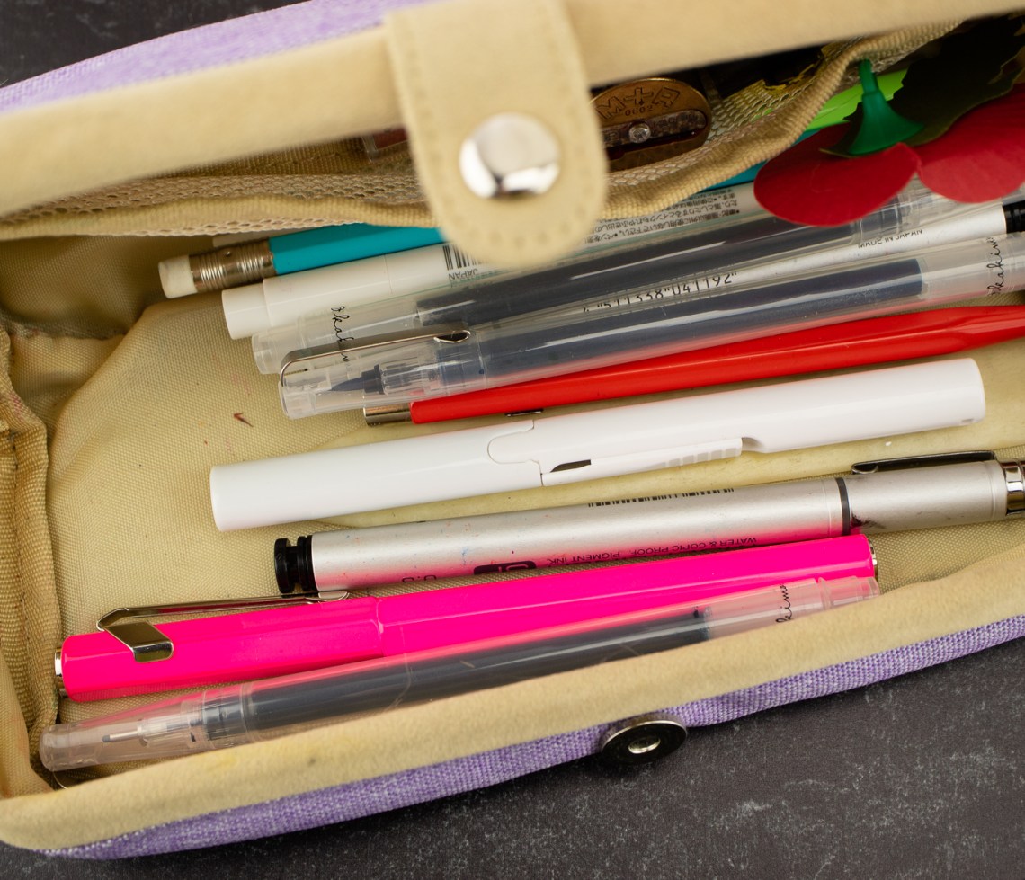
Tools:
- Paper: Rhodia Uni-Blank No. 16 with 6mm guide sheet and
- Col-o-Ring Ink Testing Book ($10)
- Pens: Uni-Color-3-Erasable-Multi-Mechanical-Pencil ($8.25)