

The most recent ink line in my collection is the IWI Colors of Nature line. The line includes 24 colors so I will be presenting the collection in parts – today I’ll be covering the second set of 8 out of 24. I purchased my samples of IWI Colors of Nature inks at Vanness: each ink is $12 for a 30mL bottle or $2.60 for a 4mL sample. If you missed part 1 of this series, make sure to read that as well.
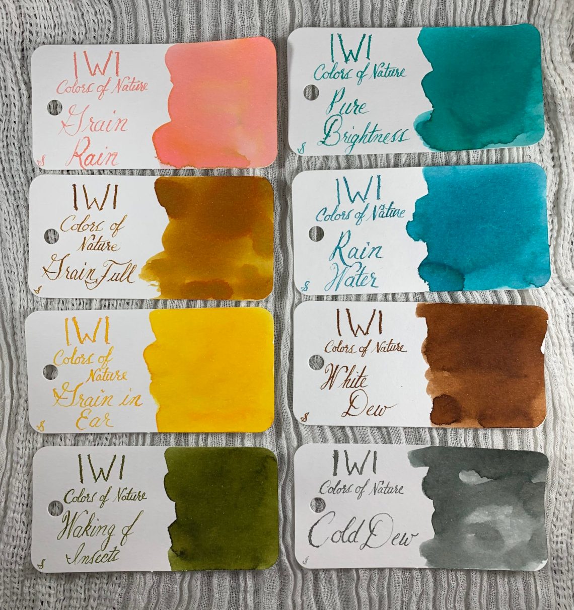
I’ve divided up the Colors of Nature inks into various themes. This group is the Grain set. First up is Grain Rain. I love this color and I was disappointed with the feathering here. The pink and yellow show up separately making the overall color a peach.

Once there is a good Grain Rain, you get Grain in Ear. This is a great yellow that is a bit lighter than PR Buttercup but darker than Montblanc Lucky Pig.

Time marches on, giving way to Grain Full. Somewhere between RO Honey Bee and Callifolio Inti, Grain Full Has definite multi-chromatic qualities where the dark yellow-brown separates from the orange.

This may be the set with the most dramatic difference between the two tested papers – Cosmo Air Light first followed by Tomoe River paper second. There is even a textural difference between the two.


The second group is… the group that Didn’t Fit Well Into Other Groups (DFWIOG). First up is Waking of Insects. This is a beautiful dirty green, very close to Diamine Safari.

Pure Brightness is a touch bluer than Ferris Wheel Press Mirror of Moraine.

The final DFWIOG ink is Rain Water. This contains more blue than Pure Brightness and is close to Faber Castell Turquoise.

I apologize for the random splatters of Grain in Ear on the page. This again proves that cats and ink should never mix. The first photo here is Cosmo Air Light paper and the second is Tomoe River. Again, there are color differences between the two paper types but also a textural difference. Tomoe River paper has a grainy texture while Cosmo Air Light is crisp.


The two papers side by side so you can see the differences under the same lighting conditions.

The last two inks today could be grouped in with part 3, but I’ve placed them in part 2 because the numbers worked out that way. I have elegantly named it Condensation Through the Year (CTtY). Yes, I know Rain Water could be with this group.
White Dew is lighter than Diamine Ochre and not quite as red as SBRE Brown.

Cold Dew is a fabulous gray and seems to be warmer than my cold grays but colder than my warm grays. Bungubox Melancholic Grey is the closest I could find.

Both White Dew and Cold Dew take on a cooler tone on Cosmo Air Light paper (first photo below) than on the Tomoe River paper (second photo below).


The full eight inks presented today lined up together:
As I mentioned in part 1, these IWI inks have quite an issue with feathering. They all have a watery consistency that allows some beautiful color separation – an amazing quality in inks used for artwork or on paper with slow absorption. Tomoe River paper seems to handle IWI inks with little to no feathering while still showing the multi-chromatic characteristics. Again, this is a topic I will revisit in part 3, next Thursday.
DISCLAIMER: The items included in this review were purchased by me and I was not compensated to write this review. Please see the About page for more details.


