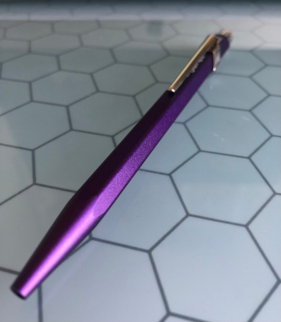
Ever since I discovered fountain pens, my use of ballpoint pens has been minimal. I love my Retro 51’s, and an impressive collection of gel pens and fine liners, but I’m mostly done with ballpoints. When I saw the Caran d’Ache Nespresso (3rd edition, $45.00), I felt a pang of longing though. For starters, it’s PURPLE and I have developed a deep and abiding love of purple since 2019’s purple forays. Second, the pen is manufactured from recycled Nespresso cartridges. I love how Caran d’Ache has made a gorgeous pen with innovative recycled materials. What could be cooler than that?
However, I still held off purchasing because it was a ballpoint. So you can imagine how tickled I was to receive the Nespresso as a present this holiday season!
The aluminum barrel of the body is actually made of recycled ‘Arpeggio’ capsules, creating a purple body that is super smooth and sleek. The body is Caran d’Ache’s signature hexagonal shape. I should add that all of the packaging for the pen is made of 100% recycled materials as well!
The pen comes with Caran d’Ache’s signature Goliath ink cartridges which are available in 3 tip widths, and 4 colors (mine is in blue). According to Caran d’Ache, the Goliath will write up to 600 pages of A4. Although it writes fairly smoothly, I may be consulting the refill queen to find out if I can add a gel refill to this baby and make it all mine.
I will say that there are uses for ballpoints – sometimes a fountain pen just isn’t the best for every situation. I’m excited use my Nespresso at those times!
DISCLAIMER: Some of the items included in this review were provided to us free of charge for the purpose of review. Please see the About page for more details.
While the Pelikan M205 Moonstone Fountain Pen Set (€123.14) was supposed to be the “Ink of the Year” for 2020, due to the pandemic, the pen and ink shipped late in the calendar year. This is not such a bad thing as Pantone chose grey was one of the two colors chosen as “Color of the Year” for 2021. Way to be ahead of the curve, Pelikan!
The M200-series feature stainless steel nibs. This makes the M200-series the least expensive of their “Souveran” pen line. The set, with ink, purchased for the EU is considerably cheaper than buying it domestically because of some weird pricing strategies for the US and North American market.
The Pelikan Moonstone is available in a range of nibs sizes and also as a ballpoint if your fountain pen collection has reached critical mass.
After my fuss about pen companies (that should not be named) that do not include converters with pens over $50, I am inclined to prefer piston pens which do not require converters. As such, the M205 is one of the best “next step” pens when you are looking to upgrade to a more upscale fountain pen.
The Star Ruby M205 was a huge success last year so Pelikan played it safe and made the Moonstone M205 in a similar translucent plastic embedded with glitter. To be honest, I like the look of the Moonstone, even more than the Star Ruby. The Moonstone 205 has a subtle bling to it where the Ruby is much flashier.
The Pelikan M205 Moonstone Pen and Ink Set (€123.14) ships in a paperboard box and includes the pen and a full bottle of the Pelikan Edelstein Moonstone ink.
Upon close inspection, the microfine sparkles embedded in the translucent grey material are opalescent creating a sort of stardust effect. This effect definitely reinforces the gemstone vibe that Pelikan set out with the naming and theme of the inks.
The nib is steel but the M200-series steel nibs from Pelikan are some of the softest steel nibs I’ve used. Early in my fountain pen days, they were too soft for me but over the years, my writing style has changed. I think I write with a lighter touch and are therefore more able to appreciate the Pelikan steel nib. Depending on your writing style, the softness of this nib may be difficult for some writers to use.
It’s not a flex nib but if you write with a heavy hand, it is possible to choke the ink flow.
The Ink:
Pelikan Edelstein Moonstone is a pleasant change in the “ink of the year” from this ink line. The color is a beautiful mid-range, cool-neutral grey. It’s dark enough to be legible even in a fine nib but not so dark that it starts to look like a faded black.
Performance-wise, the ink is smooth and largely odorless. (Some inks have a distinct smell and I don’t notice any with the Pelikan Edelstein inks).
When used with a large folded nib, the shading and range of shading is stunning. It reminds me of the range of color of the moon in photos from the Apollo program.
There is a little color shifting in the ink between a cool blue and a warm golden undertone.
In regular writing samples, even with the M205 EF, the ink is still legible. With slightly wider nibs, the ink color really starts to show its character.
This close-up image shows the slight flex of the nib as well as the non water-proofiness though the ink does stain the paper just a bit. The shading it visible quite well here.
On Tomoe River paper, the ink appears slightly darker and the swatch shows a bit more of the color-changing effects.
When compared to other grey ink options, there are a lot of similar shades. Lamy Agate has a greenish undertone that makes it notably different. Montblanc Heritage Spider Metamorphosis Web Grey is more blue-violet in its undertone. Montblanc Oyster Grey is slightly darker. Kaweco Smokey Grey is probably the closest match.
First, I must begin by admitting that I am not a huge user of mechanical pencils. Though I use clutches with certain art materials, I’ve always preferred woodcased pencils to write with. Call me fussy, but many mechanicals I’ve tried are either too heavy, too light, too cold, or just too engineer-y.
That’s why I surprised myself when I discovered that I love the Caran d’Ache Fixpencil 884 ($22). Also known as the “Junior” model, the Fixpencil 884 takes 2mm leads. It’s available with a green, red or blue barrel. (A similar Fixpencil model comes in matte black with colored knocks.)
According to The Gentleman Stationer, “The history of the Caran d’Ache Fixpencil begins in 1929, when an engineer in Geneva invented this unique clutch pencil as a hedge against potential wartime disruption of the woodcase pencil supply. After launching a year later, the Fixpencil became a global success. The Caran d’Ache Fixpencil was the world’s first modern mechanical pencil.”
Something about its sleek, classic design and especially the clip evoke Seattle’s mid-century Space Needle.
The plastic aluminum barrel (A pencil community member corrected me: The Fixpencil is made of powder-coated aluminum, not plastic.) is lightly textured, which makes it comfortable to hold. Its well-balanced weight is also comfortable – not too heavy, not too light. Most significant, however, is its hexagonal shape, which was obviously designed to mimic the woodcased pencils that were expected to be in short supply during the war.
It’s probably no coincidence that the 2mm lead it takes is also close to the size of a standard woodcased pencil core. All of this explains why the Fixpencil appeals to me: It’s the woodcased pencil of mechanical pencils!
As is true with most mark-making implements that wander into my hand, my first impulse was to draw with it. I was told that the graphite lead that comes with the Fixpencil is about a B grade, which is harder than I like for sketching, but the barrel is pleasant to draw with, and the 2mm lead size has the same line variation as a woodcased pencil. (I’m going to put a Uni Mitsubishi 4B lead in it to draw with, and then I’ll be happy.)
Bonus: 2mm is the size of the Caran d’Ache colored leads! (Drat – if the Fixpencil also came in yellow, I could get one of each color to match the four leads. Really, Caran d’Ache, you didn’t think of this? Why doesn’t anyone ever consult with me on these important matters! I guess the replacement buttons will have to do.)
Writing is equally pleasant as drawing. One of my objections to writing with most mechanical pencils (such as those with .05 mm leads) is that the line stays perfectly consistent (which is one of its benefits for drafters and other technical people who require a consistent line and those who prefer it), thereby eliminating subtle line variations that can be expressive for both writing and drawing. With a 2mm lead, however, my writing shows some thicks and thins.
As for the Fixpencil’s mechanics, they are as streamlined as its appearance: Push the knock on the end, and the lead advances. Pull the knock off, and there’s a convenient lead pointer inside. It will do in a pinch. However, to get a smooth, beautiful point, I recommend the Möbius + Ruppert brass lead pointer ($6), which has two holes to accommodate 2mm and 3.2mm leads.
Finally, a mechanical pencil that I can love!
DISCLAIMER: The items included in this review were provided free of charge by Gentleman Stationer for the purpose of review. Please see the About page for more details.
Pineider is one pen company I have wanted to investigate for a while but the opportunity never presented itself. The pens are beautiful, the packaging is thoughtful, and the quill nibs look amazing.
First of all, the packaging. The first layer protecting the Bellezza is a cardboard box. This box protects a beautifully designed but oddly shaped box that is covered in leather or leather-like material in a dark forest green.
This inner box opens in two places – a top flap covering the pen and a bottom flap that opens to reveal a bottom shelf containing the product information and stationery.
The stationery turned out to be 5 matching card and envelope sets. The cards are single piece card stock – not a folded card. I did not test the cards since this is a review copy, but I would expect no ghosting or bleed-through with the weight of the cards.
The pen I received is the Tiger Eye color. Looking at various images of this pen, I have seen the colors show in everything from a bright yellow-orange to a smoky grayish brown or even bits of green. Pineider describes the pen material as a resin embedded with marble dust – chosen because it closely imitates the celluloid used in vintage pens and for the depth of color in the material.
The large variation of color between individual pens could be an issue for people who like to choose the color of their pen. However, this is easy to avoid with communication before the final purchase. I appreciate pens with such a wide spectrum within a particular name, although purchasing can be easier at pen shows where you can see the actual pen.
In order to try to show the depth and variation within my review pen, I’ve taken photos in various lighting arrangements. This pen varies from a bright yellow-orange that moves from bronze to a pale yellow. A streak of brown-gray-green runs through the back of the pen and a bit into the cap. The aspect that is difficult to capture here is the depth of the swirls and the slight metallic-like sheen in certain colors. I assume that is the marble dust since the effect has nothing to do with an actual sparkle.
The trim is silver in color – I could not find any information about the material used for it, however. The clip is shaped as a quill and has a lot of movement. It is spring loaded but the spring is inside the cap so the clip is kept thin on the outside. The clip slides onto paper or a pocket easily although it slides off if clipped to only smooth paper. On a leather notebook cover, the pen stayed very securely fastened even with a lot of jostling.
The cap has a patented magnetic closure that is interesting. The magnets cause the cap to snap into the correct orientation with respect to the pen every time. Once the pen was capped, I couldn’t knock it free at all. Only when I pulled or twisted the cap did it release from the magnet. When the pen is closed, an inner seal keeps the nib ready to write.
For those who post your pen, the pen contains a corresponding magnet on the back so it can post securely. However, the posting magnet allows the cap to post in any orientation.
Now for the nib! I found the quill nib to be delightful to use. At first I tried no pressure when writing. The pen is well tuned and writes before I even feel it touch the page. I did not experience skipping, hard starts, or slow flow. I also didn’t find any gushing or blobs. The flow was just… perfect. My attention was never drawn to the flow because it was never an issue. This was also true when flexing the nib.
This pen came with an extra fine quill nib, 14kt. The unflexed nib performed exactly as I would expect an extra fine gold nib to perform, perhaps slightly finer than others. The flow from gold nibs seems to be a touch faster than steel nibs making an extra fine line difficult to achieve. The thin lines below are using no pressure. Thicker lines are mid level pressure.
The Bellezza pen possesses a few special touches that could be missed. The silver grip has a small roughened patch to help a user grip the metal section. The uniquely shaped breather hole on the nib. The cap band that carries the saying “the quick brown fox jumps over the lazy dog” in raised letters – the saying many pen users write when testing a pen since it contains every letter in the english alphabet. These little touches, along with the box details, make the pen feel more luxurious in my opinion.
I only used a Lamy 2000 and a TWSBI Eco to compare the size of the Bellezza. The diameter of the barrel is exactly in-between the two other pens and the same length as the Eco.
Uncapped, the Bellezza shows the unique shape of its section – the curve felt very comfortable in my hand. The section did not feel like my fingers would slip off – an issue I occasionally have with a Lamy 2000. But it didn’t feel as demanding as a TWSBI Eco grip – Ecos sometimes annoy me – they like to control your grip posture.
The huge difference between these pens is the weight. The Bellezza comes in at 38g when capped and 22g without the cap. That’s equal to a filled, capped TWSBI Eco.
The Bellezza does carry this weight well, however. I could easily use it for long writing sessions (30 minutes or longer) without it tiring my hand. I prefer to use it unposted but even for my small hands, using the pen while posted was not out of the question in terms of weight or length. In my opinion, the weight added to the feeling of worth overall.
Appelboom lists the La Grande Bellezza for $382, a price which qualifies for free shipping. Do I think the pen is worth that price? Yes. The pen feels luxurious in every way I know. I would compare it to pens from Visconti, Montegrappa, Aurora with the attention to detail, original materials, and nib quality. I would predict Pineider’s pens rising in price as the name gains more attention in the fountain pen world. Name recognition is the biggest difference I see between these brands at the moment – the brands I mentioned above are charging $450 to $750 and even above for a similar level of quality. I’m interested to see what else Pineider has in store.
Every week, I think I won’t have anything to write for the introduction of Link Love and then something will pop into my links, my life or my head at the last minute and I feel compelled to type a paragraph or two to share with you.
This week the link on Baum-Kuchen’s blog about education could not have been more perfectly timed. Next week, I begin my second semester as a college instructor, all while teaching remotely via Zoom. Even though I have yet to teach a college course in-person, I have previously worked with interns, new hires and fellow designers in-person. This has allowed me to look at their work — be it analog or digital — as they are working and provide input as needed. Teaching remotely, especially for art and design, is especially challenging both for the instructors and for the students. Reading Frido’s post about how he has changed and adjusted his teaching methods for remote teaching is invaluable to me.
(Link Love artwork created in Adobe Illustrator by calligrapher and lettering artist, Chris Purcell)
We need each other. Please support our sponsors and affiliates. Your patronage will let them know you appreciate their support of the pen community. Without them, and without you, we could not continue to do what we do. Thank you!
In the before times, we all had an EDC (every day carry). Those few pens and notebooks that we had to have with us. As we move around less in the pandemic era, many of us are working from home and no longer carrying anything anywhere. So today I’m going to tell you about my EDDS (every day desk set). These are the pens and notebooks I can’t do without right now.
From left to right: TWSBI Eco, M Nib; TWSBI Eco Rose Gold, F Nib; Caran D’Ache 849, F nib; Vanness Exclusive Pocket 45 from Franklin Christoph, F Nib
I’m grouping these two together because with the exception of aesthetics, they’re both the same pen. TWSBIs aren’t the most elegant or the most refined, and they don’t have the precision nibs of Sailors. What they do have going for them is that the write every single time. Whether I wrote with them yesterday, or 6 weeks ago, every time I pick up my TWSBIs they’re ready to write. This makes them tops in my desk set, because when I’m on a phone call and need to jot a note down, I don’t want a pen that is a little dry and doesn’t start. Add in that I feel safe putting any ink in them, they’re sturdy and can take a bit of a beating, and I can see exactly how much ink I’ve got left and I love ’em. My clear one is inked with Robert Oster Fire & Ice (from recent Christmas card addressing!) and my Rose Gold is inked with Lamy Vibrant Pink.
This pen is actually one of the few purchases I made in 2020 and is the newest to the crew so it’s hanging out on my desk. Yes it’s really this bright – I needed something cheerful! I didn’t bother with a converter when I got it, just played cartridge roulette (remember all those random cartridges you have? The ones you throw in a random container? Pick one!) and got going. This one is a quick writer, has a fun snap cap (oh the fidgeting) and can store an extra cartridge in the barrel so you never run out of ink.
This one might be my favorite pen in my entire collection, at least for the joy I get from writing with it. Like the TWSBIs it is always ready to go as a writer. And between the Jim Rouse nib that was expertly tuned and smoothed by Audrey Matteson, it writes like butter. I went with a darker shade of green for this one – so far I’ve stuck with Colorverse Morningstar since I got the pen.
Notebooks:
I’ve also got a stack of notebooks that I’m using. For the post part, I’ve decided that I like spiral bound the best. I love being able to lay the notebook completely flat, and the spiral keeps things tidy and easy for me to flip between pages. From top to bottom my current notebooks are:
Story Supply Co. Ithaca – This holds all my work notes that I want to keep for future reference. Notes I take at seminars or professional development, procedures I want to document so I don’t forget them, etc. This notebook I’ll be keeping even when it’s full.
Write Notepads Dot Steno Notebook, A5 – This one holds all the work notes that I don’t need to keep forever. It’s my notes from phone calls, team meetings, to-dos that I need to add to my calendar, etc. Eventually, when it’s full I’ll throw it away, but it’s still useful to refer to at various time
So that’s it for my daily desk set for January of 2021. What are your favorites right now? Do you still do an EDC?
DISCLAIMER: Some of the items included in this review were provided to us free of charge for the purpose of review. Please see the About page for more details.
I was a loyal subscriber of the Birmingham Pen Company Pen Parcel ink subscription for several years. This habit meant I ended up with almost 100 bottles of their ink. Each color is named after a person, place or event related to their hometown of Pittsburgh, Pennsylvania and the designs of their bottles and packaging includes these thoughtful details. Overall, the packaging and branding for Birmingham looks great. When Birmingham decided to cease their subscription service and retool their company, I was disappointed but I understood the desire to find a way to, in a very competitive market, differentiate their business from all the other online pen shops. When I heard that they were ready to come back into the spotlight, I was thrilled to be a part of the process.
To provide some background, for several years, Birmingham Pen Company was releasing inks every month through their Pen Parcel ink subscription and then those ink colors (or some of them) were available for purchase on their web site. These inks were produced by a third party for Birmingham Pen Company and bottled by Birmingham Pen Company. The bottles were labelled with either “made in England” or “made in Germany” so the assumption was that the inks had been made by either Diamine or DeAtramentis for Birmingham.
About a year ago, Birmingham sold off all these inks and announced they would start making and selling their own inks. Of course, there were questions from ink users and collectors like myself. Why the change?
The Interview
In building an overview of the new Birmingham Pen Company’s ink line, I decided I needed to hear from the creators about the changes to their ink line. Birmingham Pen Company is run by two brothers, Nick and Josh. Josh was kind enough to respond to my questions.
Q: Why did you decide to make your own inks? More control? Costs? Were you not getting the looks or colors that you wanted?
A: Nick and I had a long conversation a few years ago regarding the trajectory of our work. We concluded that ultimately we want to build a business that could last our lifetime (we’re both in our 30s), and to do that we’d need to build relationships that would last a lifetime. To build relationships that would last a lifetime, we needed to build products to do the same.
Without full control over the manufacturing process we were unable to react to all the opportunities we observed for product improvement. Manufacturing products in-house required a much larger investment compared to contract manufacturing through third parties, but having complete control of the process allows us to fine-tune every detail while implementing plans for continuous product improvement as we grow.
Q: Some of the new inks have similar names to previous colors but look different? Purposely? Accidentally?
A: Early in the ink manufacturing process we discovered that traditional water soluble dyes don’t react in a linear fashion when they’re combined to achieve particular colors. That is, there’s no obvious path to achieve a desired color based on the color characteristics of the base dyes. Dye colors change when they’re mixed with water, change unpredictably when mixed with each other, and then change further when calibrating the rest of a delivery ‘vehicle’ around the colorant. An ink ‘vehicle’ is the combination of chemicals used to deliver the colorant to substrate. In the case of our Traditional Inks, the colorant is a water soluble dye and the substrate would be paper. We calibrate our vehicle individually to every combination of various water soluble dyes. Our vehicle includes diluent (laboratory grade water), thickener, humectants, lubricants, surfactant, and preservative. Each of these ingredients is combined and refined over a 17 step process with the colorants for every bottle of Traditional Ink.
Our plan is to introduce an incredible variety of ink colors with a wide variety of properties… eventually hitting all of the original inks and more.
Q: Some ink color names have changed… is it because the ink colors are different or did Jeff Goldblum complain? (For context, one of the first inks I noticed from Birmingham was the Goldblum Independence Day Grey.)
A: Unfortunately, Jeff Goldblum has not contacted us. Growing up in the 90s, Nick and I are huge fans! The revised ink names are intentionally modified to a form with greater prospective longevity.
Q: Did you select the ink colors (currently released) because they were the best sellers of their previous incarnation? Or did you want to release the colors in a certain order?
A: We’ve arrived at our starting palette with a combination of searching for desired ink properties and discovering the capacity to tame particular dyes and dye combinations within a delivery vehicle. Ultimately, our objective is to provide the largest selection of fountain pen ink colors and properties worldwide.
Q: Are you planning to formulate all the previous colors in your inventory or do you plan to be a bit more targeted?
A: Our ambition is to achieve every color property we originally offered and much more!
Q: How will you choose what colors you create next? New shades? More colors from the back catalog?
A: We plan to introduce new ink characteristics and colors as we discover the symbiosis between the target ink properties and successful performance within a vehicle. We’re planning to have new inks just about every month for 2021! We’ll keep everyone informed with our email newsletter.
Thanks so much to Josh for taking the time to answer my questions and giving us a peek behind the secretive world of ink making. I am looking forward to seeing what the brothers create next and where their experiments will take them next.
So, let’s focus on the inks now:
Birmingham Pen Company currently offers three lines of ink: Traditional, Everlasting, and Twinkle inks. Traditional inks (starting at $9 for a 30ml) are classic water soluble fountain pen inks. Everlasting inks (prices start at $19 per bottle) are designed to be permanent and waterproof. Twinkle inks ($29 per bottle) are shimmer inks. Traditional and Everlasting inks are available in three different bottle sizes: 30ml, 60ml and 120ml. The Twinkle inks are only available in 60ml bottles.
The three boxes of ink I was sent included a massive assortment of their new Traditional and Twinkle inks. (Jesi will review the Everlasting inks soon.) Since receiving the box, several more colors were released and more will be coming in swift succession as Birmingham continues to fill out their offering.
I received 23 bottles of Birmingham Pen Company Traditional Fountain Pen Ink and four bottles of their Twinkle Ink. At first glance, I think that the previous reputation that Birmingham had developed for having dark, sooty, brooding ink colors is starting to lift. Many of the ink colors are clear, bright and downright cheerful.
The range of blues include several that do sheen: Ice Rink, Polar Bear, Snowflake, Fountain Turquiose, and Electron. Celestial Blue has a hint of sheen too but it will probably only be noticeable on Tomoe River paper.
In this photo, if I were to arrange the inks from most green to most blue, I would put Fountain Turquoise as the most green blue and Celestial Blue as the bluest blue. Ice Rink is more vivid blue. Snowflake, Polar Bear and Electon are aqua/turquoise colors that get progressively more blue (respectively).
The ink colors in this grouping are more familiar to fans of Birmingham. The bottom row are the smoky, sooty steel mill inspired shades reminiscent of Pittsburgh steel and iron works past.
This final grouping show a much brighter, optimistic picture of Birmingham inks and Pittsburgh. Many of these colors make me think of joyful, childhood summers filled with flowers, food and fun.
Swatches with the pencil “B” on them are the new formulations. Not all swatches got labelled when I was swatching.
I have a massive assortment of Birmingham’s previous incarnations of ink colors but amazingly, I don’t have all of their original ink collection. I feel I do have enough to compare and comment on the differences between the new formulas and the previous incarnations. I’ve provided side-by-side photos of the inks I do have from the original ink line-up with it’s new version.
As mentioned in the interview, some ink names were changed slightly but the essence of the original name is still there. The four inks pictured above represent a good sampling of the color and characterstics between the Birmingham-made inks and the third party created inks. Southside Market Boysenberry is slightly more blue purple and does not have the sheen that the previous version had. Pop Art Purple is now more purple and less violet. Gulf Tower Gerbera is more pink than it was previously. Waterfront Dusk is now more of a reddish purple and not nearly as dark as the previous incarnation.
Some of the blue swatches I have to compare feel like the colors were flip-flopped. Polar Bear (new) looks more like the previous version of Snowflake and vice versa. The new formulations of both Celestial Blue and Ice Rink are both much more ultramarine where the previous versions have more of a phthalo blue tone. In this range of blues, Snowflake is the only one with a phthalo (slightly grey green undertone).
Once again, when I get into blue inks, I feel compelled to compare them to watercolors where I have terms to describe the colors. With high quality watercolors, there is not only some consistency in the naming of colors (not as fun as the names Birmingham gives to their inks) but the addition of the numbers (like PB29) which inidicates a specific pigment in making the color. Some watercolors have multiple numbers because they are made up from more than one pigment (i.e. Payne’s Grey which is usually made up of two to three pigments). BEyond the individual pigments, what makes each watercolor shade of Ultramarine different is the quality of the pigments, and the binders and fillers that are added to the paint (here’s a good breakdown of what goes into watercolor paint).
Using this language, helps me understand (or at least mentally process) fountain pen ink color variations. Since watercolors are also translucent, the comparison to fountain pen inks is pretty clear. And I feel like when ink makers start playing with blues, they start with the brilliance of an Ultramarine pigment. Celestial Blue and Ice Rink definitely feel Ultramarine to me. Polar Bear and Snowflake are more phthalo blue (green shade) IMHO.
The new formula of Petroleum is more green compared to the previous version’s bluish undertones.
Swatches with the pencil “B” on them are the new formulations. Not all swatches got labelled when I was swatching.
The last page of comparisons I have is across the spectrum: Weathered Brick (new) is definitely more of a brick red compared to the more red wine color of the previous formulation. Salmon hors D’oeuvre is not as neon coral as the previous version. Independence Grey is more grey compared to the previous version which was almost black is was so saturated and dark. Finally, Argula is more of a low saturation yellow-green compared to the previous version which was a dark leafy spinach color.
Strawberry Twinkle is a big gulp of Strawberry Milkshake delight topped with sparkles. It’s a glowing pinky-orange with a healthy dose of silver shimmer. To say this is my favorite new ink from Birmingham might be an understatement. Overall, Birmingham has had a reputation for featuring a lot of dark, brooding, soot-soaked ink colors but Strawberry Twinkle puts their murky reputation into question. Not so murky anymore!
I had only one ink that was ever kind of similar to Strawberry Twinkle and its a super-rare Asian ink that I can’t even remember how I got it. Starry Ink and Small Endowment/Ancient Charm are both much more coral orange compared to Strawberry Twinkle.
Both Steamboat Twinkle and Blizzard Twinkle are turquoise-based shimmer inks. Steamboat is much darker, more teal in color where Blizzard is more aqua. Both of these inks also have a reddish-pink sheen. They are double-hitter inks! I put several other shimmer inks beside these colors but they are not all that similar in color.
Pennsylvania Canal Tributary Twinkle (I mislabeled my swatches!) is a brilliant ultramarine blue with red sheen and silver shimmer. It is a pretty amazing combo. If you like J. Herbin 1679 Bleu Ocean or Diamine Jack Frost, Tributary Twinkle may be an ink for you to try. Even compared with the considerably more expensive Colorverse Cat, Tributary Twinkle may become a new shimmer favorite.
This was an epic overview of the new inks from Birmingham Pen Company. They have done some great work in trying to reformulate and match or improve their inks while making the inks themselves. For as an epic a project as it was to put together this overview, Nick and Josh are undertaking an equally daunting challenge. So far, I think the results are stellar. There are only a handful of small batch ink makers in the US and the market is as hungry for artisan inks as the coffee or beer market is for small batch brews (handy word for either coffee of beer!). I think Birmingham Pen Company, with their wide range of colors, formulations and quality packaging and presentation are ripe to corner the market.
If I had to choose a small selection of inks from their new offerings to start, I highly recommend Strawberry Twinkle, Independence Gray, Waterfront Dusk, Fountain Turquoise, Pennsylvania Railroad Boiler Steam and Coking Coal. Steamboat and Blizzard Twinkle are also strong contenders for a first purchase. If you don’t dig shimmer inks, I would substitute Snowflake and Ice Rink for Steamboat and Blizzard Twinkle and Salt Water Taffy for Strawberry Twinkle (I think they are the same inks just with shimmer but don’t hold me to it.)
DISCLAIMER: The items included in this review were provided free of charge by Birmingham Pen Company for the purpose of review. Please see the About page for more details.