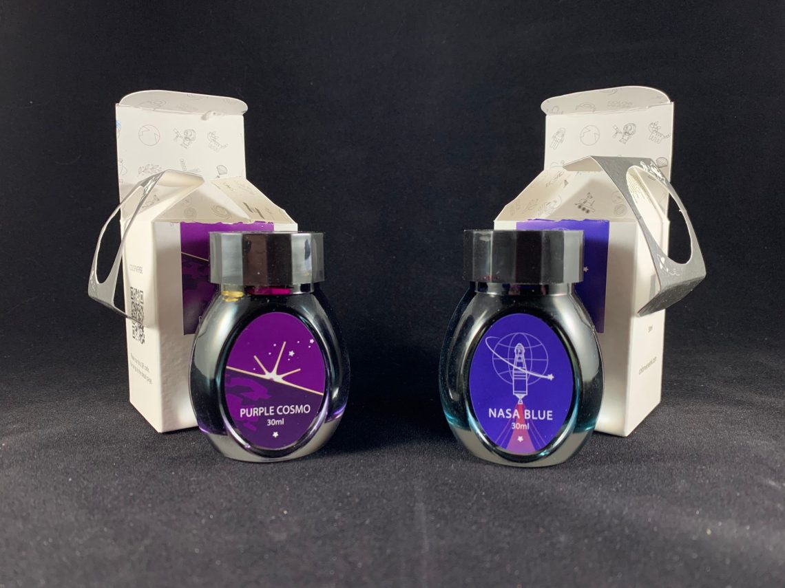
New inks are exciting; surprise new inks are even better! I received a package recently from Dromgoole’s that contained two new, surprise inks by ColorVerse – Purple Cosmo and NASA Blue. These inks are both Dromgoole’s exclusive inks that are available now at $15 for 30mL each either online or at their physical store in Houston.

I have to say, I enjoy this shape of bottles from ColorVerse more than the larger, round bottles. Space is used more efficiently with this shape although only an issue if you have WAY too many inks!
Of course, the first ink I tried was Purple Cosmo. Purple is always the best!
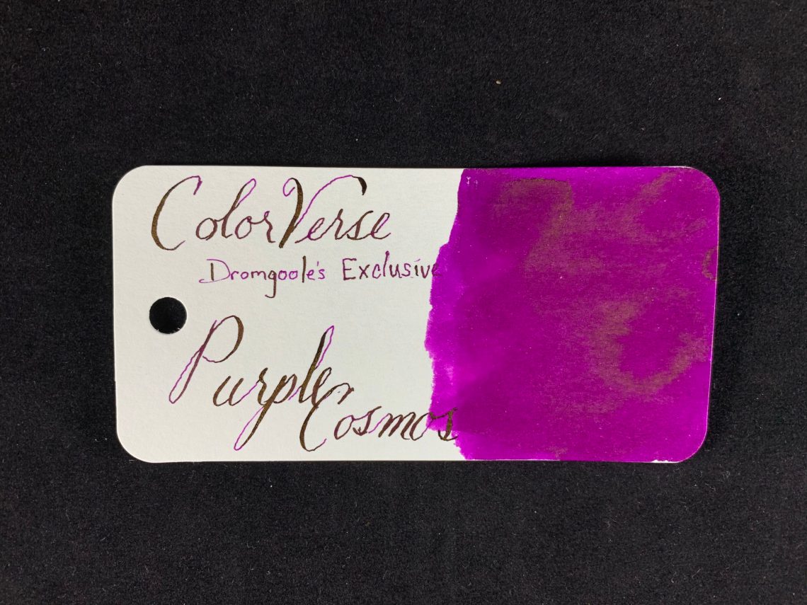
Please excuse the spelling on the swatch card – the name is actually Purple Cosmo. The ink is a bright, blueberry juice color with a gold sheen and it writes a bit towards the side of wet. I didn’t have any problem with feathering or bleed through on the Col-o-ring nor on Tomoe River paper (old).

Purple Cosmo is very close to Rohrer & Klingner Solferino but has a bit more sheen. Not nearly as much as Sailor Manyo Akebi, though.
NASA Blue is the second ink, a deep blue that leans towards blurple-y-ness with lots of pinkish red sheen.

The closest ink in my collection is Diamine Blue Edition Festive Cheer, including the color of the sheen. NASA Blue writes on the dry side of normal and also didn’t feather nor did it bleed through on the Col-o-ring cards or Tomoe River paper (old).

One issue with highly sheening inks is smearing. I did notice some smearing in the title Purple Cosmos of my writing test where I didn’t think I had touched it.

I specifically tried to smear a couple swatches of ink – both of these were scribbled onto the paper, allowed to dry for 12 hours and then purposely used a finger to smear. The result was definitely smeared although not as much as I had expected.
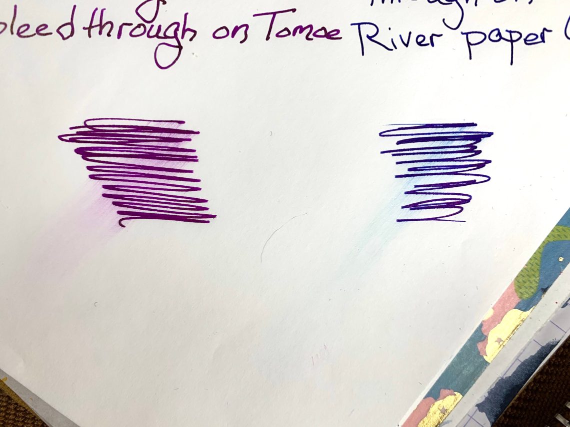
Compared to the amount of sheen, I think the smearing amount is acceptable.

In my longer writing, I had only the smearing in Cosmos at the top. The blue smears on the right side were made by ink that was on my hand before writing began. However, my hand never touched ink – it would look very different for left handers.

To sum up, I enjoyed these two inks and will absolutely use both again. Purple Cosmo is my favorite – bright, purple, gold sheen and a little on the wet side. I appreciate being given the chance to review these by Dromgoole’s – thank you! If you would like to purchase one or both of these inks (ESPECIALLY the purple), you can find them on the Dromgoole’s site – NASA Blue and Purple Cosmo.

- Swatch Cards: Col-o-ring cards (100 for $10)
- Notebook: Musubi Tomoe River Folio (~$35 for 384 pages)
- Ink: ColorVerse Purple Cosmo and NASA Blue ($15 for 30mL at Dromgoole’s)
DISCLAIMER: The inks in this review were provided free for the purpose of reviewing including the Col-o-rings which are provided to me by Ana because she knows she can keep me writing all the time in exchange for the wonderful cards. Please see the About page for more details.