


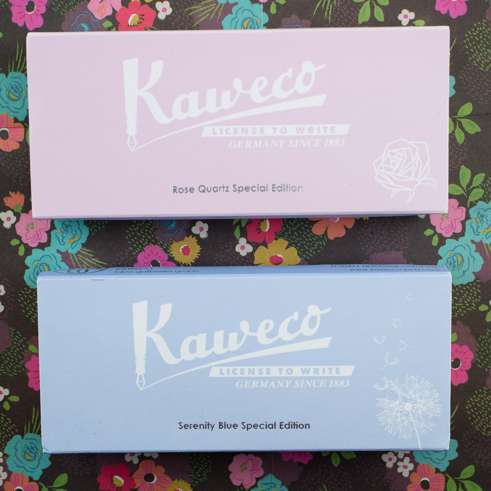
More and more pen companies and pen shops are getting into the special edition game. So it comes as little surprise that limited edition Kaweco Sports are slowly making their way west. I acquired a set of special edition Kaweco Sports from Hong Kong a couple years ago (in the Pantone Colors of the Year: Rose Quartz and Serenity Blue).
The Kaweco Sport Coral by Fontoplumo (€29.50) is the most recent special edition. It comes in two hardware trim colors, gold and silver.


Coral was the Color of the Year last year but it’s still a popular color. It’s such a warm color. Though I have a hard time deciding if the silver hardware or gold accompanies the coral color better.

Either color trim looks good with the coral, in my opinion.

Printed in matching foil on the opposite side of the cap from the Kaweco Sport logo is “Coral by Fontoplumo”. The Coral with gold hardware has gold foil lettering, the Coral silver has silver foil lettering.


I am a huge fan of the Guilloche hatching designs on the Kaweco Sports. It adds just something that makes the pens look classic and dresses up the simple plastic barrel and cap. I have a black Guilloche Sport that I used so much I rubbed the patterning off. Then I misplaced it. Thankfully, Fontoplumo luckily had one still available some years back so I was able to get another one. So, the Coral edition with Guilloche is extra special.
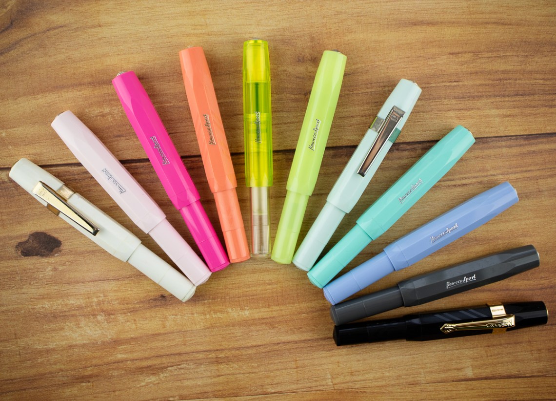
Are you ready to start building your own Kaweco Sport rainbow? The Coral is a great place to start.
The Giveaway
I am giving away one Kaweco Sport Coral. Winner will get to choose whether they want the gold or silver hardware.
TO ENTER: Leave a comment below and tell me how many Kaweco Sport pens you own. If you don’t have any, do you have multiples of another pen? Play along and type in something. It makes reading through entries more interesting for me, okay? One entry per person.
If you have never entered a giveaway or commented on the site before, your comment must be manually approved by our highly-trained staff of monkeys before it will appear on the site. Our monkeys are underpaid and under-caffeinated so don’t stress if your comment does not appear right away. Give the monkeys some time.
FINE PRINT: All entries must be submitted by 10pm CST on Friday, February 21, 2020. All entries must be submitted at wellappointeddesk.com, not Twitter, Tumblr or Facebook, okay? Winner will be announced on Monday. Winner will be selected by random number generator from entries that played by the rules (see above). Please include your actual email address in the comment form so that I can contact you if you win. I will not save email addresses or sell them to anyone — pinky swear. If winner does not respond within 7 days, I will draw a new giveaway winner. Shipping via USPS first class is covered. Additional shipping options or insurance will have to be paid by the winner. We are generous but we’re not made of money. US and APO/AFO only, sorry.
DISCLAIMER: The items included in this review were provided free of charge by Fontoplumo for the purpose of review. Please see the About page for more details.


