Review by Tina Koyama
For my third and final installment of the TWSBI 1791 ink set, I’ll review Emerald Green and Royal Purple. (Please see Part 1 for images and comments about the full set.)

Of the six inks in the set, Emerald Green is the most complex. Shading shows hints of dark green, turquoise and even a touch of reddish-brown.

Emerald is generally not my favorite side of green, so I had nothing in my collection that came close (or even lukewarm).

But the shading I saw in the swatch made me think it would be a good candidate for another hacked Pilot Parallel, this time the 3.8mm (you can see the hacked 6mm in Part 2). This ink is fun in the Parallel, which showed more of the hue’s full range of subtleties.

I sketched a couple of rows of people from the book People of the Twenty-First Century by Hans Eijkelboom. (This book, by the way, is a fascinating collection of possibly thousands of images of people Eijkelboom photographed on urban streets during the past couple of decades. They are made more visually interesting by being arranged in grids by theme – women wearing pink tanks, men wearing black raincoats, children in strollers, etc.)

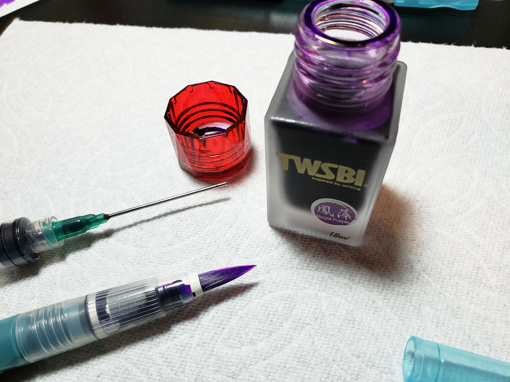
TWSBI’s Royal Purple may be my favorite of the set (wait, I said that about Prairie Green, didn’t I?). Although I see no sheening or complexity in this vibrant purple, it’s saturated and rich even with my fine nib dip pen.

It’s obvious that I favor this hue – I found several close matches in my collection. Closest is probably Nagasawa Pen Style Kobe Sannomiya with Iroshizuku Murusaki-shikibu at its heels, though both are just a smidge more on the blue side than TWSBI. Slightly more on the red side would be Diamine Majestic Purple.

I like the intensity of this purple so much that I filled a waterbrush with it to make a brush pen.
Ink-filled waterbrushes are a lot of fun at life-drawing practice, especially the short poses, because it’s like painting with watercolors but faster. At a recent drawing event, where models posed two at a time, I made gesture sketches of both models within one minute. Royal Purple is on the left; Orange (reviewed in Part 2) is on the right.

Final Impressions
Overall, the limited-edition TWSBI 1791 set is a lovely jewel-hued collection, and the implication is that the company plans to continue releasing new editions. This is a solid start, and I hope TWSBI will explore more unusual or complex hues.
TOOLS
- Papers: Canson XL Mixed Media pad, 98 lb., 10” x 7” (60 sheets/$6.90) and Stillman & Birn Zeta softcover sketchbook ($17.99)
- Swatches: Col-o-Ring Ink Testing Book ($10)
- Pens: Zebra Comic Pen G Model Nib (10/$13.50) with Koh-i-Noor holder and Pilot Parallel with 3.8mm nib (hacked) ($8)
- Brush: Winsor & Newton pointed round 4 ($12.28) and Kuretake water brush – large ($7)
- Inks: TWSBI 1791 Emerald Green and TWSBI 1791 Royal Purple (18ml/$7.50)
DISCLAIMER: The items included in this review were provided free of charge by JetPens for the purpose of review. Please see the About page for more details.
 Tina Koyama is an urban sketcher in Seattle. Her blog is Fueled by Clouds & Coffee, and you can follow her on Instagram as Miatagrrl.
Update: 12/18/19 to add link to drawing event at Gage Academy.


 On to the review of Pink and Prairie Green.