Planner Review: The Knitting Planner

Review by Laura Cameron

Last year I had the pleasure of previewing the Strickplaner (€18.90, review here) which was a planner designed with knitters in mind. I confess that I didn’t use it much last year, but I really did like the way creator Martina Behm included different trackers and layouts so you could brainstorm for projects, do quarterly planning and sprints, and store all your project notes as well as calendar items in one place. Sadly, I realized that I do better with long lists of items, and less well with a traditional calendar format. I also found some of the calendar spaces limiting – sometimes I have more than 5 things to do in a day!

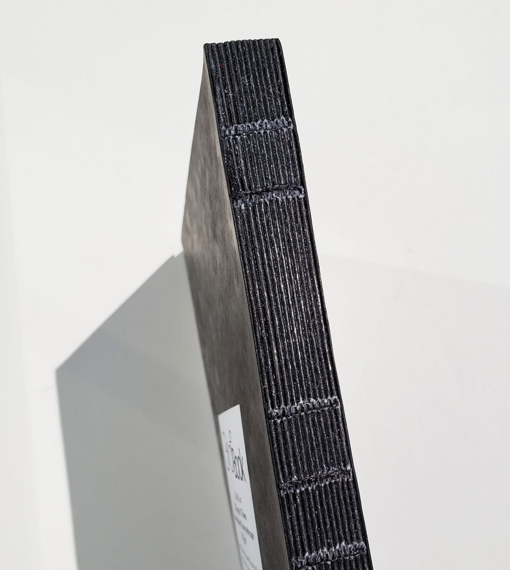
So I was excited to see that there was a new entry into the knitting and planning world, The Knitting Planner ($38.00). The Knitting Planner is a 240-page softcover planner that includes monthly and weekly calendar spreads in addition to project planning, brainstorming, notes, sizing and sketching pages (including graph paper!). The Knitting Planner measures 6″ x 9″ (15.5cm x 23cm) so it is a non-standard size, but for overall size comparison is close to an A5. The book is approximately 1/2″ (1.5cm) thick.

While the bulk of the journal is in black and white, a few knitting related photos and yellow pops are included when you least expect them, as well as a few quotes related to knitting or project planning. Pictured below is the inside cover.

The book begins the monthly and weekly layouts. Each month has a cover page and knitting related image.

Following that is the monthly spread, a quick glance at the month. I do like that there’s lots of white space in this calendar – plenty of room to note appointments or deadlines and the like.

Following the monthly spread are the undated weekly spreads (5 for each month). I’m torn as to whether I like pages undated or not. On one hand it gives you the ultimate flexibility – even if you pick up the book partway through the year. That said, since the monthly spreads are dated, this is clearly a 2019 edition.

But aside from that I do love the weekly spreads. I love that you get the full spread for the week, and that each day has its own generous, unstructured box allowing for maximal writing space. I also love that Saturday and Sunday each have their own boxes (I don’t know about you but I’ve got lots of stuff to do over the weekend). I also think the box on the upper left, where you note the week’s starting date, would work really well to note events for the week that may not be confined to a certain day, or reminders of weekly tasks.

At the end of each month is a 2-page Project Planning spread including an area for listing projects, notes, start and end dates, and checklists of items. There’s even a small box of graph in case you need to make any drawings (many knitting projects include schematics indicating garment measurements or geometric designs which can be charted).

The final section of the book is devoted to brainstorming, sketching, and capturing what projects you’d like to knit throughout the year. Graph pages measuring 6″ x 9″ are included here for working out larger patterns while on the go. I also think this section would be useful for shopping lists. When knitters to go knitting events (vendor shows, conventions – replace Pen Show with Knitting Show and you’ll understand), it’s useful to note what projects you want to knit in the future, and how much yarn you’ll need to buy to be able to knit them successfully!

The year is only just starting, and I’ve only had the planner for the last 2 weeks, so I don’t have a lot to show or tell you in terms of how it would fit into my lifestyle or how I might use it during the year. But I can show you one important thing: the paper! As far as I know the designer isn’t part of the pen and stationary community, but her paper is fountain pen friendly!!! (it requires several exclamation points). I tested my Knitting Planner with a variety of fountain pens, gel pens and fine liners and with one exception (a Retro 51 Medium nib with Robert Oster Fire & Ice) there was absolutely no bleed through. There is some ghosting, but I don’t know think it’s enough to bother me in my personal use.

Overall, I think this is a pretty good contribution to the knitting & planning world. My biggest reservation so far is that the book is a non-traditional size and soft cover, so I worry about how beat up it would get with daily use and that there isn’t a ready made cover for purchase. I did find this cover at Franklin Covey that might work, but again, options would be limited. The other option I found was more of a classic vinyl cover from MochiThings.

All of that said, if you’re a knitter in search of wide open white spaces and room to plan your projects, this might be a planner for you!


This product was purchased with my own money. All opinions are my own.

DISCLAIMER: The item in this review includes affiliate links. The Well-Appointed Desk is a participant in the Amazon Services LLC Associates Program, an affiliate advertising program designed to provide a means for sites to earn advertising fees by advertising and linking to Amazon. Please see the About page for more details.

Review: 2019 Traveler’s Notebook Diary Inserts

Review: 2019 Traveler’s Notebook Diary Inserts

Every year, the Traveler’s Company releases monthly ($11.50) and weekly refills ($26) for their leather covers (both regular-sized and passport-sized). The weekly refills come in two notebooks with six months in each book and the monthly calendar is one book. But along with the calendar refills, they also release a new set of calendar stickers ($11.50) and a new Shitajiki (writing) board ($5.25). Each year has a theme. This year’s theme is music.

Traveler's Company 2019 Planner

Traveler's Company 2019 Shitajiki board

Inside each set of notebooks was a sheet with two big round stickers and a 2019 Guide. The Shitajaki board has a print of musical instruments, radios and tapes on one side and a traditional grid on the other side. If you are heavy handed, it will keep your writing from leaving indentions. It will protect pages from ink bleeding through (though with the MD paper, the likelihood is pretty slim).

Traveler's Company 2019 Weekly Diary

The Traveler’s weekly layouts is one of my favorite planner layouts. On the lefthand page is the week divided evenly starting with Monday and the righthand page is graph paper for notes.

Traveler's Company 2019 Stickers

Traveler's Company 2019 Stickers

I forgot how awesome the set of stickers are. The set comes with six pages. A page of rub-on letters (stunning!), a sheet of translucent dots to use on calendar dates, a sheet of event-specific stickers (not the best designs but useful), a sheet of calendar tabs for regular- and passport-sized books, and a sheet of decorative music-themed stickers.

Traveler's Company Planner Stickers

I put the matching tab stickers on the notebooks — the monthly book tabs were placed down the long edge and weekly notebook tabs were placed along the tab edge.

Traveler's Company Planner Stickers

On the cover, I used the rub-on letters to add “2019” to the front of the weekly book, plus some stickers, of course.

Traveler's Company 2019 Monthly Diary

Once properly decorated, I started adding upcoming events, including birthdays and upcoming trips. The paper is MD Cream so it takes fountain pen ink very well.

Traveler's Company 2019 Weekly Diary

Weekly pages are perfect for getting a bird’s eye view of my week. I include work and blog and personal events. It helps me keep track of everything because I can’t keep it all straight if it isn’t all in one place.

I do love the Traveler’s Notebook set up and for some reason, I always love the regular size. Whether you need both the monthly and weekly calendar, or just want some cool stickers or never had a shitajaki board, the 2019 Traveler’s Company inserts are worth considering.


DISCLAIMER: The items included in this review were provided free of charge by JetPens for the purpose of review. Please see the About page for more details.

Colored Pencil Review: Tombow Irojiten (36-color set) Colored Pencils

Colored Pencil Review: Tombow Irojiten (36-color set) Colored Pencils

Review by Tina Koyama

I have been known to look askance at and even mildly mock packaging that seems gratuitously fancy. And yet I’m the first to admit that I bought the entire original nine-volume (90-pencil) slipcased set of Tombow Irojiten Color Dictionary colored pencils for packaging alone. With most colored pencils, I like to take them out of the boxes they come in and store them upright in mugs on my desk for easy access. The Irojiten set is the exception: I keep them in their lovely slipcases on a bookshelf. (You can read my review of them on my personal blog.)

3 - slipcase

They aren’t hangar queens, though: Irojiten pencils are well worthy of use. If you are accustomed to soft and creamy Prismacolor Premier pencils, Irojiten will probably seem hard to you as they did to me when I first tried them. Slightly softer than Faber-Castell Polychromos pencils, they still fall on the harder end of the colored pencil scale. But the more I use colored pencils in general, the more I have come to appreciate that harder colored pencil cores have their place – both for imparting fine details and for building rich color. Irojiten pencils are among my favorites.

4 - box

I was therefore thrilled to see that a new set had been released: Tombow Irojiten Color Dictionary set of 36 colors. Much larger than the original boxes, the new box is similarly slipcased and has a notebook-like elastic band securing the clamshell lid. (I found it interesting that the new box opens like a Western book from right to left; the original “books” open in reverse, like a Japanese book.) As with the original set, the “book covers” feel somewhat like book cloth. An outer wrapper and insert list the colors and offer coloring instructions (in Japanese).

2 - outer wrapper

Inside, the pencils are as beautiful as ever. The glossy white, round barrels have colored end caps that are also glossy and rounded. (This is a good time to say that Tombow makes some of the most beautiful pencil end caps I’ve ever seen! Look at the Mono 100 and swoon!) The Tombow logo, color name and number are printed in silver near the end cap. Like the original set, the pencils are made in Vietnam.

5 - box opened

6 - closeup of pencils

7 - closeup of end caps

8 - pencil tips

A small sharpener is included with the set.

9 - sharpener

In reading the color listing on JetPens’ site, it wasn’t clear to me whether these 36 colors were all new or simply a repackaging of colors from the original set. Geek that I am, I carefully compared the color names and was initially excited because I thought that the majority was new.

10 - Irojiten color swatches

Alas, I wasn’t as careful as I thought I was (counting apparently isn’t one of my strengths), and only 13 of the 36 are new. Even so, the new colors are unique additions. I especially like Verdigris, Yolk Yellow and Scouring Rush, which are useful urban hues. In fact, I can see the strategy: The 36 colors selected for the new set are more wide-ranging and diverse than any single three-volume set in the original release, making the new set the best value as a stand-alone purchase.

11 - new colors

For my sample sketch, I used Cherry Red, Narcissus, Dandelion, Deep Sea and Verdigris in a Stillman & Birn Epsilon sketchbook. The pigments apply smoothly and blend beautifully, and the cores stay sharpened for details. Indeed, Irojiten pencils are still among my favorites.

12 - sample sketch

13 - pencils and sketch

I have only one question: Why, oh why, did Tombow change the packaging? Despite what I said about how this set of 36 is a better value than the originals if you are purchasing only one set, the new package is pedestrian instead of unique: Nearly all colored pencil sets come in wide, flat boxes. The original set is such a lovely presentation; why not come out with a selection of 30 new colors and simply add three more matching volumes that would have looked so beautiful next to the first nine?

14 - old set with new

As it is, the much-larger box of 36 doesn’t fit easily on my already crowded desktop, so I took all the pencils out and put them in a cup. I usually store pencils with their points up, but those delicious end caps deserve to be seen.

15 - pencils in cup


tina-koyamaTina Koyama is an urban sketcher in Seattle. Her blog is Fueled by Clouds & Coffee, and you can follow her on Instagram as Miatagrrl.

DISCLAIMER: Some items included in this review were provided free of charge by JetPens for the purpose of review. Please see the About page for more details.

Philadelphia Pen Show 2019 Review: A Vendor’s View

Philadelphia Pen Show 2019 Review: A Vendor’s View

I’ve been thinking about the best way to review the Philadelphia 2019 Pen Show. I know there are plenty of pen show reviews out there and if you didn’t attend a show it can be overwhelming to look through all of the reviews;  if you were at the show, it can get repetitive to read through several reviews since you were there and know what generally took place.

Knowing all of that and trying to present something a bit different, I have decided to present my pen show review from the view of a vendor since, well,  I am a vendor.  This means it will be heavy on photos before and after the show, totally lacking some events* (if I was too busy to even touch my phone’s camera), and perhaps a different viewpoint than other reviews.  It also means that if you want to see what happened during the busy daytime, you will want to supplement this review with another.  I hope you enjoy this slightly different take!

* Seriously missing from this review is the great time we all had at the Pen Show Mixer arranged by the lovely and hardworking Lisa Vanness from Vanness Pens. It was a blast, but I wasn’t able to take any photos.  Kimberly has a nice collection of photos from the mixer here, though!

Packing Up

As a vendor who usually takes a flight to shows, a big part of packing up is cutting down on weight.  I’ve tried to find good ways to protect pens in the smallest space.

It’s amazing how much you can fit into a suitcase.  Sometimes it’s only tough finding room to pack clothing.

Getting There

I find flying over the midwest to be a beautiful experience.  I personally like to see rivers through farmland.

I’m always ready for the pen show as I fly out.  Headphones let me actually believe planes can be quiet.

Those who drove to this particular show found the parking a bit on the expensive side.  As far as I could see, though, this was the only downside to the location.  Beautiful hotel, lots of restaurants close by…

The Hotel

This is a view of the hotel restaurant from the mezzanine level where the vendors’ tables were located.  As I said, beautiful hotel.  Lots of space as well.

A BIG hotel.  I thought it was great that there was no 13th floor.

The view from a hotel room was never too big of a deal to me – until suddenly it was. So now I always get a photo.

Before The Show

We were allowed to set up for the Philly show the night before it opened.  That helps quite a bit since no one wants to arrange anything at 7 am.  It’s a great time for me to talk to people who have arrived early — a laid back feeling with the excitement of the show ahead. Nik Pang decided to get more calligraphy practice in by making me a lovely sign for my table.

Just behind me, the Andersons were setting up as well.  Sandra (The Cupcake Master of the Universe) looked like she was ready for the show to get going! Phil and Ashley (aka SgtStretch and MrsSgtStretch) stopped in for chat time.

The Table

Nik has quite a way with pens and ink.

My table was all set up the night before, ready for the public on Friday.

This is my favorite part of my table!  The Esterbrook testing station all ready for people to try lots of vintage nibs.  I love being able to help people find the nib they enjoy, one that they know how it feels before they head home.  I was overjoyed to come across this testing station a few years ago.  This may have graced the counter at a department store in the early 1950s.

The Food

I may or may not eat healthy food while I’m at a show.  However, at least it is colorful!

I also have amazing friends who will bring back stir-fried noodles for me late at night.

And of course, there are plenty of treats and snacks and possibly a rogue bottle of wine.  After the pen show closed for the night, personal pens and cookies came out, this time supplied by my wonderful roommate, Kimberly.

The PENS!

So, the reason pen lovers come together for these shows: the pens!  One popular spot was the Franklin Christoph Prototype Trays.  These were placed out each morning — one of a kind patterns and materials.  On Friday morning, the trays were laid out but no one was allowed to pick them up until 9 am.  It was a tough rule to follow.

The dark purple pens on the tray to the right are Franklin Christoph’s most recent pen model, the 46.  It is the same length as the 45L but slightly wider and it uses a #6 nib (a standard size in many modern fountain pens).

And the Esterbrooks!  This collection brought joy to my heart.

Of course, I needed to purchase a Franklin Christoph.  This is a Pocket 66 pen in a beautiful rose, brown and gold material from Mike Allen’s Woodshed Pens.  I call it Chocolate Covered Strawberry.

The People

Even though the pens are central to a pen show, the people are what make a pen show memorable and worth all of it.  Franklin Christoph announced the return of their popular S.I.G. nib due to the hard work of Dr. Audrey Matteson who is now their main nib grinder.  Audrey did an amazing job at the show!

Mike (Inkdependence), Kimberley, and Andy stopped by with big smiles for me! They often provided me with food, soda, and restroom breaks.  Thank you!

At the end of the show, I was finally able to get a photo of the ever elusive Ralph Reyes. And a computer bag.

Andy and I shared a ride back to the airport on Monday.  Notice how well her hair matches her scarf!

Lisa Anderson has been a good friend to have and has a wonderful smile.

Nik Pang and Ian Schon were catching up with one another as the last vendors packed up to head back home.

Going Home

Heading back home after a show is bittersweet.  Saying goodbye to everyone after a busy time together is tough but I love going back to my family and the (relative) quiet of home.  The end of the show means it’s time to head back to my beloved workbench to restore more pens and nibs for the next show.

This time, I had plenty of cold and snow waiting!


Link Love: Topsy Turvy

Link Love: Topsy Turvy

It feels very topsy-turvy this week. The pencil links are sharpeners and after months of neglect, Kaweco is in our headlines. I have heard a story about one of Einstein’s famous fountain pens and it’s not any of the ones listed on the story below. Diamine release ink inspired by Les Paul guitars and the UK shop Bureau Direct has shuttered its doors. I blame the weather which pummeled us here in the Midwest and promises to continue for the foreseeable future.

Pens:

Ink:

Pencils:

Notebooks & Paper:

Art & Creativity:

Other Interesting Things:

Ink Review: Diamine Coral

Review by Laura Cameron

I’m not gonna lie…last year I fell in love with purple and it still hasn’t stopped. BUT it is 2019 so I thought I should give coral a chance.

I’ve started my 2019 coral journey with Diamine Coral (30ml for $7.50). And while I’m aware coral is an orangey-pink I was not prepared for the BRIGHT punch that Diamine Coral packs.

Diamine Coral is unapologetically orange, bright and beautiful.

I immediately thought of Diamine Flamingo, and when I looked I found out they’re pretty close in terms of intensity, but Flamingo has an added pink to it. Iroshizuku Fuyu-gaki is probably the closest I have in my collection and it’s pretty darn close.

The only sheen I find is in incredibly saturated applications like ink splotches, where it shines almost greenish-gold at the edges. Otherwise you get a bit of shading, and lovely intense coral orange.

As with other Diamine inks, Coral performs well, flowing smoothy through my Sailor and drying fairly quickly. I think purple still has my heart, but I’m going to endeavor to incorporate Coral into my 2019!


DISCLAIMER: The ink included in this review was provided to us free of charge for the purpose of review. All other materials in this review were purchased by myself. Please see the About page for more details.

Ink Review: Birmingham Pen Co. Pen Parcel December 2018

Ink Review: Birmingham Pen Co. Pen Parcel December 2018

The Birmingham Pen Company’s December Pen Parcel featured brighter-than-usual colors for a company known for dark, moody ink colors. When rumors went out that the December kit would include brighter colors, I was expecting BRIGHTER colors but, I guess, for Birmingham, this was bright.What surprises me is that the pens that they make are often very vivid colors so it seems at odds that the inks are not occasionally equally vivid.

Birmingham Pen Co Pen Parcel December 2018

The December Pen Parcel included two shades of yellow:  Jane Grey Swisshelm Daisy Lace and Luna Park Marmalade. Daisy Lace is much more of a true yellow and would probably only be useful in a flew nib or wide stub for calligraphy. The Luna Park Marmalade is more of a yellow-orange making it a bit more usable in more pens. There are also two shades of red: America’s Oyster Bar Salmon Hors d’Oeuvre (I really think the names of Birmingham Inks could be longer, don’t you?) and and Erroll Garner Rose Overture. The Salmon Hors d’Oeuvre is a warm red-orange and does remind me of the color of salmon though it also reminds me of the Pantone color of the year too. Rose Overture is a deep red rose red with slight pink undertones. The last color in the set is the odd man out, I think. It’s Henry P. Ford Argula. The color is a deep green black. While it is an interesting color, if the goal of the December Pen Parcel was to be more bright inks, then the Argula did not quite fit in to the equation.

Overall, all the inks shade but none exhibited any sheening. As with any subscription service, some items in a kit will be to your liking and some will not. This month, though I was truly hoping for some bright brights, I ended up liking the Salmon and Argula best of the lot with the Marmalade being a close third. I always find yellow inks hard to use in practice, even if they look great in swatches.

Birmingham Inks are some of the best value inks on the market at the moment and I like the surprise and delight I get swatching the new inks each month, regardless of whether the colors strike a cord with me or not. I gladly share the inks with friends either way.

Tools:


This product was purchased with my own money. All opinions are my own.

DISCLAIMER: Some items included in this review were provided free of charge for the purpose of review. Please see the About page for more details.