Review by Tina Koyama
For years I’ve been DIY-ing my own planners because none of the commercially available options gave me the exact format and features I wanted. This year I’m using Baron Fig’s undated planner (dressed up with a little washi fun) which does give me the page layouts I prefer – but I still had to do the work of filling in all the dates. For 2020, I got lazy and decided to forego DIY altogether: I’m trying a Leuchtturm 1917 weekly planner ($23.50) in the A5 size (Ana reviewed the weekly + notebook format a few years ago).
The leatherette hardcover is plain on the front and has an understated debossed logo on the back. The year is debossed on the spine. The elastic band matches the cover (I chose Berry; eight other colors available), and two coordinating ribbon bookmarks are attached instead of the more common single one. An obligatory pocket is on the inside back cover.


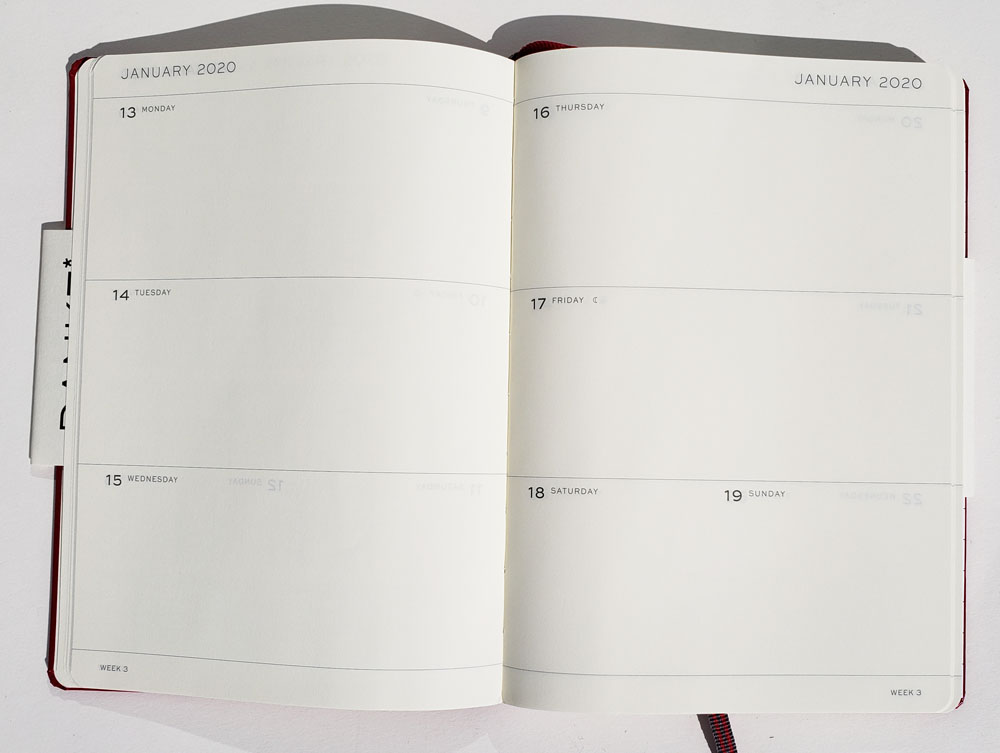
 Except for Saturday and Sunday having to share space (is it just me, or aren’t weekends as busy as other days for everyone?), the weekly spread has the format I prefer in a planner: plenty of unruled, freeform space for appointments and to-do items as needed.
Several additional planning and information pages are included, such as reference calendars for 2019, 2020 and 2021, vertical planning pages, international holidays and project planning pages. All pages are numbered, as is typical of Leuchtturm’s notebooks, and the last nine blank pages are perforated for easy removeable. Although I tend not to use reference or project planning pages, all the other features are useful (and I’m thrilled to have unruled pages, which are so hard to find in planners).


 Also included are a sheet of handy adhesive index labels and a gridded guide sheet – both standard with Leuchtturm notebooks.

An interesting anomaly included in the Leuchtturm planner is a thin, staple-bound booklet, which is suggested for anniversaries and addresses. I recall that Moleskine planners used to come with a similar address book that eventually disappeared. As much as I prefer analog tools to most digital counterparts, I cannot ever see myself giving up Outlook Contacts and going back to a messy, handwritten address book. The Leuchtturm address booklet seems anachronistic. But in fact, I have a use for it! More on this in a moment.


The planner’s ivory paper is the same as in most Leuchtturm notebooks. Shown below are my usual media tests. The paint pen bled through, as expected, as did tiny spots with my juicy Sailor fude fountain pen. None of the pens feathered, however. A more significant issue is the paper’s lack of opacity: There’s quite a bit of ghosting of darker, bolder pens that might annoy some. I generally prefer more opaque paper, but since I’ll usually be writing in my planner with a graphite pencil, show-through will be minimal and not bothersome.

 One planner element that I find essential is a monthly calendar in a traditional grid format. This is where I like to record birthdays, anniversaries and other special days. I also use this space to get a long-term overview when I’m planning travel or large projects. Although the Leuchtturm planner includes European-style vertical planners and tiny monthly reference calendars, there’s no monthly page spreads.
This is where that address booklet comes in! I started thinking that its 13 index-tabbed pages would be ideal for making exactly the monthly calendar pages I want. Having already decided I wasn’t in a DIY mood, however, ruling the grids and filling in the dates seemed tedious. I started looking around at all the amazing planner stickers and other tools available these days, and I found the Pine Book Free Diary Washi Tape Set ($9.75). It’s available in several formats (I chose the color set, of course, but a more professional black set, a B6 size, and a set with slightly narrower tapes are also available), including an A5 set, which fits my Leuchtturm planner perfectly.


First, I ruled the page spreads horizontally to accommodate six weeks, which means that two days would never have to share a space at the beginning or end of longer months (as happens in many calendars gridded for five weeks – another planner pet peeve of mine). The provided address-book ruling gave me enough guidance that I didn’t have to measure the spaces; I only had to count lines. I decided that the dates themselves would demarcate the days sufficiently, and vertical grid lines weren’t necessary.

The Pine Book set comes with a 6mm roll of days of the week, and seven of them fit across the A5 page spread nicely. The adhesive is strong but forgiving and can be easily repositioned (in case you’re straight-line-challenged like I am).


Another roll contains a full year of dates. You only have to pay attention to which date starts the week, roll off seven days, and tear off at the handy perforations. Seriously easy and fun!


Month labels are also included. Look at August: On most commercial calendars, you’ll find the 30th and 31st sharing a space. Not on mine, baby!

The last step was to label the index tabs with number indicators for the months. To add more color and to conceal the existing A – Z index labels, I pulled out the Mark’s Maste Washi Tape Set that I got last year to jazz up my Baron Fig planner. The 15mm width fit perfectly on the tabs. Then I placed the Pine Book numbered labels over the tape. Done! All of this took so much less time than DIY-ing my own calendar pages – and it was much more fun, too.


Final Impressions
The Leuchtturm weekly planner has all the features I want in a planner and only one (admittedly idiosyncratic) flaw – the weekend days having to share space – so it’s a nearly ideal planner for me. After all these years of rolling my own, it’s a relief to find something readymade that’s close to perfect.
As for the Pine Book calendar tape set – I like it so much that I’m thinking I might order a set for the following year. I’d love to see more options (Different color themes? More sizes?). And it’s exactly the level of DIY I was up for this year.

Tina Koyama is an urban sketcher in Seattle. Her blog is Fueled by Clouds & Coffee, and you can follow her on Instagram as Miatagrrl.


 Jaclyn is a research pharmacist and graduate student in Indianapolis. Follow her on


