Tag Team Pen Review: East Hill Tombstone White Brush Pen

Review by Tina Koyama (and Ana Reinert, with art from Hannah Carey and Cory Say)

Here at the Desk, we love brush pens, and we also have a penchant for white ink. Imagine our excitement when a white brush pen appeared on the market!

By way of explaining the product’s unusual name, JetPens describes the East Hill Tombstone white brush pen ($8.25; also available in black and vermillion) as “originally designed for repairing the engravings on Japanese tombstones and stone lanterns.” Very similar to the form factor of the Kuretake Zig Cartoonist Brush Pen, Pentel Art Brush Pen and other such pens, the East Hill pen contains ink in a soft reservoir.

Squeezing the barrel pushes ink from the reservoir to the brush tip.

I was pleased to find that the water-resistant, pigment-based ink is opaque and fast-drying. I especially like its opacity on toned paper (this opacity test and my sketch sample were done in a gray Stillman & Birn Nova sketchbook).

However, I was disappointed that the ink doesn’t flow as smoothly as I would like it to when sketching. In my sketch sample, I tried to “paint” the sky behind the trees, but I think the ink is a bit too thick for that type of application. It’s good for a “dry brush” effect, though, if that’s the effect you’re going for. A calligrapher or fancy letterer could probably make some beautiful effects on dark paper with the thick/thin brush strokes.

In an ongoing struggle with flow, I found that the ink tends to clog. I assume that was the problem, anyway, when squeezing the reservoir barrel sometimes resulted in the ink over-flowing from the edge of the ferrule instead of flowing into the brush. If you squeeze too hard, an unfortunate drip of ink may result.

Now that I see that the Kuretake Zig Cartoonist comes in white, too, I’m optimistic that more opaque white brush pens will become available.

Ana’s Perspective

Now, it’s our turn to weigh in about the East Hill Tombstone Brush Pen. My friend Hannah (you might remember her from Episode 22 of Art Supply Posse) mentioned the Tombstone pen to me and we set about prodding JetPens to find it on their next sourcing expedition. They were able to locate them, much to our glee. Clearly, many other artists wanted it too, so it sold out as fast as they stocked it. Finally, we were able to procure a couple white pens and black pens.

Hannah agreed to test out one of the pens and see if it lived up to her memories. She was happy with the results and got some pleasant shading. We got to see one of her cool illos.

Cory took a white one for a spin. He got some good opaques and shading but said he had some difficulties getting the ink out as well. He still made it look easy.

We all had the same issues with the white pens bubbling that Tina did and I found the ink super dry. Hannah had a little better luck with the black pen. Either way, the Tombstone pens have the advantage of being waterproof when dry.

Dr. PH Martin's Pen White

At one point, Elaine (at JetPens) cooked up a workaround since the Tombstone pens kept selling out. Using Dr. P. H. Martin’s Pen White ($12.25) in a water brush pen ($5.75) works exceedingly well for most cases where you might need opaque white. Of course, P.H. Martin’s Pen White is not waterproof but when added to the brush pen with a little bit of water,  it’s so much easier to apply. The Tombstone was a bit of an ordeal to apply and felt chalky.

If you are adding eyelights, highlights or just doing lettering on dark paper and don’t need waterproofiness, I’d recommend making your own brush pen with Pen White. Since Pen White is soluble with water, it can be used for shading too. It will probably ruin the brush pen or it will probably be the only thing the brush pen can be used for. One bottle of Pen White can fill two water brush pens so it’s an even value to the Tombstone pens or you can go halfsies with a friend.


tina-koyamaTina Koyama is an urban sketcher in Seattle. Her blog is Fueled by Clouds & Coffee, and you can follow her on Instagram as Miatagrrl.

DISCLAIMER: The items included in this review were provided free of charge by JetPens for the purpose of review. Please see the About page for more details.

Pen Review: Pilot Grance

Pen Review: Pilot Grance

By Jessica Coles

I found myself lost the other day in the depths of JetPens, wandering through various corridors.  It seems that even though I could swear I’ve seen everything they offer, I can still find nooks and crannies of previously unseen goodies.

This time, I came across a Pilot fountain pen that I had never seen before.  It was the Pilot Grance fountain pen ($137 from JetPens). I’ve known that Pilot offers a few amazing deals for mid-level fountain pens, but this was a special treat.  A gold nib fountain pen!

Gold nib fountain pens are not necessarily for everyone.  In fact, there was recently a great conversation about gold nibs versus steel nibs on an episode of The Pen Addict that touched on the pros and cons of nib materials (the question was asked by a listener and is near the end of the episode).

My personal preference swings between steel and gold, but I am always excited to find a great deal on a new gold-nibbed fountain pen – one that is at a lower cost than most others.  Pilot also offers the E95S at a similar price ($135 at JetPens), but it is a rather small pocket pen that doesn’t usually appeal to those with larger hands.

The grip of the Grance is 9.5 mm, about the same as a Pilot Metropolitan.  The weight of the Grance is also in-line with the Metropolitan, coming in at 25 grams to the Metro’s 27 grams. The posted Grance is about half an inch shorter than the posted Metropolitan, although the capped pens are nearly the same size.  Again, like the Metropolitan, the Grance pen closes with a very satisfying snap.

However, the exterior of the Grance is quite different.  It has a pearly finish that comes in white, pink, or light blue, each with black and gold accents.  

The pen is long enough (for my hand) to be used unposted, but the balance is much nicer when posting it.

The Pilot Grance is offered with an extra-fine, fine, medium-fine or medium 14kt nib.  The nib is a buttery smooth nib with a bit of springiness.  A small amount of variation is present when writing with no pressure at all.

The nib is soft when writing with light pressure.

In longer writing sessions, using the Grance pen feels elegant and looks amazing, especially in the sunlight! I had no problem writing for several pages with the posted pen – the balance of the pen kept me from pressing harder on the page and the nib was absolutely perfectly tuned straight out of the box.

The pen comes in a plastic clamshell box with one black cartridge but no converter.  It is a sad thing that no converter is included in a gold nib pen purchase, but it seems one way that some pen manufacturers are using to keep the retail prices down.  A converter is available separately ($7.25 at JetPens), or it can be used with Pilot’s proprietary cartridges.

Overall, I would highly recommend this pen.  At $137 for a gold nib, a post-able, snap-able, beautiful pen that writes smoothly out of the box, I think the Pilot Grance is one that you will treasure.


DISCLAIMER: The items included in this review were provided free of charge by JetPens for the purpose of review. Please see the About page for more details.


Eye Candy: Moo Kate Moross Notebook Set

Eye Candy: Moo Kate Moross Notebook Set

Moo has once again released a special edition of their notebooks. This time, they teamed up with artist Kate Moross and created a 3-notebook set in a slipcase ($24.99) that is available starting today.

Moo Kate Moross Notebook Set

The slipcase has the same texture and sturdy build as the slipcase that my original hardcover notebook came in. Its matte finish though. Inside the slipcase are three stitch bound, softcover notebooks each with coordinating covers, center pages.and stitching.

Moo Kate Moross Notebook Set

Each cover is printed in tone-on-tone inks with a clue to the purpose for each notebook.

Moo Kate Moross Notebook Set

The turquoise blue book is set-up for to-do lists, the bright goldenrod yellow is blank sketchbook and the red is lined for notes.

Moo Kate Moross Notebook Set

The red notes notebook is printed with yellow lines and has contrasting blue blank pages in the center and yellow end papers.

Moo Kate Moross Notebook Set

The yellow blank sketch book has contrasting red paper in the center and blue end papers.

Moo Kate Moross Notebook Set

The blue to-do book has wider red printed lines and check boxes with yellow pages in the center and red end papers.

These notebooks all use the same paper as the previous notebooks.  The paper is 100gsm Munchen Kristall and the colored paper is 135gsm Colorplan, the same used in the previous editions of the Moo notebooks so all our previous writing tests apply here as well. The paper is lovely, these notebooks are cool looking and the slipcase makes for great storage later.


The Giveaway

Clearly, I can’t possibly keep something this nice all to myself. So, I want to share the wealth. I am giving this amazing Moo x Kate Moross Notebook Set away to one lucky reader.

TO ENTER: Leave a comment below and tell me which notebook you’d use first. Play along and type in something. It makes reading through entries more interesting for me, okay? One entry per person.

If you have never entered a giveaway or commented on the site before, your comment must be manually approved by our highly-trained staff of monkeys before it will appear on the site. Our monkeys are underpaid and under-caffeinated so don’t stress if your comment does not appear right away. Give the moneys some time.

FINE PRINT: All entries must be submitted by 10pm CST on Sunday, February 3, 2019. All entries must be submitted at wellappointeddesk.com, not Twitter, Tumblr or Facebook, okay? Winner will be announced on Monday. Winner will be selected by random number generator from entries that played by the rules (see above). Please include your actual email address in the comment form so that I can contact you if you win. I will not save email addresses or sell them to anyone — pinky swear. If winner does not respond within 7 days, I will draw a new giveaway winner. Shipping via USPS first class is covered. Additional shipping options or insurance will have to be paid by the winner. We are generous but we’re not made of money. US and APO/AFO only, sorry.


DISCLAIMER: The items included in this review were provided free of charge for the purpose of review. Please see the About page for more details.

Link Love: Ink is Where it’s All Happening!

Link Love: Ink is Where it’s All Happening!

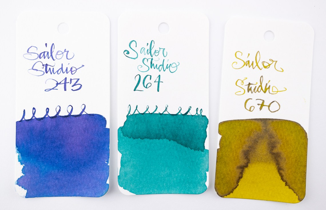
This week, the ink is where it’s at! Oh, there’s still lots of other interesting things to read but between Macchiato Man’s overview of the Sailor 100 inks and Mountain of Ink reviewing the much revered Parker Penman Sapphire, the Ink category is this week’s hot ticket.

Oh, and in honor of Chinese New Year, I thought you might enjoy seeing this video that our Asian American group put together at work in honor of the occasion. If you watch carefully, you might see someone you know!

Pens:

Ink:

Notebooks & Paper:

Other Interesting Things:

Ink Review: J. Herbin Corail des Tropiques

Review by Laura Cameron

As I said, I thought I ought to give coral a chance this year. So when I placed my last ink order, I went ahead and added J. Herbin Corail des Tropiques (10ml for $5.50) to my cart.

The photos I’ve taken really don’t seem to do Corail des Tropiques justice. While Diamine’s Coral is a bright hit of orange, Corail des Tropiques is more subtle and shaded, and looks almost dustier. There are no bright oranges in this one, just peachy coral goodness; the kind that reminds you of the southwest or the beach.

I think the distinction is hard to make in the ink comparison swatches (thanks camera!), but a bit easier to see in my writing pages.

I didn’t see any sheen in this ink, just tons of beautiful shades of coral.

I was pleasantly surprised that the Corail des Tropiques was soft at times and yet still had good coverage. Some of the J. Herbin inks are very light and faint in writing, but this was very readable. I have to say, I think I like Corail de Tropiques even better than the Diamine Coral!


DISCLAIMER: The ink included in this review was provided to us free of charge for the purpose of review. All other materials in this review were purchased by myself. Please see the About page for more details.

Notebook Review: Clairefontaine A6 Graf’book

Notebook Review: Clairefontaine A6 Graf’book

The Clairefontaine Graf’Book is a simple, blank notebook with black card stock cover and an exposed thread binding. The Graf’Book is made up of 100 pages of 100gsm bright white paper. I got the A6 size but the Graf’Book is also available in A4 and A5 size with portrait or landscape binding options.

A6 Grafbook

The exposed binding allows the book to lay flat when opened and is aesthetically appealing in its simplicity.

A6 Grafbook

Along the inner edge of the pages, they are printed black. It creates a slight visual margin.

A6 Grafbook

The 100gsm paper stands up to most fountain and drawing pens, water-based markers and pencils. The paper has a tiny bit of tooth. It’s not super smooth like most Clairefontaine paper so its suitable for drawing and holding graphite. I have not tried heavier water medium like water color but the paper is heavier than most notebooks but not watercolor paper so it will probably buckle under heavy water application. For quick sketches, though, I think it will hold up. The soft cover will accommodate any growth as well.

A6 Grafbook

There was a tiny bit of show through with the calligraphy width pen but nothing with any other tool. There has been no feathering with any tool I’ve used with this notebook either and I’ve been using it for several weeks.

I’ve been using this book for a catchall for ideas, quotes, doodles and ephemera and I absolutely love it. I really hope that the Graf’Book gets wider distribution in the US so that its easier to get your hands on one.

I purchased mine at Wonder Fair in Lawrence, KS. If you’re passing through, it is an absolute MUST see. Otherwise, ask your favorite retailer to start stocking the Graf’Book from Clairefontaine today.