I recently came into possession of a new notebook named My Graphic Book ($16 at Vanness) that lives up to the name quite well. This notebook consists of six sections, each featuring a different kind of graph in various bright colors. My first thought was that this could check several boxes for me; a rainbow of colors, graph paper that begs for doodling plus the bright colors seemed to give me permission to have a notebook that was set aside for fun.

Please excuse the slight bend in the cover. I’m fairly tough on notebooks!
First, an overview of the paper in general. All sections in the notebook use the same paper, bright white, smooth paper (I have not found information about the weight of the paper but it is fairly thick) that feels wonderful to write on it.

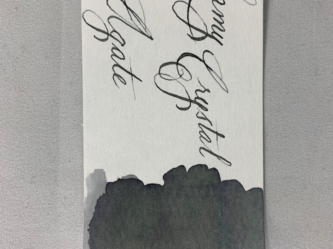
I was somewhat disappointed at first when fountain pen ink bled through the paper. But then I remembered something. There are writing instruments that are not fountain pens!

My obsession with fountain pens didn’t start with fountain pens. It started as an obsession with pens in general. Gel pens were a huge part of my notetaking in school; between classes and journaling, I could easily write gel pens dry on a regular basis. Micron pens, Stabilo pens, Gelly Roll pens… I don’t use these pens as much anymore, but why not? They are so fun! I decided to get out ALL of them and play with color in this notebook.

I was actually pleasantly surprised to find how well this paper did with nearly every pen I threw at it, even Sharpie marker. By far my favorite was the Stabilo 68 pens that don’t play well with my usual Tomoe River paper. I had forgotten how many of these I actually owned, so there was no problem finding plenty of colors.

The first section of the Graphic Book is blue dots at a spacing of 7mm. The larger distance between dots helped remind me not to take myself too seriously here – this notebook was to be fun.
The next section consists of bright green lines. The spacing alternates between 3 and 4 mm.

I got out my super fine gel pens for this section.

Nothing bled through with this pen.

Did I mention? Each section in the notebook is marked off from the others with a matching Day Glo divider!


The next section consists of neon orange lines, surrounded by neon orange dividers. These lines reminded me of the handwriting pages that were given out in grade school.

The lines made me nostalgic for those handwriting exercises, so I gave that a try!

Next came a neon red grid. It was hard to get the photo to come anywhere close to the actual color here – it seems the red is a bit bright for my camera.


Here I brought out the Stabilo markers for fun.

The fifth section is a VERY bright neon pink.

The grid in this section was even more playful and reminded me of quilts.

So I made pinwheels using Stabilo 88 markers and got out my Day Glo gel pen!

The best color was saved for last. Purple.

This grid also ended up being one of my favorites. The heavy lines are a 10mm spacing, the medium lines at a 5mm spacing and tiny 1mm grid over all of it.

I didn’t have the chance to get as involved with this graph, but you’d better believe that this one will get more color soon!

The binding for this notebook consists of six signatures (or group of sheets that are folded together) that are each sewn.

The signatures are then glued at the sewn edge.

This allows all of the colors and textures to be seen on the spine.

I have enjoyed using this notebook – I often make the mistake of keeping notebooks only for serious reasons. My Graphic Book pulled me back into the fun parts of doodling with good paper, it’s a wide variety of graphs and amazingly bright colors. I highly recommend it for having lots of fun.

DISCLAIMER: Some of the items included in this review were provided to us free of charge for the purpose of review. Please see the About page for more details.


 Tina Koyama is an urban sketcher in Seattle. Her blog is