Review by Tina Koyama, Laura Cameron and Ana Reinert
All the reviewers on The Well-Appointed Desk participated in the Baron Fig bag Kickstarter and all three of us purchased the tote bag so we decided that it would interesting to write a review with each of us weighing in. Hope you enjoy this mega-review. (All links for this post will be at the end of the review.)
Tina’s perspective:
A long-time fan of Baron Fig’s notebooks (I backed their very first Kickstarter for the hardbound Confidant), I was excited to see that the New York City company was initiating a collection of bags with a Kickstarter campaign. Although I needed another tote bag like the proverbial hole in the head, I backed it immediately for $45.
Unlike the dozens of other totes hanging in my closet, however, Baron Fig’s is built like travel gear – a very heavy-duty canvas fabric that looks like it’s going to go for miles and miles. I haven’t had it long enough to abuse it, but I have no doubt of its sturdiness. I also appreciate that its wide straps are made of cotton weave with a texture that helps to keep the bag from slipping off my shoulder.
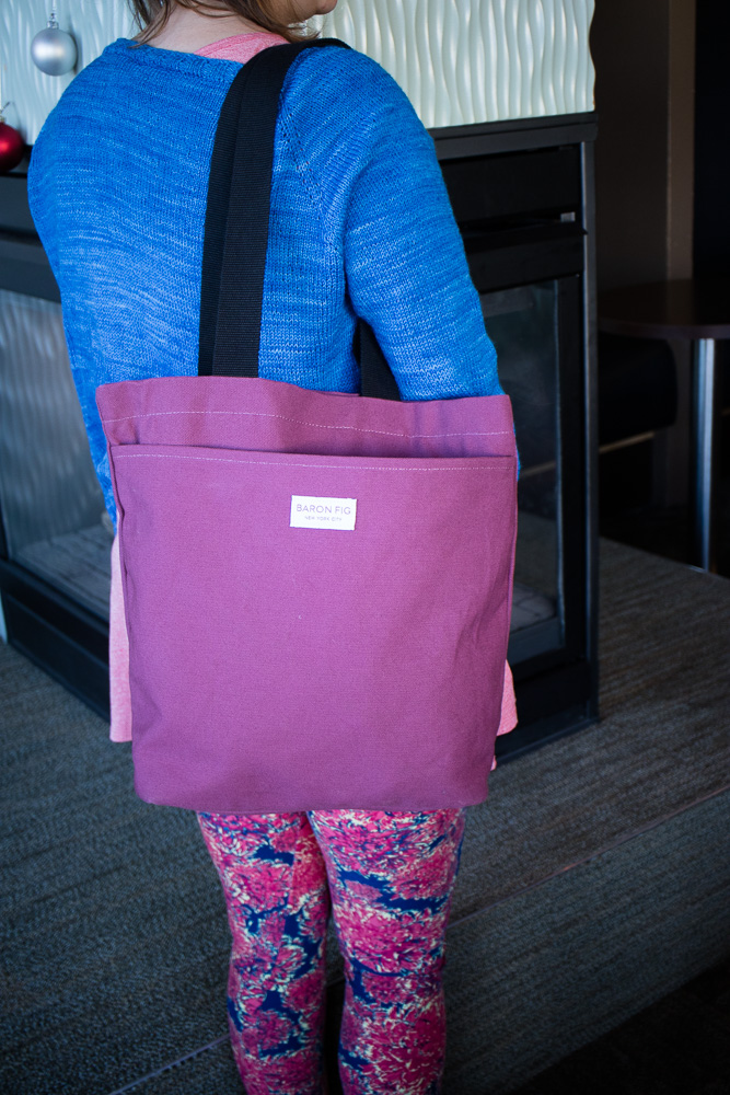
Also unlike most of my totes, the Baron Fig is attractive and “urban” looking. I could see myself throwing produce from the Pike Place Market into it, and then meeting a friend for lunch downtown afterwards, and I wouldn’t look schleppy at the café. I chose the Fig Wine color, which is pretty but not bright. While I don’t have a problem carrying garish bags around town, if I had the kind of job where people look askance at such things, this bag would slide into a conference room without turning heads.

The tote’s front, embellished with Baron Fig’s logo, is taken up with one compartment the length and full width of the bag. It’s a handy place to slip a newspaper or magazine for commuter reading. However, I’d be wary about putting anything of value there, since it offers easy access to the carrier as well as a deft pickpocket.

Inside the roomy tote is one zipped wall pocket near the top, which is the only secured pocket. It’s a generous space, so it fits my phone, keys, wallet and anything else of value.

Curiously, there’s also one shallow, unzipped pocket at the bottom of the tote that I didn’t even notice, even after taking photos, until someone mentioned it. I really don’t know how I would use it, since it’s so far down that it doesn’t serve to make things easier to reach. A second zipped pocket at the top of the opposite wall would have been more functional.

As for the very roomy main compartment, Baron Fig’s marketing copy suggestion – “throw in notebooks, clothes, your dog” – is not an exaggeration! I know several dogs that could comfortably fit inside, along with the notebooks and clothes. My concern, though, would be BF’s other suggestion, which is that the space is large enough for a 15-inch laptop. It may fit, but I would be very nervous about carrying one, because if I set the bag down on the bus seat, the large opening would expose the laptop and everything else inside. If it fell over, the contents would be on the floor of the bus.
Final Impressions
Overall, the BF tote is strong, well made, attractive and roomy. (It’s a bit out of scale for those of us who are “vertically challenged,” but I can hardly blame the bag for that.) I find it handy for schlepping groceries without looking schleppy. The unsecured compartments, though, make me hesitant about schlepping anything more valuable than a loaf of bread.

Laura’s Perspective:
Several months ago I eagerly backed the Baron Fig Kickstarter campaign. I really liked the look of the Fig Wine tote bag and thought it would be good for an everyday carryall.
When the tote arrived I was a little surprised by the color, which was a more mauve and less wine-colored than the photos indicated. That said, I was pleased with the tote overall. The tote bag is made of sturdy canvas and is approximately 11″ x 13″. The size is perfect for me: big enough to hold items that I don’t want to carry in my purse, but small enough not to be a huge bag to lug around with me.
So far I’ve been using mine as a carryall to and from work. I use it to store my Hobonichi Techo, a couple of pen cases, and a knitting project. I can usually throw a snack in there, and a bag of charging cables as well.
The bag has been holding up well for the last few weeks of constant use, and still looks brand new. I appreciate the zippered inner security pocket to hold keys, credit cards, or the like, although I don’t use it exclusively for that. I’m not sure what to make of the inner pocket towards the bottom of the bag; I did notice it was there but, like Tina, I don’t find it useful for anything. The outer pocket is fine to throw my keys into, and my bag doesn’t happen to gape open the way Ana’s bag did. I think a snap or a zip would make that front pocket less of a theft risk, but for my suburban needs, I’m not terribly bothered by it.

Overall, this is a very functional tote bag. It seems slightly more expensive than similar totes at L.L. Bean or Land’s End, but if you’re itching to support a pen and stationery company then this one seems like a decent buy.

Ana’s Perspective:
I am the last to weigh in, so most of my notes will relate specifically to my use-case for the bag and the advantage that Laura and I had in being able to put our bags side-by-side to compare the materials. I will try not to repeat too much that Tina and Laura have already covered.
I backed the Baron Fig Kickstarter for the Three Bag Level so I received the Tote, Messenger and Backpack. The Tote bag is the only one I got in the Blue Slate color which was available as a stretch goal option later in the Kickstarter. The Messenger and Backpack I received are in the Smoke (originally listed as Charcoal).
I schlep a lot of books, projects and sundry items back and forth from work so the tote bag seemed like a perfect option for me. I drive to work so the open top isn’t a huge issue and I only walk from the parking lot to the office.
I work in an enormous series of buildings where I occasionally have to move materials from one end of the building to the other (9+ stories and often half a mile or more of walking from one location to another with samples, books, projects, etc) so I hoped the tote bag would be a perfect schlepper.

One of the first things I noticed with my Slate Blue bag was that the outside pocket is very wide and open. Laura and I compared notes and after some test runs with the tote filled with various amounts of items, I determined that the outside pocket flops open too easily to be useful. If the tote has only a couple items in it then the problem is exacerbated. I really wish that there had been some sort of closure put on the outside pocket.
I threw my keys in the pocket the first time I used it and it gapped so widely that I referred to it as the “pickpocket’s dream”. Having lived in Chicago for years and taken the El and the bus to and from work, I often still consider bag security and this does not have it at all. The photo above the pocket only has a packet of tea in it and its enough to flay the pocket open pretty easily. Sad.
If the tote is packed full, then the pocket is pushed closed but its still best not to put anything in it.

If your goal for the bag is to take your knitting to your Knit Night or, like I mentioned earlier, schlep around your gym, office or campus, then its a pretty durable canvas bag but the advertised option to put your valuable laptop or other electronics seems a bit flashy, even in suburbia.
The zipper pull on the interior pocket is a little small for me. I think I’ll put a zipper pull on it to make it a little easier to grasp. And I completely agree with Tina and Laura about the interior slot pockets. They are far too low in the tote bag to be useful. I just kept catching things on them rather than actually organizing or coralling anything. I know its supposed to hold a notebook and pen but they just flop forward. I just find it awkward.
The cotton weave straps feel durable but, for some reason, they slide off my shoulder. Maybe its specific to the material that my winter coat is made from that is contrary to the straps but I don’t normally have this much trouble with things falling off my shoulder. My Orla Kiely bag has super smooth straps that don’t slip so I’m a little befuddled.
Final Impressions:
It seems our consensus on the tote is that it is a decent first effort but needs some refinements to make it truly top-notch. It was pretty ambitious to try to reinvent the tote bag so I admire the gumption on the heels of trying to reinvent the backpack and messenger bag too.
Links:
 Tina Koyama is an urban sketcher in Seattle. Her blog is Fueled by Clouds & Coffee, and you can follow her on Instagram as Miatagrrl.
 Laura is a tech editor, podcaster, knitter, spinner and recent pen addict. You can learn more about her knitting and tea adventures on her website, The Corner of Knit & Tea and can find her on Instagram as Fluffykira.