
Ink – Written by Hand (#INKdoc) from Ryan Couldrey | @RyTron on Vimeo.
A film by Ryan Couldrey featuring Tanja Tiziana and Wonder Pens.
Ink – Written by Hand (#INKdoc) from Ryan Couldrey | @RyTron on Vimeo.
A film by Ryan Couldrey featuring Tanja Tiziana and Wonder Pens.

 Following yesterday’s Link-less Link Love, I received a lot of feedback regarding images for the weekly Link Love. First, let me clarify. I will be continuing to do Link Love — I was just asking about the illustration of Link (from The Legend of Zelda) holding a pencil and whether people were getting bored with him.
As a result of the comments, a great idea was born. I’d like to ask you, my lovely readers, to write, draw, photograph, or doodle an original “Link Love” image. It can be lettering, calligraphy, your own interpretation of Link or anything else you think might relate to the weekly list of pen/pencil-centric blog links.
Email your submission to me at ch***@***************sk.com. Please include any link information you’d like in the image credit (your full name, your Twitter handle, Instagram feed, blog, whatever). Also include any information about inks, tools, paper, etc used in your creation. Please let me know that you give me permission to include it in the weekly Link Love post here on the blog and that the image is your original piece.
Thanks to everyone! And I can’t wait to see what you create!

I can’t believe I’ve waited so long to share details of the Franklin-Christoph Pocket 66 Ice that I purchased at the Atlanta Pen Show. Being able to try every single Franklin-Christoph nib and pen body at the show was such a great experience and Lori from Franklin-Christoph was a great enabler too. She carried her Pocket 66 proudly all weekend, eyedropper filled with Pilot Iroshizuku Fuyu-Gaki which looked like a little writing lava lamp. Sold!

I ended up choosing the standard medium italic nib and also eyedropper filling my Pocket 66. This maximizes the ink capacity and looks super cool, especially with brighter, vivid ink colors. For these photos, I filled my Pocket 66 with Pelikan Edelstein Tourmaline, a bright fuchsia.

The Pocket 66 Ice is clear polished acrylic but the inside of the cap and body have a frosted finish giving the pen its unique look. I like to just slosh ink around in the reservoir and watch the color.

The Medium Italic nib is a custom ground nib by Mike Masuyama which is available directly from Franklin-Christoph and is a nominal upcharge from the standard nibs. The medium italic glides easily across the paper! Its lovely to use.

The pen measures 5 inches capped and 4.75″ uncapped. The cap posts easily and make the Pocket 66 5.5 inches long. The pen is lightweight at 15 gms capped and filled and 13 gms filled without the cap.

Franklin-Christoph pens ship with a leather zip pouch which is one of the most useful extras I’ve ever gotten with a fountain pen.
The price for this configuration is $164.50 but a standard nib makes the pen a little less expensive and an 18K nib will increase the price but not nearly as much as other pen manufacturers. If you have a chance to try the F-C nib testing station at a pen show, I highly recommend it as a great way to find just the right nib and pen body combination for you.
Are you sick of my Link image? Would you like to see something new? A different image every week? I’d post images from my favorite posts but I got in trouble for not asking permission and I don’t have enough time to wait for permission before posting other people’s images so I am not going to do that. Please give me some suggestions on things you might like to see make this list of links a little more exciting. Thanks!
Fountain Pens:
Pens:
Ink:
Pencils:
Paper & Notebooks:
Other Interesting Things:

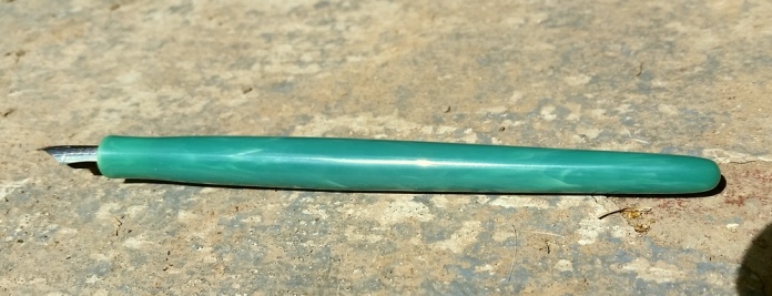
Earlier this year, I contacted Shawn Newton about making a nib holder for my large collection of Esterbrook nibs. I thought it would be a great solution for ink testing since the nib holder has no ink reservoir. This makes clean up fast and easy.
Shawn was super easy to work with and the whole transaction was organized through email. I chose the material for the pen and my order was put into the queue. He’s a single man operation so all work, whether its custom pens or nib work are handled in a first-come, first-serve order.

I chose a light jade alumilite which is a mixed resin material. Its a cool green with threads of white which is quite reminiscent of jade stones.
The pen is just a nib holder, it has no cap, no ink reservoir… just beautiful, comfortable to hold resin body that is threaded to fit my Esterbrook nibs. The taper at the grip is very comfortable and the resin is smooth without being slippery.

I’ve been using this nib holder for ink reviews for several months now and I actually look forward to writing ink reviews since this nib holder is so pleasant to hold and use. Since the Esterbrook nib units have feeds built into them, a dip into ink will fill the feed allowing me to write for quite awhile without having to dip again. I can often write a whole page or more without needing to dip the nib again.
With the nib unit installed the pen measures 6 inches and weighs 12 gms. The nib holder actually weighs less than a Kaweco Sport in plastic but is a full sized pen!

For my test page I continually swapped out nibs and dipped in the ink again. As you can see the first nib I used hadn’t been cleaned so the ink came out much darker than it should have been. I bounced between various nibs as I was writing and dropped the used nibs into a glass of water to clean.
If you have wanted to experiment with the wide variety of Esterbrook nib units, a custom made nib holder is a great option. NOS and used Esterbrook nibs are available from Anderson Pens or you can scout around on Ebay.
Threaded nib holders start at $75. Contact Shawn directly to make arrangements.
Tested with discontinued Sailor Jentle Apricot ink (sorry!) on Rhodia Uni-Blank No. 18 pad with 6mm guide sheet.

I was pretty flabbergasted when my friend Kasey offered to send me his Nakaya Decapod pen to try out. It was such a kind and generous gesture considering how special (and pricey) Nakaya pens are. But that didn’t stop me from accepting his offer immediately. How often does one have the chance to test a pen at home, with your own inks and papers, with the luxury of comparing it side-by-side with your own pen collection? Exactly, so I had to do it.

The pen arrived in a paperboard shipper box made from beautiful Japanese paper. Inside was a balsa wood box with writing on the lid in black. Once that was opened, I saw the pen wrapped in a “kimono” cloth case, ink cartridges and a cartridge converter, all laying on a red velvet mat.

Once I got the pen out of the packaging, I could truly appreciate the beauty of a Nakaya. The pen is in the now retired color Ao-Tamenuri (a blue-green urushi). This particular Decapod is known as the Cigar as it has no clip and a distinctly tapered shape like a cigar. The color of the finish is so beautiful in person and really hard to capture in a photo. The urushi is applied like layers of ceramic glaze which creates the lighter areas shown on the edges of the facets and a deeper, almost black color on the flat surfaces. Each pen is hand finished so the amount of color difference is unique to each pen. This Decapod has distinct edges with bright color difference that look almost green. The example shown on the Nibs.com site is much darker with heavier application of urushi that gives the pen a softer, rounder appearance.

The pen was purchased through Nibs.com which allowed for the pen nib to be modified by the legendary John Mottishaw. The original Japanese Medium 14K gold nib was ground into a Cursive Italic. Since the Nakaya Medium nib is already much finer than the European or US equivalent, this made for a fine cursive italic.

Its a beautiful nib on the end of a beautiful pen. I had to work up the courage to actually ink this gem up.

I decided to use the Pelikan Edelstein Aventurine ink which is a similar shade of green to the ridges on the Nakaya.

Once I had the pen inked and in my hand, I remembered fully and completely what all the fuss is about with Nakaya. Not only is the pen beautiful and unique but it is perfectly weighted in my hand. It was silky on the paper and wrote flawlessly.
On a less poetic, more technical side, the Decapod is a large, full-sized pen measuring 6 inches capped and 5.125″ uncapped. The cap does not post. The pens weighs 24 gms capped and filled with the converter and 18 gms with the cap removed. Its not a particularly heavy pen. The Lamy pens I reviewed a couple weeks ago were twice the weight! The faceted shape also helped make the Decapod one of the most comfortable pens I’ve ever used.
I tested the pen on my standard Rhodia Uni-Blank No. 18 pad with 6mm guide sheet under the blank page. Yep, that small.
This Ao-Tamenuri color is no longer available but other colors and configurations are still available if you are interested in pursuing the Nakaya dream. Decapods sell for between $650 and $750 each. Nib customization is additional, depending on the grind.
Its official, I understand what all the fuss is about regarding Nakaya pens. I know why they end up on folks’ grail lists. I think this pen is going to go on my grail list. Do you think Kasey would notice if I didn’t send it back?

(Thought you’d be amused to see my big, dumb cat attempting to “help” me write my review.)