Posts of the Week:
I just received my Field Notes Colors Edition: Ambition and was looking forward to writing and photographing my own review until I saw these two. So, kudos to Josh and Andy for setting the bar REALLY high for reviewing the latest edition.
- Field Notes Winter 2014 Ambition Unboxing Video (via Woodclinched)
- Field Notes: Ambition (via The Newsprint)
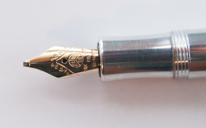
Pens:
- Pilot V-Pen Hack (via Write to Me Often)
- Vintage Value: The Conklin Duragraph Fountain Pen (Cracked Ice) (via From The Pen Cup)
- A.G. Spalding & Bros Bullet Roller (via Pen Addict)
Inks and Refills:
- Comparison of D1 Refills (part two!) (via Pens! Paper! Pencils!)
- TUL Needle Point .5mm (via Gentleman Stationer)
- Ink review: Lamy Coral (via Fountain Pen Physicist)
- Anderson Pens’ Fox River Blues (via Inkdependence)
Notebooks and Paper:
- Baron Fig Apprentice Pocket Notebooks (via Gourmet Pens)
- Kaweco Zequenz A6 Notebook (via My Pen Needs Ink)
- Guest post: My Life In A Pocket (via Plannerisms)
Other cool stuff:
- Adventures in Stationery: Book Review (via All Things Stationery)
- An Interview With Baron Fig (via Tools & Toys)
- Making Mail movie is online (via Letter Writers Alliance)
- Sealing the Deal, with a Chop (via Penucopia)
- Wireless Chargers – Buy This not That (via Office Supply Geek)


 Sorry for the delay in this week’s Link Love. I came down with a nasty cold this week and missed a couple of prime blogging days as a result. I hope to get all caught up as soon as the NyQuil hangover wears off.