Paper Review: Nanami Zen Paper

In a previous post, I reviewed the Cosmo Air Light (CAL) notebook from Musubi and compared it to the Tomoe River (TR) notebook (also from Musubi). I have included a few photos from those reviews in this post for review purposes. I’ve used the same pens with the same ink where I could, and all inks are the same for each test.

One of my favorite Tomoe River retailers has long been Nanami Paper. The online store offers a focused inventory that includes notebooks, loose-leaf paper, paper pads, and some paper accessories. With supply issues of Tomoe River paper during pandemic lockdowns, the staff looked for other paper sources; this search has recently led to an introduction of Zen paper.

I obtained a small sample of Zen paper from Nanami – each sample sheet seems to be 1/3 of a sheet of A5 paper from a notebook. Nanami states on their site that their Studio notebooks using Zen paper will soon be available and I assume from this sample that A5 will be one option.

The ruling on my sample is a 4mm grid of light gray lines – each line is a dotted line which helps it fade into the background.

Below is my first test of Zen paper. The dry time for Robert Oster Ocean here was just a tad over 30 seconds. Cosmo Air Light paper clocked in at 35 seconds for the same. TR timed 43 seconds.

You can see above how the bright pattern behind the paper shows slightly. Below is the reverse side of the page (with other paper behind to block the bright tropical fruits.

The top of the TR paper below is using the same Robert Oster Ocean ink. Shading is about the same for both options but the haloing of the ink is more pronounced on the Zen paper. By haloing I am referring to the way each letter looks outlined by a slightly darker color.

With the same ink on CAL paper, I saw no haloing but much more shading.

I used the same 6 inks on the rest of the testing. Bungubox Sweet Love Pink ink shows very bright on Zen paper, but with no real sheen. Athena Eternal Blue sheens bright pink on CAL and Tomoe River and sheens a muted pink on Zen. Sailor Manyo Haha shades dramatically on the Zen paper, more so than on CAL or TR, but the purple and green colors did not show on this test. Sparkle from Robert Oster Rose Gold Antiqua was best on the Zen paper – both more visible and richer color. Pen Saijiki would only show sheen when I layered on lots of ink.

You can see below that ink did start showing through the page, but only when multiple layers of ink were applied.

My last test used Robert Oster Antelope Canyon which shades amazingly on CAL paper. On Zen paper, the result was pleasant shading but not dramatic. The shading was similar to the results from TR paper.

Below is the message on Nanami’s homepage regarding the new Zen paper. I don’t know how long this will be offered, but I am certain all handwritten letters would be appreciated!


NOTICE: The Studio Note is almost here! We expect it to arrive in early June. It is made of a new paper we found which is very similar to Tomoe River paper. We are calling it “ZEN” paper. It is 52 gsm and about the same color white as the “white” Tomoe River. If you’d like to try a sample sheet, as well as a sheet of the “New” Tomoe River, please send a self-addressed stamped envelope to:

Nanami Paper
Att: Samples by Mail
P.O. Box 17422
Irvine, California 92623-7422


    If possible, please use a typewriter or fountain pen in your letter to us. There’s no special reason, other than I love to see stuff like that!
    ___________________________________________________________________

DISCLAIMER: All of the items included in this review were purchased by me or were provided for free when I sent a self-addressed, stamped envelope to Nanami Paper and is available to anyone who does the same. Please see the About page for more details.

Link Love: Tomoe on our Minds

Link Love: Tomoe on our Minds

There were lots of posts this week about alternatives to the beloved Tomoe River paper. The pen community has made it its mission to find good alternatives and spread the news when they find it. Have you been seeking an alternative or settled on one you really like?

For random interesting bits, the kottke.org Quick Links can’t be beat. There’s a smattering of news snippets, pop culture anecdotes, and the occasional Lego or animal-interest link.

Pens:

Ink:

Notebooks & Paper:

Art & Creativity:

Other Interesting Things:

We need each other. Please support our sponsors and affiliates. Your patronage will let them know you appreciate their support of the pen community. Without them, and without you, we could not continue to do what we do. Thank you!

GIVEAWAY: Yenderings Pen Roll

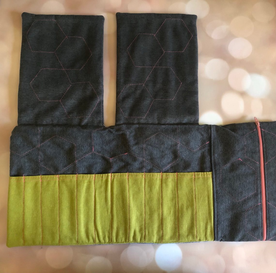
Today I’ve got a treat for you! A few years ago Ana picked up a Yenderings pen roll. The case is handmade, and gorgeous, and it isn’t getting used and loved like it should, so Ana is generously offering it up as a giveaway!

For a short while, Yenderings produced a limited batch of pen rolls with designs inspired by places in Toronto. We found a review from the Pen Addict dating back to 2018 showing another case and discussing some of the design inspiration. There is a Yenderings Facebook page (linked above), but the website isn’t active currently. Still we wanted to share this gorgeous case with you.

This soft fabric case has a combination of individual pen slots and separate zippered pockets to hold your essentials. When opened completely, the case is approximately 20″/50cm wide. The case is a tri-fold can can be folded and held closed with a fabric tie, at which point it is approximately 8″/20cm wide x 9.5″/24cm tall.

All of the seams on this case are beautifully finished, and the complementary zippers open up to reveal lined pouches. I easily fit a pocket sized notebook into both zippered pouches and, while it would create some bulk, one could fit a handy Col-o-Ring in there as well.

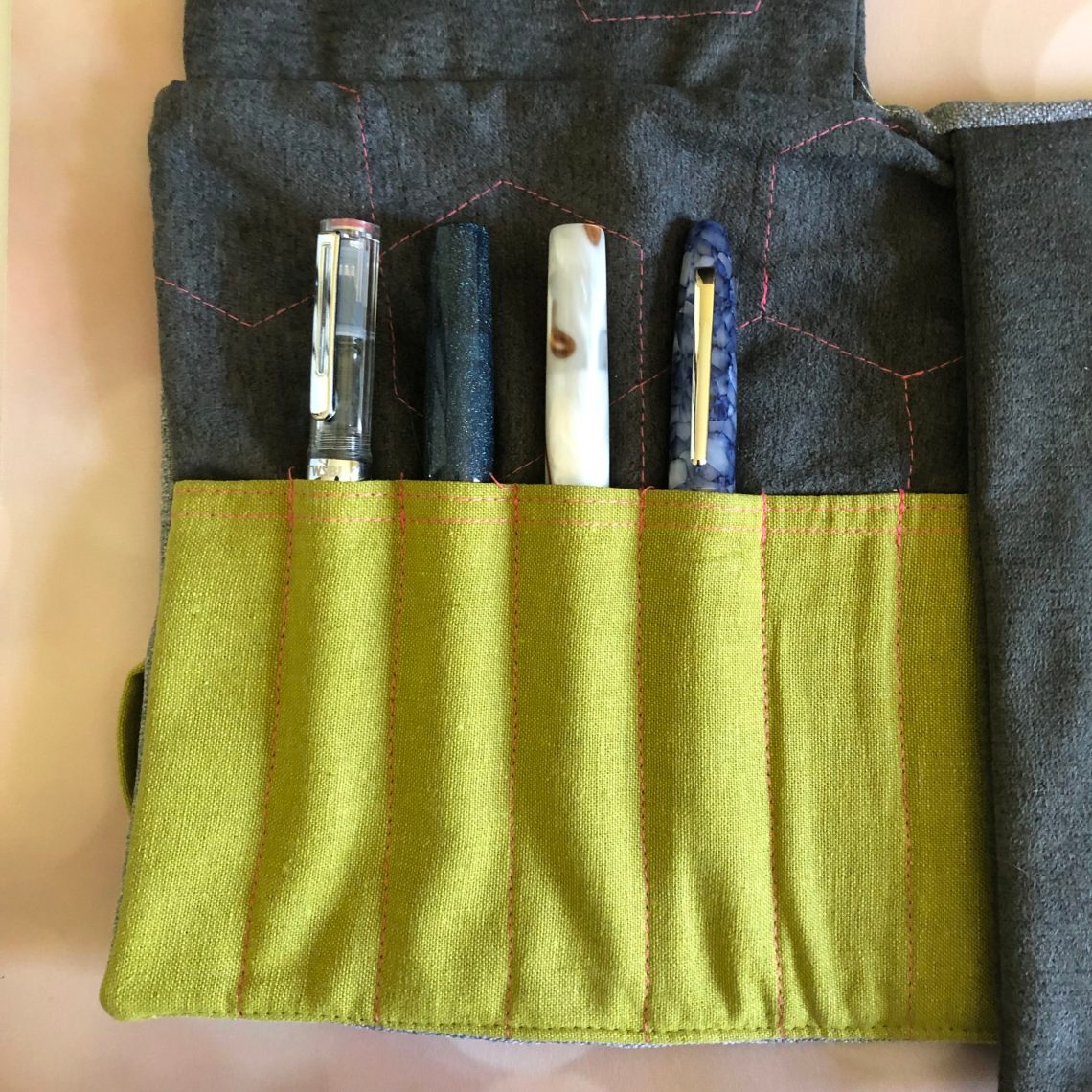
The 12 pen slots are deep, meaning your pens can slide in and remain protected (for those who never want their pens to touch!). For the photo I didn’t push them in quite all the way, but when I did there was less than an inch of the caps that showed. Col-o-Ring aside, the case is a few inches thick when full, but lightweight.

And if you match it with a Musubi notebook, you’ll be stylin’!

So let’s get on with the giveaway shall we? The giveaway includes the gorgeous pen roll pictured here, but not any of the props I used (I’m keeping my pens and Musubi y’all).

TO ENTER: Leave a comment below telling about your current go-to pen case!  (Play along and type in something. It makes reading through entries more interesting for me, okay?) One entry per person.

If you have never entered a giveaway or commented on the site before, your comment must be manually approved by our highly-trained staff of monkeys before it will appear on the site. Our monkeys are underpaid and under-caffeinated so don’t stress if your comment does not appear right away. Give the monkeys some time.

FINE PRINT: All entries must be submitted by 10pm CST on Friday, June 18, 2021. All entries must be submitted at wellappointeddesk.com, not Twitter, Tumblr or Facebook, okay? Winner will be announced on Monday. ONE winner will be selected by random number generator from entries that played by the rules (see above). Please include your actual email address in the comment form so that I can contact you if you win. I will not save email addresses or sell them to anyone — pinky swear. If winner does not respond within 5 days, I will draw a new giveaway winner. Shipping via USPS first class is covered. Additional shipping options or insurance will have to be paid by the winner. We are generous but we’re not made of money. US and APO/AFO only, sorry.

DISCLAIMER: All the items included in this post, as well as the giveaway item, were purchased by the staff of The Well-Appointed Desk using their own funds.

Fountain Pen Review: Ranga Abhimanyu Premium Ebonite

Fountain Pen Review: Ranga Abhimanyu Premium Ebonite

Every time I have a Ranga pen in my hand, I am reminded how much I like them. The Ranga Abhimanyu Fountain Pen (starting at $72) is no different. This cigar-shaped pen is available in both brilliant acrylics and subtle ebonite colors. The pen has a long, tapered grip section which is very comfortable in the hand. It’s not a long pen but is wider than a lot of smaller pens making it comfortable for a range of hand sizes.

The pen comes with a standard international converter. The pen can be converted to an eyedropper filler by using the accompanying silicone grease and eyedropper that Teri includes with each order (we received the grease and eyedropper kit but we are sending it out with our Peyton Street Pens Miwok 2 pen so I don’t have it here to photograph).  There are a lot of threads on the barrel to remove the body from the grip section to get to the converter but that’s probably my biggest criticism of this pen. The cap screws on with only a quick twist but removing the body from the grip section took me about 11+ turns. At least it’s unlikely to ever become untwisted on its own, especially if it’s eyedropper filled.

I tested the Premium Ebonite model in Green-Yellow with a broad cursive italic nib that was custom ground by Nivardo, the Peyton Street Pens in-house nibmeister. The color of the ebonite is a shamrock green with a yellow-gold marbled swirl. Initially, it wasn’t a color combo I would have picked for myself but I am warming up to it. I tend to like to color coordinate my inks with my pens and I tend to not use any bright green inks. However, there is also a thread of teal in the ebonite as well as the yellow-gold and those are both colors I’m inclined to use.

I have another Ranga Ebonite pen and I like that the ebonite finish can become more matte over time. I’m sure you could polish it up if you prefer to keep it shiny but I like the softer finish. It’s a nice alternative to all my shiny acrylic pens. If you prefer shiny acrylic, the Abhimanyu is also available in an array of beautiful acrylics.

Ranga Abhimanyu Premium Ebonite Green Yellow Fountain Pen

The Abhimanyu is pretty lightweight and can be posted. In my small hands though, it made the pen a little too back heavy. If you have larger hands, using it posted will probably be more comfortable.

Weights:

  • 29 gms capped/posted
  • 20 gms uncapped

Pen Weights

Length:

  • 5.325″  (13.5 cm) capped
  • 4.625″ (11.75 cm ) uncapped
  • 6.625″  (16.8 cm) posted

I think the long, tapered grip section is of particular interest for a lot of pen enthusiasts. If you have an unusual grip, long fingers or find that threads often press into your fingers, this pen may be for you. Because the grip is long, the threads are much further back on the pen making it less likely for them to press into your hand.

Ranga Abhimanyu Premium Ebonite Green Yellow Fountain Pen

Can we talk about the nib?!?! The nib is a stock #6 JoWo nib but can be upgraded to a custom ground nib (approx. $45). If you have not ever tried a nib by Nivardo, what are you waiting for? I honestly think this soft spoken gentleman is one of the most under-appreciated nibmeisters in the pen community. I have several pens from Peyton Street over the years and while the pen brands and bodies catch my eye for their shape and color, it’s the delicious writing experience of Nivardo’s nibs that keep me coming back.

Ranga Abhimanyu Premium Ebonite Green Yellow Fountain Pen

Ranga Abhimanyu Premium Ebonite Green Yellow Fountain Pen

The nib on the Ranga Abhimanyu is a Broad Cursive Italic and usually, as a lefty who writes small, I tend to stay away from broad crisp italics for a number of reasons: too broad and my letter counters fill in (the insides of e’s and o’s and such), my writing angle is such that if an italic nib is too sharp then I just dig a corner into the paper and finally, really broad italics and calligraphy nibs are often difficult for me to keep both sides of the nib on the paper consistently (think of an ice skater moving from the inside to the outside of the skate blade) which means the feed isn’t in contact with the paper so no ink!

All of that is to say that NONE OF THAT HAPPENED with this fantastic broad cursive italic nib. It wrote smoothly at all angles, didn’t dig into the paper and wasn’t so broad that my letters filled in. I’d call that a win, wouldn’t you?

Ranga Abhimanyu Premium Ebonite Green Yellow Fountain Pen

Finally, I’ve always been a fan of Peyton Street Pens’ simple, understated pen packaging. They use a paperboard box with magnetic closure, foil stamped with their web address. The pen is wrapped in plastic, inside and there are two small foam bumpers inside the box in case your pen experiences a bumpy ride on its way to you. This box is small and protective without being overly fussy. I know the packaging does not make or break the sale of a pen but I appreciate it when the packaging doesn’t make me cringe.

I realize that I pretty much summed up my feelings about this pen at the beginning of the review but I’ll reiterate it here: Ranga pens are a good value, available in an array of colors and materials and getting one of Nivardo’s custom nibs is the cherry on top. Let me know if you try one of these out and if you like it as much as I do.


DISCLAIMER: The items included in this review were provided free of charge by Peyton Street Pens for the purpose of review. Please see the About page for more details.

Ink Review: PenBBS Season 29 Part 1

Ink Review: PenBBS Season 29 Part 1

Today I will let the pictures speak for themselves. PenBBS Season 29 is out with 2 shimmer inks included in the lineup – 12 inks in all but I’ll be showing the first 6 in the series today. Each ink comes in the standard 60mL hexagonal bottle.


#406 Moon and Stars Shimmer

I didn’t really find much shimmer in this ink. but the coppery sheen is beautiful and plentiful.

#407 Carpodacus Roseus

#407 and my camera had a tough time agreeing if a color this bright should be photographed. It is bright but not neon.

#408 Xiamen

I don’t have a great match for #408 here. It’s closer to purple than either of these comparisons, but the saturation level is the same.

#409 Spring Lake

Another PenBBS ink, #272, is the closest color I have to #409. It is bright, minty and may be a bit too light for normal writing unless you have a broad nib or a stub.

#410 Year of the Rat Shimmer

Plenty of shimmer here in #410! Year of the Rat is a great gray ink with very fine silver shimmer.

#411 Purple Sky

Purple sky is the last of the six inks for today. This is another ink where my camera and I had words. it is a gorgeous royal purple that isn’t so dark that it looks black. The swatch of Dragon Night is close, but in writing, Purple Sky keeps the purple color.

Purple Sky is my personal favorite here, although Spring Lake and Xiamen are close seconds. I’ll be sharing the next six in this season next week before going on to season 30!

Tools:


DISCLAIMER: The ink in this review was purchased by me because I am obsessed with ink. Please see the About page for more details.

Ink Preview: Papier Plume Carolina in my Mind (Triangle Pen Show 2021 exclusive)

Papier Plume Carolina on my Mind

In honor of the Triangle Pen Show, Papier Plume has created a special ink: Carolina in my Mind.  This beautiful smoky teal ink will only be available at the Triangle Pen Show which opens on Thursday, June 10 and runs through June 13 this year. Any bottles remaining after the show will be available for purchase on the Papier Plume web site or in their brick-and-mortar shop.

Papier Plume Carolina on my Mind

Carolina in my Mind is a teal blue leaning slightly green with a good deal of shading. There is no noticable sheening but it does pool into a nice halo in spots on certain papers like the Col-o-ring card above.

Papier Plume Carolina on my Mind
(on Tomoe River 52gsm paper)

On Tome River paper, the shading and range of color is evident. I confess this is one of those colors that I can seldom resist.

Papier Plume Carolina on my Mind

Because Carolina in my Mind was in a color range which is widely represented in my ink collection, I had WAY too many swatches to compare it to. Probably the most noticeable similarity is to the coveted Lake Michigan Winter from Papier Plume which was a Chicago Pen Show exclusive in 2019. If you missed getting a bottle of Lake Michigan Winter, than I would recommend jumping at the chance to pick up a bottle of Carolina in my Mind. The other ink that is very close is the Edelstein Aquamarine. The other inks shown above are either bluer, darker or lighter, or in the case of Colorverse Photon — greener but they show where Carolina in my Mind sits in the inky color spectrum.

Tools:


DISCLAIMER: The items included in this review were provided free of charge by Papier Plume for the purpose of review. Please see the About page for more details.