

I’ve been reviewing only one new TWSBI ink each week but today I’m combining the remaining three colors: Tangerine, Crimson, and Navy. If you would like, read about Grape or Forest Green as well! I’ve purchased these from Vanness and they can be found at most retailers that carry TWSBI products.
I do appreciate the labeling of each box with the name and color swatch. Small, but accurate.

I’ll start off with Crimson. This is a neutral red that can look a bit pink in fine nibs. It also brings a bit of haloing in certain lights – faint but noticeable.

TWSBI Navy has a hint of green undertones and a more noticeable halo than Crimson. Navy is a bit darker than Taccia Indigo. I don’t think I would call this Navy – to me that indicates a darker blue.

TWSBI Tangerine is such a happy color. It is a bit less yellow than Akkerman Oranje Boven but contains a touch more yellow than Robert Oster Orange. Tangerine is absolutely a happy color!

To give a better idea of how these three inks look in a pen, here are samples on Cosmo Air Light paper (top), and Old Tomoe River paper (bottom). Crimson was the sheeniest!

Finally, here are swatches of all five new TWSBI inks, first on Cosmo Air Light paper:
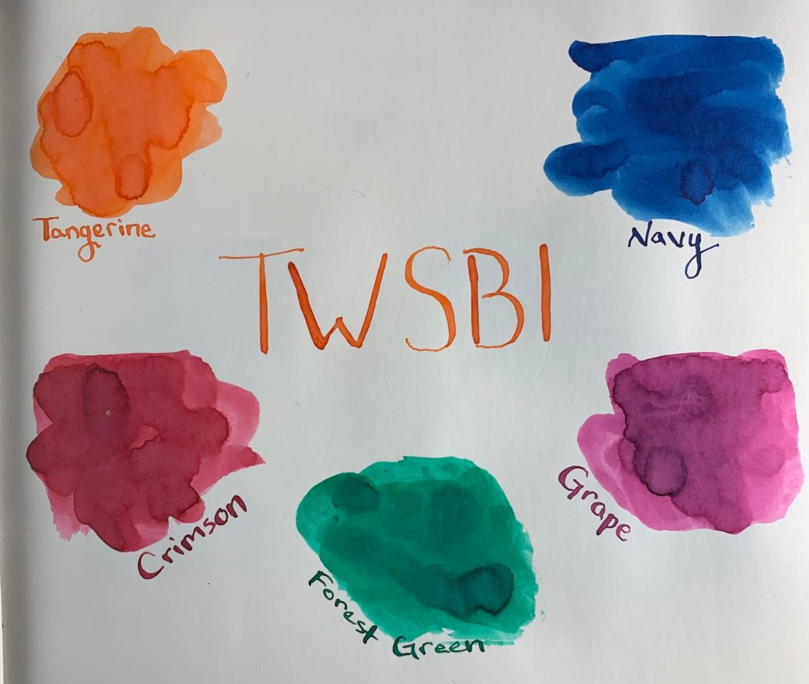
And again on Tomoe River paper:

I hope you’ve enjoyed this look at the five newest TWSBI inks! The bottles are small but pretty in frosted glass. You can find these at any ink retailer for $6.50 each. $0.36/mL is a great price for these lovely colors.

DISCLAIMER: I purchased the items for this review with my own money and all opinions are my own. Please see the About page for more details.
Jessica,
Nice overview of those last three inks. They're pretty, but I have too many inks like them to be tempted.
I hope you’re well!
Ruth
What an overview. All ink colors are pretty. May i know about this ink company?
The company is TWSBI. You can learn more at https://www.twsbi.com/.